While the U.S. dollar ended higher in trading yesterday the Japanese yen was even stronger so we will use this ‘detail’ to start things off today.
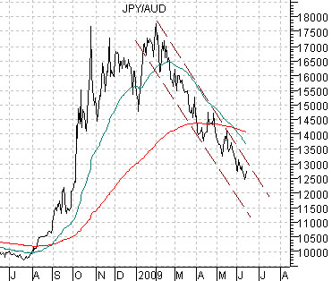
Belowwe show a chart of the cross rate between the Japanese yen (JPY) and Australian dollar (AUD) futures.
The yen was most certainly stronger while the Australian dollar was weaker but within the context of the trend that began to form at the end of February this year it would take more imagination that even we have to call this a trend change. It may end up being a trend change, of course, but yesterday’s action was far too little in terms of both time and price to be viewed as a game-changer.
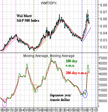
Belowwe show a fairly long-term chart comparison based on the cross rate between the Japanese yen and Aussie dollar and the ratio between Wal Mart (WMT) and the S&P 500 Index (SPX).
The JPY/AUD cross rate has been reduced to two moving average lines in order to smooth out the trend. We show the 200-day e.m.a. line in red along with the 100-day e.m.a. line in green.
Over the past couple of decades the cross rate has trended higher and lower for years at a time. The trend turned positive for the yen in 1990 and again in 1997 and then swung back to positive for the Aussie dollar in 1995 and 2001. The point that we are attempting to make is that once this currency pair reverses trend it has shown a tendency to hold the new trend for a considerable length of time.
The argument is that the JPY/AUD cross rate reflects Asian cyclical growth; specifically non-Japan Asian cyclical growth. We have argued in the past that Wal Mart’s stock price tends to strengthen relative to the broad U.S. stock market when Asian cyclical growth begins to weaken which helps to explain why the WMT/SPX ratio turned upwards in both 1990 and 1997.
Our final point is that while the JPY/AUD cross rate may have risen too far and too fast last year creating the need for some ‘backing and filling’ we are only a year or so into a new trend. If history were to repeat the yen should continue to strengthen through 2010 as the WMT/SPX ratio rises consistent with the 3-year rallies from 1990 through 1992 and 1997 through 1999.
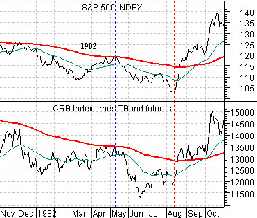
We tend to throw an awful lot against the wall as we slowly build a thesis to help get us through the short, medium, or longer-term. One of the ideas that we have returned to on a number of occasions is based on the way the S&P 500 Index created a bottom between late 1981 and August of 1982.
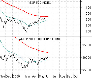
Belowis a chart of the SPX and the product of commodity prices (CRB Index) times bonds prices (U.S. 30-year T-Bond futures) from 1982 and, just below it, the same comparison for the present time period.
The idea is that the equity market is part ‘financial’ (like bonds) and part ‘cyclical growth’ (similar to commodities). It is positively influenced by rising bond prices as well as rising commodity prices but since bond and commodity prices often trend in opposite directions the equity market tends to be positive when bonds, commodities, or both are on the rise.
In any event… in 1982 the CRB Index times TBonds rallied up to the 200-day e.m.a. line along with the SPX into May and then declined to a cycle bottom in June. The CRB times TBonds finally broke above the moving average line in August just ahead of a similar move for the S&P 500 Index.
From a number of perspectives the current situation appears similar so our view was that it likely will take into August before the bond and commodity markets are ready to punch the SPX up through the moving average line.
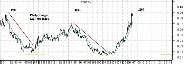
Below is a chart of the ratio between copper producer Phelps Dodge (PD)- bought out by FreePort McMoRan back in 2007- and the S&P 500 Index. The chart extends from 1980 through into early 2007.
The point? We read time and time again that the U.S. is yesterday’s news and that future growth will come from China, India, Brazil, etc. The argument is that this means that commodity prices have to go higher. Our counter to this is the PD/SPX ratio which has tended to trend in favor of the commodity sector (i.e. PD) for years at a time before reversing direction in favor of the non-commodity sectors.
Our view was that when the mines and metals finally reached a relative strength peak- as they did in 2008- the commodity trend would lag the broad market potentially all the way through into 2013.