In the midst of all of this gloom our view is that the cyclical trend is going to slowly improve from August through November with long-term yields resolving higher while gasoline, Brent crude, and gold prices decline. This creates a rather bullish set up for the equity markets. We are… just sayin’.
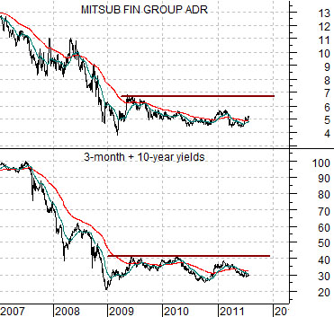
Below is a chart comparison between the share price of Japanese bank Mitsubishi UFJ (MTU) and the sum of 3-month and 10-year Treasury yields.
We use the sum of short and long-term yields because it helps to smooth out some of the lags. Typically long-term yields change directions as much as year ahead of short-term yields but for our purposes here the combination of the two works nicely.
The basic point is that the economic bludgeoning felt through 2007 and 2008 came to an end in early 2009 but to date the recovery has yet to improve to the point where real traction has been attained. We know this because MTU and yields are still ‘flat lining’. When the output gap created by the last recession has been absorbed we would expect to see an upward trend for MTU as well as yields.
We suspect that our argument teeters dangerously close to the blazingly obvious so we will push on in attempt to make it slightly more complex.
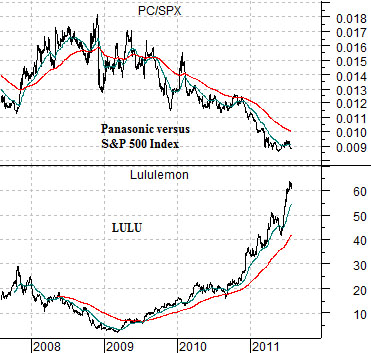
Next is a chart of yoga wear maker Lululemon (LULU) and the ratio between Panasonic (PC) and the S&P 500 Index (SPX).
With yields and MTU ‘flat lining’ the markets are responding in two ways. First, money is chasing whatever themes and sectors are still managing to show stronger growth. Second, over time valuations are expanding to catch up with the reality of near-0% short-term yields. The end result is a parabolic rise in the share price of LULU.
The offset to this is the PC/SPX ratio. This ratio will decline until the economic recovery has progressed to the point where it gains enough traction to push short-term yields higher. In a ‘flat lining’ trend there are still clear winners and losers so much of our focus of late has been on the action of the banks (which should rise with yields) and the share price of Panasonic both on an absolute basis and relative to the SPX.
Equities/Bond Markets
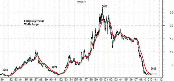
We are going to wander away from our thesis today because- for some unknown reason- we have an urge to return to the topic that we introduced yesterday. The idea was based on the fairly regular trend changes in the ratio between the price of Citigroup (C) and Wells Fargo (WFC). We suspect that this has much to do with lagging and leading as well as broker/trader/dealer versus banker.
In any event… let’s start with the chart below. The chart shows the ratio between C and WFC from 1980 to the present time frame.
We argued yesterday that this ratio has made MAJOR trend changes at the end of the ‘1’ year each decade. The ratio turned higher at the end of 1981 and 1991 and lower at the end of 2001. Given its current position we would argue that it can only turn ‘higher’ at the end of this year.
‘Crashes’ have tended to occur in the ‘7’ year (i.e. 1987 and 2007). In 1997 the Hang Seng Index from Hong Kong collapsed although this event did not disturb the C/WFC ratio.
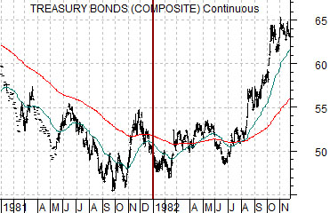
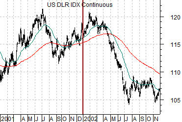
Below are charts of the U.S. 30-year T-Bond futures from 1981- 82 and U.S. Dollar Index from 2001- 02.
Major trend changes like the kind exhibited by the C/WFC ratio tend to happen within the context of other trend changes. In other words something ‘else’ likely changed direction at the same time.
Without giving it too much thought we recognized that the end of 1981 marked the low point for the long end of the Treasury bond market while the end of 2001 went with the bottom for the CRB Index as well as the top for the U.S. dollar.
If the C/WFC ratio makes another trend change (i.e. higher) at the end of this year we would expect that it will be in response to or in concert with the kind of trend changes in other markets that tend to run for a number of year. Goodness… the bond market is still rising in price 30 year after its 1981 bottom and the dollar continues to decline almost 10 years after reaching a top in 2001.