We deal with all kinds of intermarket relationships but our favorites- by a country mile- are those that are based on a fairly predictable ‘lead’. Most relationships exist in real time so if one market goes up another market should be going down. These are handy when looking for confirmation of a trend or a trend change but somewhat limited for day-to-day use given that the markets tend to reverse direction about every 15 minutes through the course of a trading session.
In a perfect world we would do all of our macro perspectives based on relationships where one market turns up or down followed by another market some time out into the future. We suspect that life- and the IMRA- would be much simpler as a result.
However… predictable lead-lag behaviors are few and far between so we have to make due with what the markets give us to work with. Today we are going to return to an argument that we probably haven’t run in these pages in quite some time. Long enough, perhaps, that it will actually come across as something bright, shiny, and new.
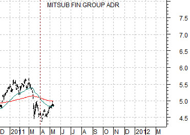
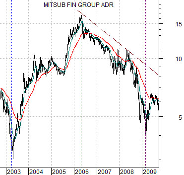
Below is a chart of biotech giant Amgen (AMGN). Below right is a chart of Japanese bank Mitsubishi UFJ (MTU). AMGN represent the non-commodity growth theme while MTU represents one facet of the cyclical growth theme.
The charts have been shifted or offset by exactly 9 months. The idea is that AMGN leads MTU at the turns by very close to 3 calendar quarters. If you know what AMGN was doing months ago you may be able to get a sense of what MTU will be doing months from now.
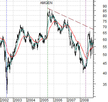
AMGN bottomed in mid-2002 while MTU did not hit bottom until the start of the second quarter in 2003. Amgen peaked in the summer of 2005 while MTU reached a top in the spring of 2006.
The share price of Amgen reached its bottom in the summer of 2008 while MTU did not wash out until the equity markets reached a low in March of 2009.
Based on the three key turning points for AMGN in 2002, 2005, and 2008 followed by similar directional changes for MTU very close to 9 months later… we came up with the argument that AMGN leads MTU by a fairly constant and predictable length of time.
Equity/Bond Markets
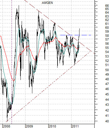
Next is yet another chart of Amgen as shift our focus from what has happened in the past to what is happening in the present.
From 2008 into 2011 the trend for Amgen lay somewhere between higher and ‘uncertain’. While each low was made at a higher level- the mark of a rising trend- each high was also at a lower level- the mark of a declining trend. Month after month and year after year the trading range narrowed as the wild swings up and down through the moving average lines tightened in.
While hardly conclusive… our thought is that AMGN may have broken the multi-year process of consolidating as it resolved up through the 57- 58 range this month. The argument would gain some validity if AMGN manages to close nicely above 62 and would look considerably better on a strong close above 65.
So… what does the chart at top right tell us about MTU?
On the one hand the message is fairly bullish. If AMGN made a clear bottom in mid-2008 then the cycle lows for MTU in the first quarter of 2009 should also mark a bottom. If Amgen continues to trend higher taking out the 2008 and 2009 highs then the message is that MTU is quarters- if not years- from its next cycle peak. Fair enough.
A slightly less enthusiastic case could be made from the chart however. If everything between 2008 and the first quarter of 2011 represents consolidation and… AMGN leads MTU by 9 months… then MTU might be expected to wallow somewhat into the end of this year. Given that ‘the end of this year’ is a long time away when one is commenting on the markets on a daily basis… this could take some amount of patience.
The point is that if we use something like the AMGN/SPX ratio to mark the trend change points then our ‘laggard bank’ theme might be dead in the water until the final quarter of this year.
Given the limitations of our attention span we wondered whether we could come up with something imaginative to speed up the waiting process. We should mention that the term ‘imaginative’ usually represents ‘unfair to the point of absurdity’.
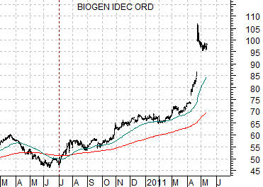
What if… we substituted Biogen (BIIB) for Amgen this time around? What if we extended the 9-month lead between the broad theme of ‘biotech’ from Amgen to another major player? While it hasn’t worked in the past perhaps this could be explained away by Amgen’s shift from an economically sensitive non-commodity growth stock to a stodgy pharma-like behemoth. Perhaps BIIB is showing the kind of growth in the current cycle that investors used to attribute to Amgen. Or not. Time will tell.
Below we have added a chart of Biogen and a chart of Mitsubishi UFJ. The charts have, of course, been offset by 9 months so that the bottom for BIIB in June of 2010 is lined up with the recent lows for MTU around the end of the first quarter this year.
Over the past 10 or so months BIIB’s share price has roughly doubled as the trend extended higher in a somewhat parabolic fashion. If MTU is lagging AMGN then it would be expected to remain fairly flat through the balance of this year but if it is lagging BIIB then we should see new recovery highs later this summer with the potential for even greater strength into the first quarter of next year.