The market often resembles one or more previous time frames. Our view is that cycles tend to repeat in a broad sense so it makes sense to look at a variety of comparisons. Today we are focusing on the similarities between today and the second half of 2003.
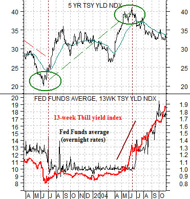
In the spring of 2003 the Fed was concerned about deflation and was discussing potential purchases of U.S. Treasury securities. After cutting the funds rate to 1% in June of that year long-term Treasury yields began to pivot higher.
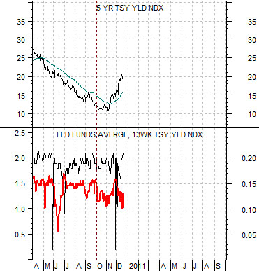
Contrast this with the current situation. In March of 2010 the Fed announced its last significant policy easing for the year- the purchase of Treasury securities. Yields declined into the autumn and then pivoted higher.
The chart below compares 5-year Treasury yields with an overlaid view of 3-month TBill yields (in red) and the Fed funds target rate. This chart is from 2003- 04 while the same comparison for 2010 has been included below right.
The low point for 5-year yields was reached in mid-2003 as the Fed made its final rate cut. The market’s response- pushing 5-year yields higher- suggested that additional easing would not be necessary.
The key here is that the funds rate remained flat at 1.0% until 3-month TBill yields finally rose above the funds rate target. This happened in May of 2004 with the first funds rate hike following a month later in June.
The next chart shows an upswing in 5-year yields that is somewhat reminiscent of the summer of 2003. Our view is that we are now ‘in between’ the end of Fed easing and the start of Fed tightening.
While it may well take a year or more before the Fed actually starts to raise the funds rate the critical point is that the market will decide when the time is right. If the current cycle follows the same basic path then expect to see a rising trend for 5-year yields until 3-month yields are eventually pushed up through .25%. That will be the cue for the Fed to start raising interest rates which will, strangely enough, mark the start of a decline in longer-term yields.
Equity/Bond Markets
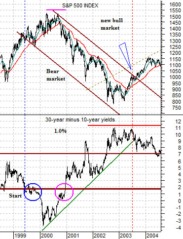
We have run through the comparison between the S&P 500 Index (SPX) and the spread between 30-year and 10-year Treasury yields on a couple of prior occasions but… we thought that we would take one last run at the idea.
The basic premise is that the trend for the SPX is essentially the mirror-image of the yield spread between 30-year and 10-year Treasuries. A rising yield spread tends to be negative for the equity market while a declining yield spread is a positive.
Any discussion based on the slope of the yield curve will generate different perspectives depending on which maturity dates are used. The most common yield spread and the one that is perhaps the most powerful in terms of predictions about future economic growth is based on the spread between 10-year and 3-month yields. One could use 10’s and 2’s, 30 year yields versus TBill yields, 5’s versus 2’s, or any one of a number of other choices. Today, however, we are using the spread between the 30’s and the 10’s.
The argument is that a ‘bear market’ begins when the yield spread or difference between 30-year and 10-year Treasury securities declines below roughly .2%. The twist is that this tends to show up as the start of the lower channel line. The upper channel line is created when the yield spread rises back to up roughly .2%.
To explain… in 1999 the yield spread declined below .2%. The SPX continued to rise into the second half of 2000 at which point the yield spread rose from its low point back up through .2%. This created the top of the declining channel that marked the upper boundary of the bear market that rant through into 2003.
While the SPX bottomed in 2003 the break out through the channel top marking the end of the decline did not take place until the spread between 30-year and 10-year yields finally began to trend lower. Note that this happened in 2003 after the Fed made what turned out to be its final downward cut in the funds rate.
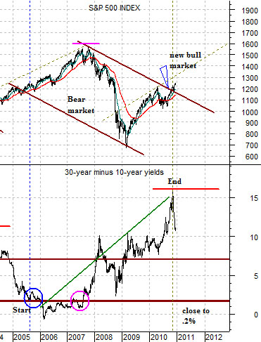
The stock market’s trend continued to be positive from 2003 into 2007. Shifting to the chart below right we can see that the yield spread fell to .2% in 2005 which marked the bottom of the channel that would describe the upcoming bear market.
The yield spread did not rise above .2% until the second half of 2007 creating the width of the downward sloping channel.
If history were to repeat the SPX would continue within the downward sloping trend until the Fed made its final easing of monetary policy. This would then lead to a falling yield spread as the SPX pushed up and out of the channel. As drawn the chart shows that this event appears to have taken place within the last few months.
From here the trend should remain positive until the yield spread declines back to .2%. Even then it could be a year or two until the spread starts to rise back up through .2% to mark the top edge of the next bear trend. The bottom line is that while we are some distance in terms of both time and price from the absolute lows we may well be quarters or even years away from the next cycle peak.