The problem with long-term or macro perspectives is that they can be absolutely correct… give or take a year or three. In a world that defines ‘long-term’ as the end of the current quarter this kind of slippage is difficult to deal with.
Our argument today deals with the tendency for the markets to rise to an asset price peak at the end of a decade. Commodities pushed to a cycle top into 1980, the Nikkei into 1990, the Nasdaq into 2000, and now we are back into a commodity trend. Our ‘logical leap’ is that if the pattern is commodities, Japan, tech, commodities… then the next ten years may include better days for Japan.
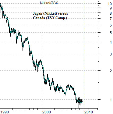
Below we show the ratio between Japan’s Nikkei 225 Index and Canada’s TSX Composite. In 1990 the Nikkei was trading at ten times the TSX compared to the current level closer to 1:1.
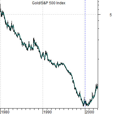
Below we show the ratio between gold and the S&P 500 Index from 1980 through 2003. The argument is that the Nikkei/TSX ratio today is in a similar position to gold relative to the broad U.S. stock market back around 1999.
Below is a chart of the gold/SPX ratio from 1999 to the current time frame. The ratio bottomed between 1999 and 2000 and then rose to what appears to be a cycle peak in early 2009.
Our macro argument is that the last decade belonged to the producers of raw materials- including gold- while the next decade will favor the users of commodities.
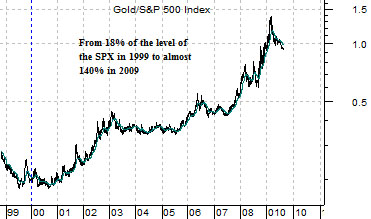
The point above was, more or less, that if you toss out all of the smoke, mirrors, and assorted crises that have marked the last ten years underlying all of it was a decade-long positive trend for gold prices. After twenty years of benign neglect from 1999 into 2009 the markets found one excuse after another to lift gold prices both on an absolute and relative basis.
The counter to a strong gold trend is, of course, a weak dollar trend. To argue that gold prices have reached a relative strength peak we are really making the case that currencies like the Swiss franc and euro have risen to a cycle top concurrent with a low for the dollar.
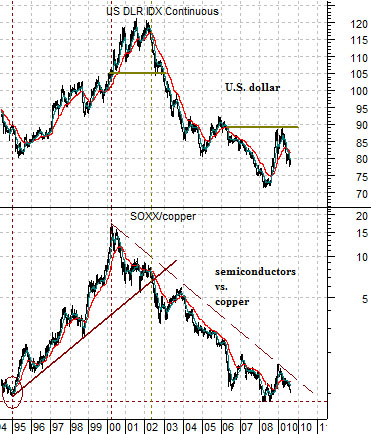
At right we show two chart comparisons that help to explain what will happen if, as, or when the dollar finally begins to rise. The chart at top right argues that regardless of what the equity markets do the trend will favor ‘tech’ (i.e. the Philadelphia Semiconductor Index) over base metals prices (i.e. copper futures).
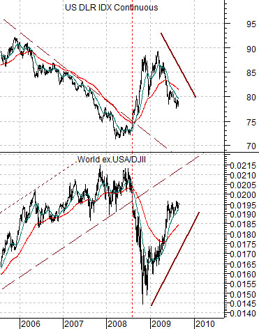
The chart below compares the U.S. Dollar Index (DXY) futures with the ratio between the World ex-U.S.A. Index and the Dow Jones Industrial Index (DJII). When the dollar is weaker ‘everything else’ rises relative to the U.S. large caps while when the dollar is stronger the U.S. large caps will tend to outperform. In other words as long as the dollar is trending lower the markets will favor commodities over tech and ‘everything else’ over U.S. large caps.
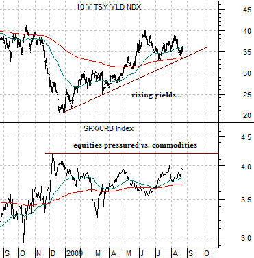
The trend for the dollar is fairly close to the trend for long-term Treasury prices so below we compare U.S. 10-year Treasury YIELDS with the ratio between equities (S&P 500 Index) and commodities (CRB Index).
When YIELDS are rising it often means that commodity prices are stronger than equity prices. A potential trend change through the remainder of this year would include 10-year yields falling below 3.3% while equities rise relative to commodity prices. A collapsing commodity market would put downward pressure on stocks while a flat or even slightly higher commodity market would kick the stock market upwards in a manner similar to 1995.