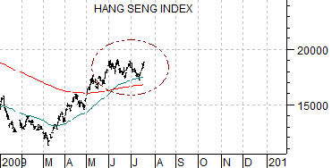
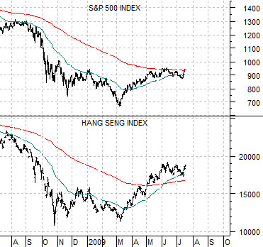
We start things off this week with a comparison between the S&P 500 Index (SPX) and Hong Kong’s Hang Seng Index.
The simple point is that the trends are virtually identical. We grant that the Hang Seng has certainly outperformed given that it is some distance above its moving average lines and has been consolidating since early June at levels equivalent to something closer to 1100 for the SPX but, aside from that, the trends are very close. If the Hang Seng Index resolves to the upside then there is a reasonable chance that the S&P 500 Index will respond in similar fashion.
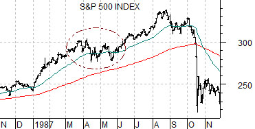
With that in mind we move on to the charts below right. We compare the S&P 500 Index from 1987 with the current chart of the Hang Seng Index.
The issue that we are circling is that the Hang Seng’s consolidation is either a top or a mid-point correction. It is either the end of the rally or the launching point for an extension of the recovery that should run into this year’s fourth quarter.
In 1987 the SPX rose nicely from January through March before working sideways into late May. We have argued on occasion in past issues that the structure of the consolidation for the SPX between April and May of 1987 was almost an exact copy of the ‘top’ that was made from August into October. In other words the equity market rose, consolidated, rose once again, consolidated, and then collapsed. The first consolidation was a mid-cycle correction while the second was a pre-crash top.
So… if the SPX consolidated twice during 1987 with the first leading to an upside extension of the rally and the second leading directly into a collapse that in a few short days eliminated all the gains created through the year…. how is this relevant to the current time frame?
Our thought is that the markets have reached a decision point. The Hang Seng Index- which trends with the SPX- has yet to break to new highs and has clearly managed to avoid failing back below its 200-day e.m.a. line. In due course- perhaps as early as this week- the assortment of markets that trade with the Hang Seng (including the Cdn dollar, Aussie dollar, copper futures, and long-term Treasury yields) will either break to new highs en masse or stage an early quarter reversal back to the down side.
Equity/Bond Markets
We are going to go for a bit of an intermarket ‘wander’ today as we explore one of the macro issues that typically fascinate us. This is a mixture of imagination, conjecture, and outright speculation but, then again, we wouldn’t bother to show it if we didn’t believe that it had some level of importance.
At top right we show a chart of the CRB Index from May of 1988 through December of 1989.
The argument is based on the ‘decade theme’ which suggests that asset price peaks have tended to occur at the start of new decade. The commodity markets peaked in 1980 and after years of leadership by the consumer and financial sectors the commodity markets pivoted upwards in late 1986 forcing interest rates higher and ultimately creating the 1987 stock market ‘crash’.
The commodity rally extended right through the crash before peaking at the end of the second quarter in 1988.
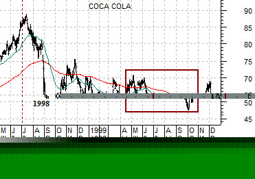
The chart at middle right shows the share price of Coca Cola (KO) from May of 1998 through December of 1999.
The Coke chart shows that prices peaked right at the end of the second quarter of 1998. Ten years after the cycle highs for the CRB Index the broad large cap consumer and financial trend began to weaken.
Our first point is that the asset price peak for Asian shares that occurred in early 1990 was driven in part by money shifting away from the broad commodity theme from mid-1988 through 1989.
The Nasdaq’s cycle peak in 2000 was preceded and, perhaps, created by early weakness in the large cap consumer and financial theme in mid-1998 through most of 1999. We could probably argue that the low point for the CRB Index in July of 1989 preceded the eventual bubble top for the Nikkei by around 6 months while the lows for Coke at the end of September of 1999 preceded the Nasdaq’s March 2000 peak for a similar number of months.
In any event… if history were to repeat… and the markets are once again building into a bubble top due some time in 2010… then one or more sectors should have reached a top at the end of the second quarter in 2008.
The thought is that an extension of the cyclical recovery will require a steady if not accelerating flow of funds. The CRB Index and Coca Cola charts shows that there was a second bout of weakness through the second or third quarters of the ‘9’ year that led to a price bottom that preceded the cycle asset price peak by, as mentioned above, around 6 months..
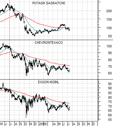
If the current situation is at all similar to 1990 and 2000 then this is about the time when a major sector that peaked in mid-2008 should begin the second leg of a correction. There are a few likely candidates but our view was that it would work best if they were the kind of sectors that investors had been overweighting. Our thought was that the charts of Potash, ChevronTexaco, and Exxon Mobil may represent the kind of names that could weaken this quarter leading to offsetting strength in other markets. If Chevron and Exxon were to break below the March lows over the next week or three… we may, in fact, have stumbled on to something rather important.