Through the final years of the previous decade the markets repeated the same basic trend change almost like clock work. Interest rates would rise through the first half of the year- usually powered by stronger energy prices- and then decline over the final six months. This served to split the markets into two different themes with the commodity cyclicals leading the charge over the first two quarters and then ‘something else’ taking over into year end.
We use the term ‘something else’ simply because leadership showed up in different sectors each year. One year the airlines would soar as energy prices declined while in another year the gold sector would strengthen as slowing growth pointed towards a financial crisis.
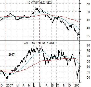
Below is a chart from 2007. The chart compares 10-year Treasury yields with the share price of oil refiner Valero (VLO).
The first six months of 2007 was dominated by rising energy prices in general with an emphasis on gasoline futures. Perceived tightness in gasoline inventories drove crack spreads higher which, in turn, helped increase the profitability of the refiners. The share price of VLO bottomed in early January just below 50 and topped out in mid-July well above 75.
The chart shows that this trend helped push 10-year Treasury yields higher followed by a mid-year reversal as the markets shifted over to other themes.
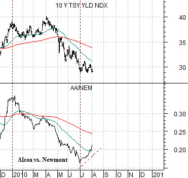
What has intrigued us so far about 2010 is the way the trend for yields was lower instead of higher over the first half. The chart below compares 10-year yields with the ratio between Alcoa (AA) and Newmont (NEM).
The AA/NEM ratio serves as our proxy for cyclical growth. This ratio peaked in January and then declined steadily through June as the gold miners outperformed the aluminum producers. The bond market’s reaction was to push 10-year yields lower into the end of the second quarter.
Our view is and has been that the kind of cyclical trend that involves rising interest rates will necessarily have to include either base metals price strength or precious metals price weakness leading to a rising trend for the AA/NEM ratio.
Equity/Bond Markets
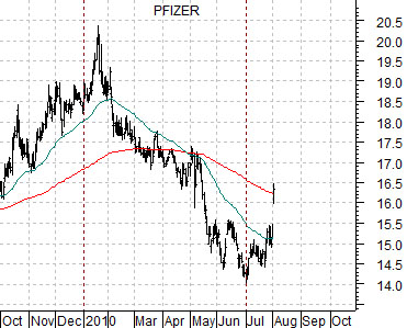
Aug. 3 (Bloomberg) — Pfizer Inc.’s second-quarter profit beat analyst estimates after sales were boosted by a weaker dollar and products from its acquisition of Wyeth. The shares rose the most in 13 months.
Just below is a chart of Pfizer (PFE). While this may end up being just another one-day wonder it did seem fit the general criteria that we have been looking for. Namely… a large cap stock with low expectations that gaps higher on surprisingly strong earnings (similar to Cisco in 2006- chart on the following page).
Pfizer spent the first six months of the year trending lower but began to strengthen at the start of the third quarter. The combination of two quarters of falling prices, a quarterly trend change, and an upside gap always intrigues us.
The markets have a habit of doing the unexpected so while our basic view has been a return to rising interest rates driven by improving Asian growth we thought we should at least take a look at another possible outcome. One that might include strength in stocks such as Pfizer.
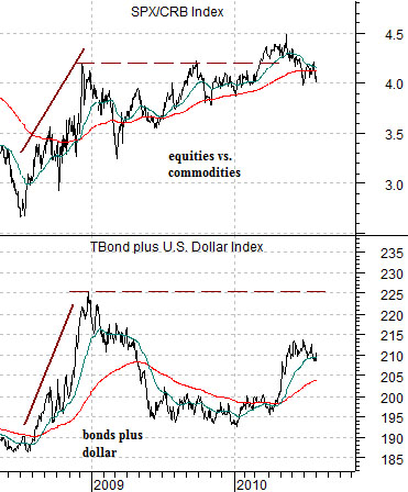
Further below is a chart comparison between the ratio of equities (S&P 500 Index) to commodities (CRB Index) and the sum of the U.S. 30-year T-Bond futures and U.S. Dollar Index (DXY).
One of our views is that there are four basic combinations of the dollar and bond market that can ‘drive’ trends. These include a weak or strong bond market and a weak or strong dollar.
Typically large-cap consumer and health care stocks tend to do best when the dollar AND the bond market is rising. In other words when the sum of the TBond and the DXY is trending to the upside. Commodity prices, on the other hand, tend to do better when the dollar is weaker and bond prices are falling so from an intermarket perspective the large cap consumer stocks are the flip side of the commodity theme.
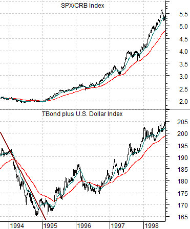
In any event… in early 1995 the sum of the TBond and dollar turned higher as the SPX/CRB Index ratio began to rise. In this instance rising bond prices and a stronger dollar helped push equity prices higher versus commodity prices which created a trend that ultimately ran through the Asian crisis in 1998 and the Nasdaq’s bubble in 1999 into the cycle peak in 2000. We show the same comparison for the current time period below left. The problem since 2008 has been that each time the dollar and bond market have shown any strength… prices have collapsed.