On any given day the markets don’t have to ‘do’ anything. Prices are prone to wandering with apparent trends changing directions two or three times per session. Over a longer stretch of time, however, trends need to make sense. Markets that move together should move in the same direction because if they don’t… the risk of having the bus back up right over top of you increases considerably.
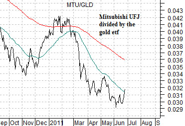
Below is a chart of the ratio between Japanese bank Mitsubishi UFJ (MTU) and the gold etf (GLD). The argument has been that the laggard trends (Japan, banks, and especially Japanese banks) should turn up when the offsetting trends (gold) turn down. In other words if money is flowing away from the laggards and into gold then once the trend changes we should see strength in the laggards and weakness in gold. In other words… a rather abrupt upward pivot for the ratio line.
We are fairly comfortable with this particular piece of logic. As long as the MTU/GLD ratio is trending lower the markets remain mired in some kind of crisis-related pressure. Sub-prime, Middle East, PIIGS, etc.
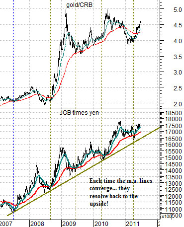
Next is a chart comparison between the ratio of gold to the CRB Index and the combination of the Japanese 10-year (JGB) bond futures times the Japanese yen futures.
The kind of pressure that has been working on the banks since 2007 has shown up in two quite different ways. First, it has elevated the gold/CRB Index ratio. Second, it has created a fairly relentless rising trend for the Japanese yen and Japanese bond market.
Our argument is that all of the charts on this page represent the same basic story. The MTU/GLD ratio declining denotes economic weakness. The gold/CRB Index ratio rising represents money moving into gold due to concerns about the currencies of most developed non-commodity producing countries. The rising trend for the combination of the Japanese bond market and yen suggests that even 20 years after the peak for Japanese asset prices the recovery has yet to find any kind of traction.
The point? We are looking for lower gold prices. We are looking for a weaker gold/CRB Index ratio. The offset to this should be strength in the banking shares. Confirmation should come from a weaker Japanese yen and bond market and our suspicion is that the most difficult trend to break is going to be the JGBs times yen. This is the ‘quiet’ trend that corrects from time to time but, when the dust has settled, is consistently resolving back to the upside.
Equity/Bond Markets
Given that we are approaching the end of the quarter with new trends emerging over the next few weeks… we thought that we might be able to spare a page to cover one of the ‘macro’ issues that we ponder from time to time.
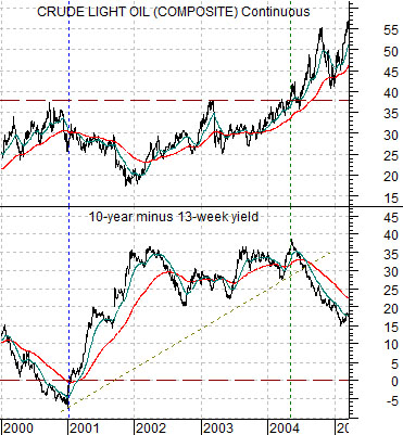
Below is a chart of crude oil futures and the spread between 10-year and 3-month Treasury yields (i.e. the yield curve or spread) from 2000 into early 2005.
The yield spread declined to a low in 2000. A falling yield spread is the markets’ way of slowing the pace of cyclical growth. A spread below ‘0’ means that the yield curve is inverted and an inverted yield curve has preceded all U.S. recessions since the late 1960’s. We should note that an inverted yield curve does not always lead to recessions but, then again, it has been a long time since the U.S. has had a recession without yield curve inversion.
In any event… the yield curve inverted in 2000. This led to a collapse of the tech and telecom sectors and some concurrent weakness in crude oil prices. Fair enough.
With the cyclical trend turning negative the yield spread surged upwards. It remained near the highs (just under 4.0%) from 2002 into 2004.
The issue is that it was the Nasdaq that pulled rates lower in 2000 while it was the energy sector that pushed them higher in 2004. Typically the dominant theme is the one that pushes yields higher (bullish) or pulls them lower (bearish).
After years of fixating over Cisco, NorTel, Intel, Microsoft, etc. investors spent much of the first half of the last decade attempting to find the bottom for the tech and telecom sectors. Meanwhile… the trend had changed as the yield spread declined on energy price strength. All this means is that we shifted from a tech trend to an energy/commodity trend.
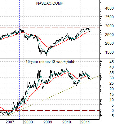
Below is a comparison between the Nasdaq Comp. and the 10-year minus 3-month yield spread from late 2006 to the present day.
We know that tech and telecom weakness in 2000 buckled the cyclical trend (as evidenced by the rising yield spread) and are aware that another sector (energy) led the recovery in 2004. The issue that we keep coming back to this time around is exactly ‘what’ busted the cyclical trend in 2007 and ‘what’ is going to lead to the upside in 2011 or 2012?
One might argue that the banks were the weak link in 2007 but we suspect that the banks weren’t the real issue but were instead the tail wagged by the housing markets’ dog.
If tech led to the down side in 2000 and energy prices led to the upside in 2004 and… home prices led to the down side in 2007… what is going to lead to the upside in 2011? A number of individual stocks have already to moved to new all-time highs along with copper futures but our sense is that the sector that has a similar chart to crude oil between 2000 and 2004 is the Nasdaq Composite Index.
The point is that it will be interesting to see whether short-term U.S. yields start to move upwards if the Nasdaq Comp. breaks above resistance at 2900.