We have a curious assortment of views with respect to the markets as we argue, for example, that the equity market trends with the bond market on two different time frames and that there are broad similarities between each recent decade. From time to time we return to the idea that there seems to be a nine month lag between the start of cyclical weakness and real downward pressure on asset prices.
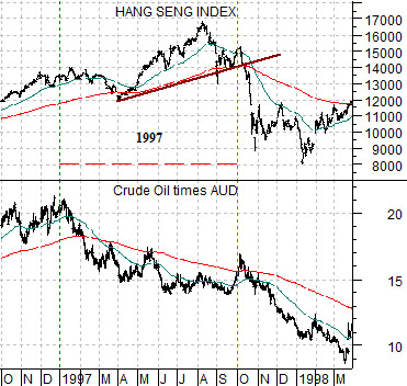
Below is a chart taken from 1996- 1998. It revolves around the start of cyclical weakness in early 1997.
There are a number of ways to show, reflect, or measure cyclical weakness but in this instance we are using energy prices and the Asian growth/commodity price sensitive Aussie dollar.
The combination of crude oil times the AUD turned lower around the beginning of 1997. From our perspective this marked the start of a negative trend that ultimately led into 1998’s Asian crisis.
The twist is that the Hang Seng Index- another notoriously cyclical market- did not break lower until the third quarter of 1997. In between the start of weakness in January and the ‘crash’ of the Hang Seng Index in October close to 9 months elapsed.
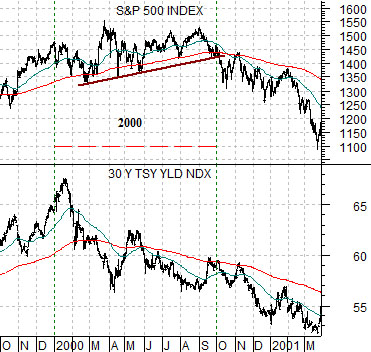
Next is a chart comparison between the S&P 500 Index and 30-year U.S. Treasury yields from the end of 1999 through the first quarter of 2001.
In this instance we are showing the cyclical trend through long-term Treasury yields. In the chart at top right we used the Aussie dollar and crude oil and here we are focusing on 30-year yields. Why? Because the trend into 1997 was focused on commodity prices and Asian growth while the trend into 2000 was dominated by the tech sector, dollar, and U.S. growth.
In any event… falling yields in January of 2000 marked the start of cyclical weakness in a manner similar to weaker energy prices and commodity prices in 1997. The S&P 500 Index remained fairly robust through the first three quarters of 2000 until finally succumbing to the gravitational pull of the bond market through the fourth quarter. Once again we can see a nine month lag between the first signs of cyclical distress and the inevitable confirmation from the capital markets.
Equity/Bond Markets
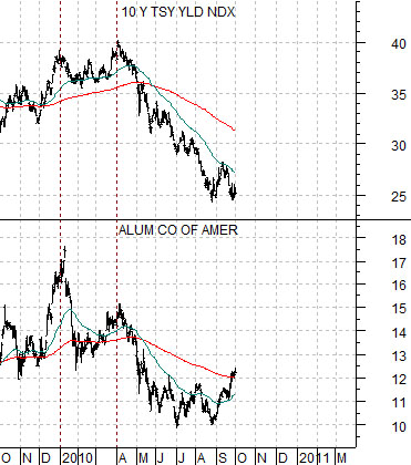
So… why did we make such a fuss on the first page about the 9-month lag? There is method to our madness- we hope.
Here we show 10-year U.S. Treasury yields and the share price of Alcoa (AA).
If there is a standard 9-month lag between initial weakness and significant equity markets price pressure then it stands to reason that it would be important to know when the cycle began. From this chart one could argue that bond yields clearly turned lower in April but a case could also be made for January when Alcoa’s share price began to weaken. Our view has been that we have 3 more months of cyclical strength but when we ponder the Alcoa chart and note that we are in the very early days of the final quarter- 9 months AFTER Alcoa began to trend lower- we admit to a bit of discomfort.
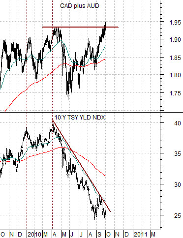
Below is a comparison between 10-year yields and the sum of the Cdn and Aussie dollars. Let’s make this as clear as possible. Whether the negative trend began in January or April is important but the key is that we are not going to see cyclical weakness UNTIL the commodity currencies stop rising. In other words… the eventual rally killer is going to be a strong U.S. dollar so until the dollar turns higher and the commodity currencies start to crack… it makes sense to trade with cyclical growth.
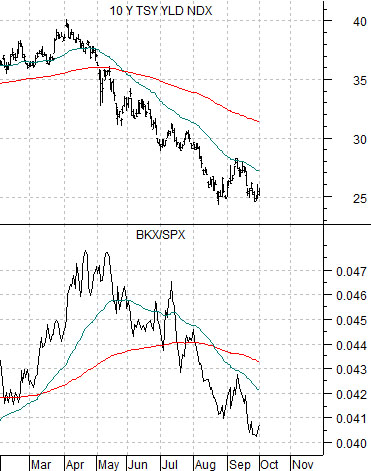
Last is a comparison between 10-year yields and the ratio between the Bank Index (BKX) and the S&P 500 Index (SPX). Two sectors that have been putting pressure on yields this year are the techs and banks.