One of our views is that the bond market represents the next bubble to burst. 10-year Treasury yields in the vicinity of 2% only make sense if the markets are truly giving even odds to the prospect of a deflationary outcome.
The argument is that a 2.0% 10-year yield represents the markets sitting on the proverbial ‘fence’. If the scales tip in favor of deflation then yields can follow the Japanese path to 1% or lower. If the recovery gains traction- as the equity markets are currently suggesting- then putting money away for 10 years at 2.0% makes no sense. It represents a massive ‘carry trade’ as speculators borrow short-term at rates close to 0% in order to earn the carry or spread while being cheered on the Federal Reserve each time it states the it will hold yields near current levels for an inordinately long period of time.
Our point? The Fed has no idea when it will raise the funds rate. In fact longer-term bond prices will tend to decline for a full year before the Fed initiates the process so a leveraged bet in the bond market relies on the expectation that the recovery will not gain sufficient traction to cause the Fed to start tightening credit a year from now.
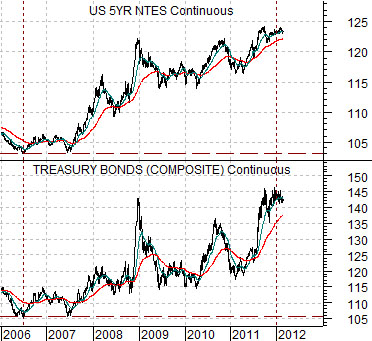
First is a chart comparison between 5-year and 30-year U.S. Treasury futures.
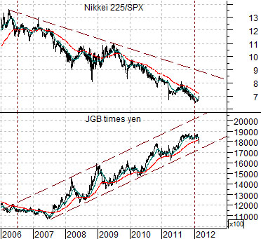
Next is a chart of the ratio between Japan’s Nikkei 225 Index and the S&P 500 Index along with the combination of the Japanese 10-year bond (JGB) futures and the Japanese yen futures.
The concept of ‘offsets’ suggests that a market that is rising due to another market’s decline will continue to rise until the weaker market finds bottom and swings upwards. Fair enough.
In the current situation there are a number of sectors that have been weaker since 2006- 07 with the offset to this resulting in a rising trend for bond prices and the Japanese yen. One example would be the banking stocks while another- in our view- is the Japanese stock market.
The argument is that bond prices should begin to top out once the Nikkei/S&P 500 Index starts to rise in earnest. The stronger the Japanese stock market- relative to just about everything- the greater the downward pressure on bond prices.
Equity/Bond Markets
We are going to do something a bit different today. The topic relates to something that we call a ‘breakout failure’. This is truly one of the nastiest of all chart patterns.
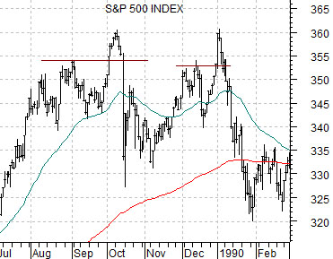
Below is a chart of the S&P 500 Index from 1989.
On two occasions in 1989 the SPX broke to new highs, rose for a few days, and then abruptly collapsed back to the down side. Those investors who bought the break out were rather severely punished for a month or so.
What has always intrigued us about this example is that the S&P 500 Index actually went on to make new highs into 1990 before swinging back into a bear market.
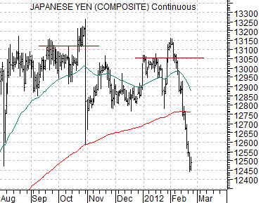
The chart at middle shows the Japanese yen futures from 2011 and 2012.
The yen completed a breakout failure in October after it pushed to new highs and then abruptly reversed to the down side. A second similar pattern showed up around the end of January this year as the yen spiked up through 1.305 and then snapped back below this level.
We have a couple of reasons for showing this today. First, we wonder from time to time about the similarity between the yen’s chart and that of the SPX from 1989. In fact the October ‘crash’ for the yen is similar to first failure for the SPX in October of 1989 while the recent plunge looks very much like the SPX in January of 1990.
Coincidence? Time will tell but… as noted above… the SPX made new highs into the summer of 1990 (chart on page 6) so in theory… we could create a chart-based scenario that would support a stronger yen (bond market and gold) through the first half of this year.
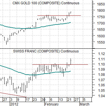
Second, we continue to stew about the way gold and the Swiss franc are diverging from the Japanese yen.
The chart below compares gold futures with the Swiss franc futures.
Both gold and the franc have broken out through resistance this week. Investors (and we use this term loosely) caught short are covering and those on the sidelines are diving back in to take advantage of what appears to be confirmation of a rising price trend.
In the majority of cases bullish is bullish. A market, sector, or security that moves easily through resistance is in a positive trend so it does not make sense to take the other side of the trade. Unless… after a week or so… the break out ‘fails’ with gold moving back below 1760 while the Swiss franc gives back the gains made above 1.097.
The point is truly two-handed. On the one hand the break lower in the yen is supposed to add pressure to bond and gold prices. So far… that hasn’t happened which brings up with the topic of ‘breakout failures’. On the other hand the yen looks so similar to the SPX in January of 1990 that we wonder whether the rising trend for gold and the Swiss franc is actually a fairly clear message from the markets that the cyclical recovery will not begin in earnest until the final quarter of this year.