We are going to meander through a few of the offsets within the markets at present, paint a bit of a scary picture on page 3, and then make the argument on page 5 that if the equity markets are going to rally into the late summer the swing upwards could begin at almost any time and from very close to current levels.
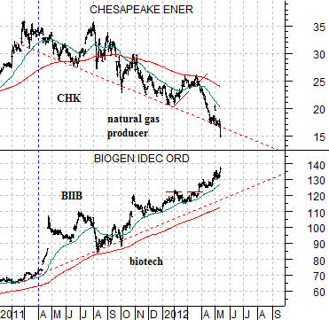
Below is a chart comparison between the share prices of natural gas producer Chesapeake (CHK) and biotech Biogen (BIIB).
We have been showing this chart for months but the idea is that money has been flowing away from the energy sector since the end of the first quarter of 2011 and towards the biotechs. Owners of CHK will feel certain that the overall trend for equities is bearish while those long BIIB will have enjoyed a much different experience.
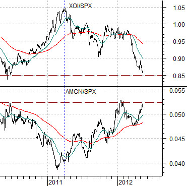
Next is another spin on this perspective. We have included a chart of the ratio between the Amex Oil Index (XOI) and S&P 500 Index (SPX along with the ratio between biotech giant Amgen (AMGN) and the SPX.
Crude oil futures prices rose from around 70 in the summer of 2010 up to almost 115 into April of 2011. This rising trend pushed the ratio between the oil stocks (XOI) and broad market (SPX) up by almost 20% from .85 to 1.05.
Once crude oil prices reached a peak just over a year ago capital started to migrate away from the oil and gas stocks. One of the chief beneficiaries of this reversal was the biotech sector as shown by the rising trend for the AMGN/SPX ratio.
The point is that the biotech stocks tend to outperform the broad market when the U.S. dollar is trending upwards. The stronger dollar puts pressure on commodity prices in general and energy prices in particular which leads to the kind of action that we have witnessed within the markets over the last 12 to 14 months.
Going forward one of the way to see if the oil stocks are ready to show strength may well be through offsetting weakness in the biotechs. As long as Biogen and Amgen outperform the broad market the argument would be that the energy trend is still somewhat bearish.
Equity/Bond Markets
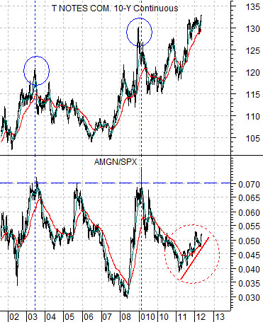
Below is a chart of the Amgen/S&P 500 Index ratio along with the U.S. 10-year T-Note futures.
Often- but not always- strength in the AMGN/SPX ratio goes not only with dollar strength but also with bond price strength.
The argument is that money moves towards the biotechs when one or more cyclical sectors are under pressure. The greater the range of negative sectors the quicker the flow of money towards names that are showing reasonable prospects for growth.
In any event there are two time periods that we have highlighted on this chart. The first is in the middle of 2003 while the second is early in 2009.
Bond prices peaked around the end of the second quarter of 2003 as the ratio between Amgen and the SPX rose to around .07. The top for bond prices marked the beginning of a broad and powerful recovery in those sectors that we call the ‘laggard cyclicals’.
Bond prices bottomed early in 2000 ahead of the peak for the Nasdaq and S&P 500 Index. Through the ensuing recession bond prices continued to resolve higher until by 2003 economic growth had improved and expanded to the point where the cyclical stocks that had been lagging the recovery finally found traction.
The point here is that the AMGN/SPX ratio rose to around .07 and then peaked with long-term Treasury prices.
In early 2009 the AMGN/SPX ratio rose back to the .07 level and once again long-term Treasury futures prices were at a high. Not ‘the high’, of course, but certainly ‘a high’ given that it took almost three years for bond prices to move to a new recovery peak.
We have two prior instances of a bond price peak marking a cyclical low point at the same time that the ratio between Amgen and the S&P 500 Index reached .07.
When we look at the current situation we can see that the AMGN/SPX ratio is moving higher but we also note that it is still some distance below the .07 level. From this perspective a case could be made suggesting that things are going to get worse before they get better. Especially for the energy and base metals sectors.
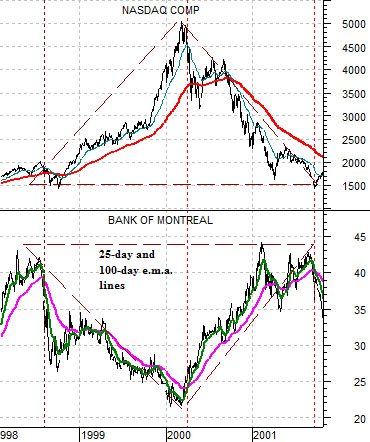
Below is a comparison between the Nasdaq Composite Index and the share price of Canada’s Bank of Montreal (BMO) from 1998 into 2001.
We wanted to include this chart because it shows two things quite clear. First, it highlights how powerful ‘offsets’ can be. As money moved into the tech sector from 1998 into 2000 it pushed interest rates higher, pulled money towards the U.S. dollar, and added pressure to the Canadian banks. When the trend reversed in early 2000 interest rates started to fall, eventually the dollar started to weaken, and the exodus of capital away from tech and telecom did wonders for the share price of BMO.
From 1998 into 2001 the Nasdaq went up and then down, BMO went down and then up, and while both returned to their original starting points the perception of whether this was a bull or bear market depended upon which of the two sectors one was holding on the long side.