The dance between crude oil, natural gas, and the bond market continues to intrigue us. This has definitely been an interesting year.
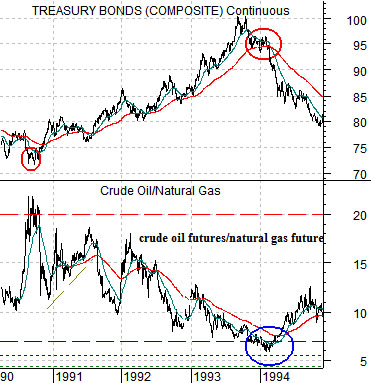
The argument has been that when crude oil is ‘high’ relative to natural gas prices the bond market tends to be ‘low’. The chart at top right shows the ratio between crude oil and natural gas futures along with the U.S. 30-year T-Bond futures from 1990 into 1994.
When the oil/gas ratio exceeded 20:1 in 1990 the TBond futures were at a bottom. By 1994 the ratio declined below 7:1 as the bond market reached a cycle top.
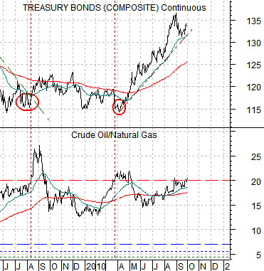
Below right we show the current situation. The ratio rose above 20:1 in the summer of 2009 marking a low point for the bond market. Since then the ratio has made repeated forays above 20:1 including the time period through April of this year. From the perspective one might conclude that bond price strength will continue UNTIL natural gas futures finally start to show some price strength.
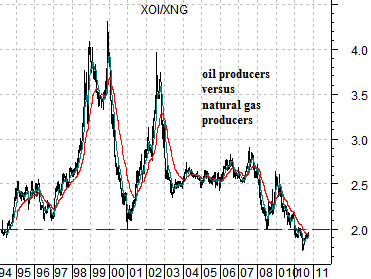
While crude oil remains ‘high’ relative to natural gas the opposite is true in terms of the equity market. The ratio between the Amex Oil Index (XOI) and Natural Gas Index (XNG) has fallen below the levels seen back in the early 1990’s. In other words as natural gas prices remain in a prolonged slump the equity markets have been favoring the share prices of the producers due to the growth potential afforded by shale gas.
Sept. 30 (Bloomberg) — Business activity in the U.S. unexpectedly accelerated and fewer workers filed claims for jobless benefits, easing concern the world’s largest economy is retrenching further… The number of applications for jobless benefits dropped by 16,000 to 453,000 in the week ended Sept. 25, Labor Department figures showed.
Weekly jobless claims have been hovering around the 450K mark so yesterday’s report was more neutral than negative for the bond market. Still… since this is the data that appears to be driving bond prices higher the slight decline served to stop the decline in long-term yields.
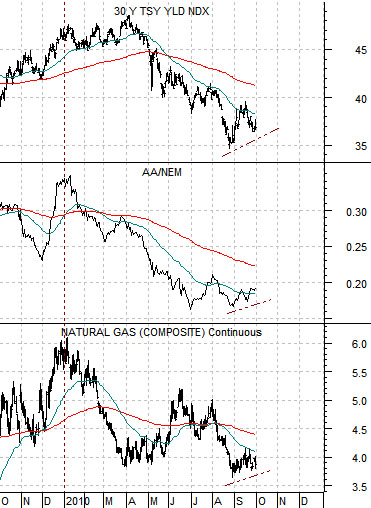
At right we show 30-year Treasury yields, the ratio between Alcoa and Newmont (AA/NEM), and natural gas futures. The sense is that all three charts are showing the same basic picture. Weak gas prices reflect pressure on U.S. growth which shows up as a downward trend for Alcoa. Weak growth pushes money towards gold which helps lift Newmont.
In yesterday’s issue we did a hard about-face with respect to the bond market. We really weren’t changing our view as much as acknowledging our oft-repeated comment that it usually doesn’t make sense to argue with the bond market. The bond market has been pushing yields lower and that tends to show up later on in weaker economic growth.
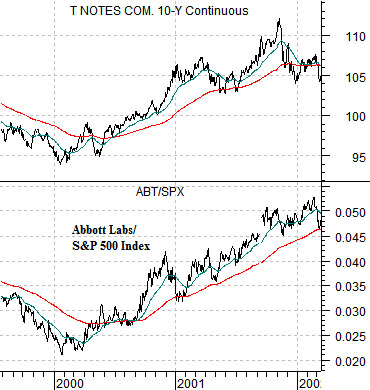
Below is a comparison between the U.S. 10-year T-Note futures and the ratio between medical products maker Abbott Labs (ABT) and the S&P 500 Index (SPX) from 1999- 2002. The point is that when bonds start to rise in price we expect to see defensive stocks rising relative to the broad market. Such was the case during 2000 and 2001.
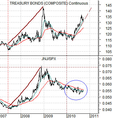
The problem this time around is that bond prices have risen but the defensive stocks haven’t outperformed (i.e. the ratio between Johnson and Johnson (JNJ) and the SPX shown below right has been ‘flat’). This reflects the strength of the Asian growth theme which has been pushing copper prices and the commodity currencies higher this year.