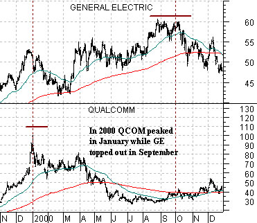
Below is a chart comparison from late 1999 through 2000. The chart shows the stock price of General Electric (GE) as well as that of Qualcomm (QCOM).
The point that we are going to attempt to make today is that a market top or bottom is usually more of a process than a single event. While a representative index may turn higher or lower at one specific point in time this tends to reflect months of relative strength jockeying by the individual components.
One might argue that the stock market peaked in late March of 2000 but in reality the process of making a top was well underway at the end of 1999’s 4th quarter and continued through the 3rd quarter of 2000. The chart shows, for example, that Qualcomm reached a peak as 1999 drew to a close while General Electric remained stronger through into the first few days of October.
After peaking around 100 the stock price of QCOM tumbled to below 30 during the middle of 2000 even as GE’s share price pushed to new highs. The question investors should have been asking themselves was whether GE’s price strength reflected the start of a new trend or the end of the old trend because if one doesn’t know the answer to this question the chances of being positioned correctly in the markets are likely no better than a coin flip.
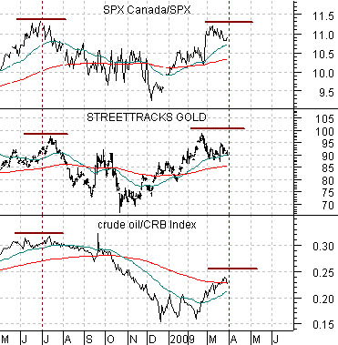
Below we show a comparative view of the ratio between the Canadian and U.S. equity markets (TSX/SPX), the gold etf (GLD), and the ratio between crude oil and the CRB Index.
The question today is whether the strength in gold along with relative strength by crude oil, the oil stocks, and the Canadian stock market represents the start of a new trend or the end of the old trend. Is gold simply making a top months after the leading edge of the commodity trend turned negative similar to GE back in 2000 or is it, as many believe, the leading edge of the next trend? Our view, of course, is that gold is part of the old trend and that we will start to get a sense of the true nature of future relative price strength once gold prices finally turn lower.
Equity/Bond Markets
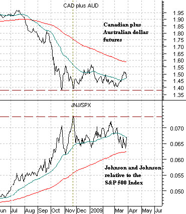
Below is a comparison between the sum of the Canadian and Australian dollar futures (CAD plus AUD) along with the ratio between Johnson and Johnson (JNJ) and the S&P 500 Index (SPX).
The page 1 point was that the markets have come to a sort of cross roads. Either the commodity sector has bottomed along with the commodity currencies with gold prices leading to the upside or… the commodity trend peaked and turned negative last year even as lagging sectors continued- like GE in 2000- to push to new highs.
Our point is and has been that this is more an issue of relative price performance than absolute price performance. In other words in our scenario the CAD plus AUD breaks to new lows while the JNJ/SPX ratio rises to new highs but whether this leads to lower, flat, or higher levels for the SPX depends in large part on what happens to JNJ. If it declines or remains flat then the broad market will remain weaker but… if it rises at a reasonable pace then the broad stock market could actually hold at current levels or even move upwards.
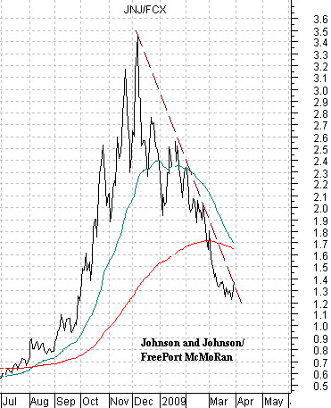
Below we show the ratio between JNJ and FreePort McMoRan (JNJ/FCX). The markets pushed the ratio higher into December and then swung back to the commodity theme from December through March.
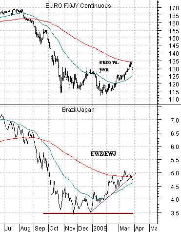
Below is a comparison between the euro/yen cross rate and the ratio between the Brazil etf (EWZ) and the Japan etf (EWJ). In our scenario the euro falls relative to the yen while Brazil’s stock market weakens relative to Japan’s. Our thesis is based on the idea that commodity prices will remain under pressure which will lead to a stronger yen and ongoing pressure on the equity markets of commodity producing countries.