We are going to show a chart comparison that we ran a week or two back and then expand the argument somewhat using a chart that we probably haven’t shown in these pages for close to a year. The combination of the two arguments creates a somewhat different perspective. We hope.
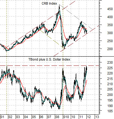
First is a comparative view between the CRB Index (commodity prices) and the sum of the U.S. 30-year T-Bond futures plus the U.S. Dollar Index (DXY) futures.
The argument is that commodity prices tend to rise on dollar weakness and on bond price weakness. The best back drop for the CRB Index includes a declining dollar AND declining bond market.
So… the CRB Index turned higher in 2001 at the peak for the dollar and bond prices. In a sense we can argue that the ‘big picture’ trend for the CRB Index is bullish… unless the sum of the TBond and DXY rises up through the highs from 2001.
The problem is that while the macro trend is still positive (by the barest of margins) the intermediate trend is actually negative.
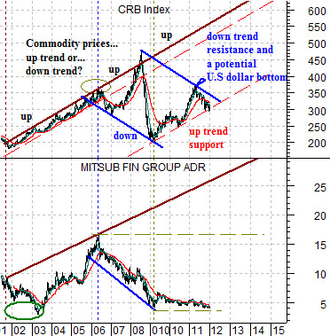
Next we show the CRB Index and the share price of Japanese bank Mitsubishi UFJ (MTU).
The argument is that while the CRB Index has been rising since 2001 it has also been in a bearish trend or channel since early in 2006 (when copper prices peaked). This trend began when the weaker elements of the cyclical trend started to push lower around the spring of 2006.
So… it is possible that the sum of the TBonds and DXY are going to rise to new highs with the CRB Index breaking support just below the 300 level. Our favored outcome, however, includes a return to a more positive cyclical trend which would require the bond market and/or dollar to swing back to the down side.
In theory if the bond market and/or dollar were to weaken in the very near future the CRB Index could swing back above resistance around 350, break through the top of the channel defining the down trend from 2006, and help power a recovery for the laggard financials and Japan themes.
Equity/Bond Markets
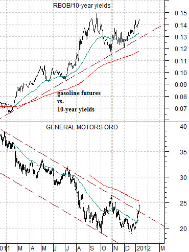
One of the intriguing details within the markets yesterday was the price strength for the autos (i.e. GM) and cruise ships (CCL). Both tend to trend in the opposite direction to energy prices.
In general the best intermarket trend for the autos and airlines consists of some amount of downward pressure on energy prices combined with a rising trend for yields. When interest rates are on the rise it tends to represent positive economic growth but when energy prices are ‘too strong’ money flows away from the energy ‘users’ towards the energy producers.
Below is a comparison between General Motors (GM) and the ratio between gasoline futures prices and 10-year Treasury yields.
The argument is that rising gasoline prices are a negative while falling yields are also bearish. If the gasoline/yields ratio turns lower it is supposed to go with a positive trend for GM.
So… we found the channel break out by GM to be a wee bit fascinating.
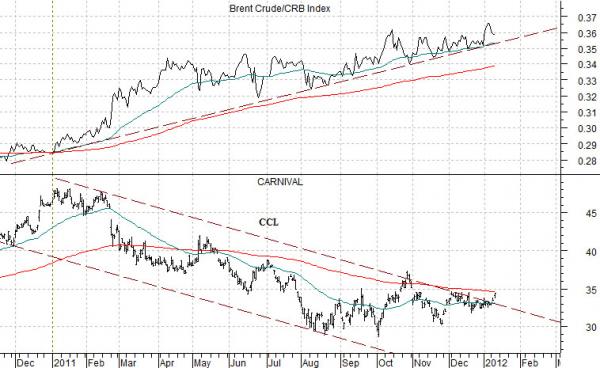
Below is a chart of Carnival Cruise Lines (CCL) and the ratio between Brent crude oil futures and the CRB Index.
This is an alternate way to view the negative trend that put pressure on the autos and airlines through 2011. Obviously the choice of the slope for the trading channel for CCL is somewhat arbitrary but these are the lines that we used for much of the past year. The argument would be that the energy ‘users’ showed just enough strength in trading yesterday to suggest that the rising trend for energy prices may be at an end.