A bit of housekeeping. In yesterday’s issue we wrote, “This time period included Iran’s invasion of Kuwait in August of 1990 and the first Gulf War that began in January of 1991.” In truth we actually know that Kuwait was invaded by Iraq instead of Iran but it is not our intention to make excuses. We erred and we apologize.
The markets continue to fascinate us. In our daily conversations we are reminded again and again about the fragility of investor sentiment. We are going to do our best to hold the bullish line for the S&P 500 Index as long as it makes sense to us and, to a certain extent, our convictions increase each and every time it is patiently explained to us how we are wrong.
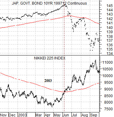
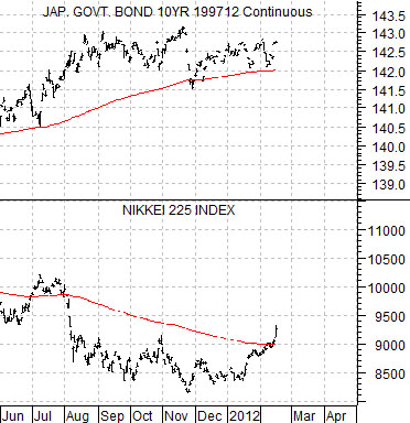
So… let’s get to it. At right is a chart comparison from 2002- 03 showing the Japanese 10-year (JGB) bond futures and the Nikkei 225 Index.
We have argued that a cross through the 200-day exponential moving average line by either the JGBs or the Nikkei is, more or less, random noise. A cross by both the JGBs and the Nikkei at roughly the same time is indicative of a major change of trend.
In June of 2003 the Nikkei crossed up through its moving average line. This occurred as the JGBs were trading up to all time highs close to 145. By the end of June Japanese bond futures had pivoted rather sharply downward and the combination of stronger equities and weaker bonds marked the start of a major cyclical trend change that would remain intact for the next three years.
Below is the same comparison for the current time frame.
The Nikkei has pushed above its moving average line but we can see on the chart that something similar happened as recently as July of last year. At that time the Japanese 10-year bond futures tested the moving average line before resolving back to the upside.
The point is that the Nikkei is now on the north side of its moving average line so the fate of the trend change rests in large part with what happens next for bond futures prices. Take the JGBs well below 142 and we can make the case that we are on the verge of one of those ‘once per decade’ kind of trend shifts.
Equity/Bond Markets
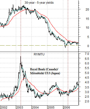
We are going to spend a bit of time exploring the relative strength of banking share prices. At right is a chart from 2002 through 2006 of the ratio between Canada’s Royal Bank (RY) and Japan’s Mitsubishi UFJ (MTU) along with the yield spread or difference between U.S. 30-year and 5-year Treasuries.
The 30-5 yield spread is one way to view the changing slope of the U.S. yield curve. In recent years a peak for the yield spread occurs at cyclical bottoms which have been associated with the high point for the Royal Bank versus MTU.
When the 30- 5 yield spread declines to or below ‘0’ it means that the yield curve has inverted which, more often or not, is an indication that cyclical growth is going to collapse. In recent years this has marked the low point for the RY/MTU ratio.
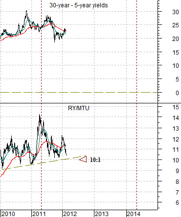
Below we show the same comparison starting in 2010. The argument is that the yield spread is ‘high’ enough to mark some kind of cyclical bottom which is generally associated with a top for Canadian banks versus Japanese banks. The RY ended yesterday at 53.41 while MTU closed at 5.13. If the ratio were to decline below 10:1 we would view it as an indication of some sort of cyclical revival in the fate of the Japanese economy.
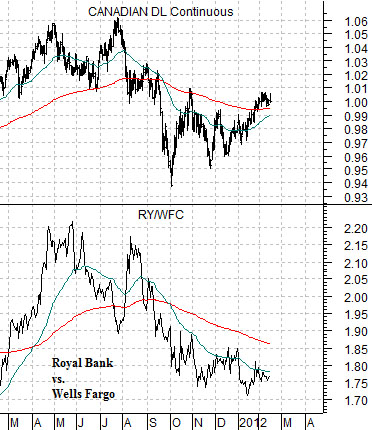
Below is a comparison between Royal Bank and Wells Fargo (WFC) along with the Canadian dollar (CAD) futures.
We have argued that the RY/WFC ratio should trend with the Cdn dollar. While the CAD has been rising since last autumn… it is not abundantly clear to us that the currency is still in an uptrend. Chart-wise it still looks like the kind of bear market rally that will run out of gas once the 50-day e.m.a. line converges with the 200-day.