We thought that we would start out today by showing a relationship that we really should have been focusing on in recent weeks. Our view has been that it doesn’t fit in well with our overall thesis but… anyone involved with the markets for any length of time probably has learned (more than once) that when your thesis says one thing and the markets say another… the markets are invariably right.
Our thesis is that the cyclical trend will kick back into gear during the second half of this year. The markets, on the other hand, are doing an admirable job of making it look as if we are approaching yet another melt down point.
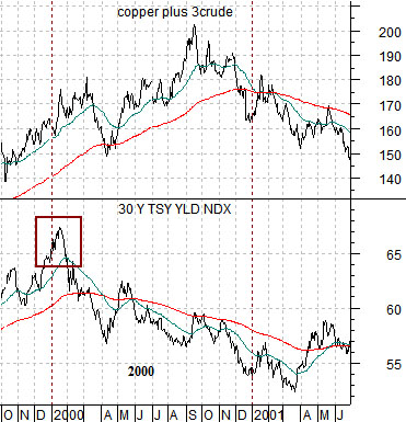
Below is a chart comparison between 30-year Treasury yields and the sum of copper (in cents) and crude oil futures (in dollars times 3) from the fourth quarter of 1999 through the middle of 2001.
We are using the sum of copper and crude oil to represent the cyclical trend during 2000. We could have used a wide variety of markets or markets combinations but this will likely do for now.
The argument is that when long-term yields reach a peak and turn lower there is often a period of time when the cyclical trend continues to push higher and this ‘period of time’ is often about one year. In other words… falling long-term yields represent weaker economic growth but for close to a year after yields peak and move lower the markets have a tendency to trend as if nothing much has changed. In January of 2000 long-term Treasury yields peaked and turned lower and in January of 2001 the Fed finally got the memo and began to cut the Fed funds rate.
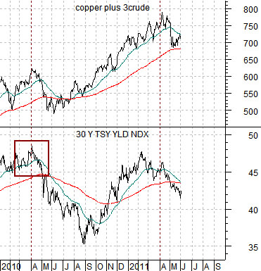
The chart below shows the same comparison from the start of 2010 to the present day. The point is that long-term yields reached a recovery peak at the end of the first quarter back in 2010. One year later… copper and crude oil prices are falling while the markets are shifting- hard- over to a more defensive posture.
The reality is that more than a year has passed since long-term yields reached a recovery peak and since the start of this year’s second quarter the markets have been focusing rather intently on weaker and more defensive themes.
Coming into trading yesterday our sense was that the markets were still balancing on the bullish side of the abyss. At the end of the session our view hadn’t changed.
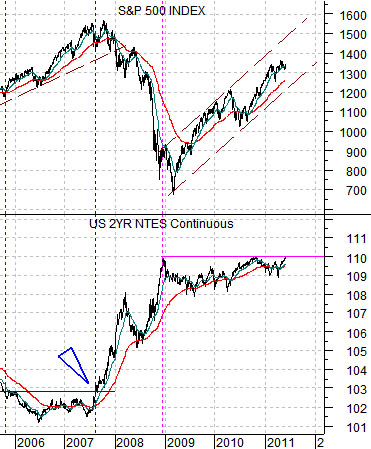
Below is a comparison between the S&P 500 Index and the U.S. 2-year T-Note futures.
The argument is that if, as, or when the 2-year T-Notes push above 110 the equity markets could be in trouble. The recovery starting in 2009 has basically lined up with the 2-years holding below the highs reached in December of 2008 and again at the start of November last year. Note that the laggard banks turned upwards last November once the T-Notes started to decline in price.
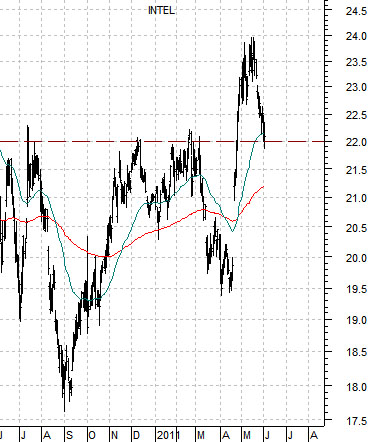
Below is a chart of Intel (INTC). The argument here is that Intel surprised the markets with positive earnings in April. The stock ‘broke out’ through resistance around 22 and has since progressed through a fairly standard ‘breakout pullback’. A close much below 22 argues that the pull back may, in fact, be a ‘failure’. Pullbacks are bullish while failures are bearish. Intel above 22 is a positive while Intel closing well below 22 suggests that the stock is going to swing back and forth through the moving average lines for awhile longer.
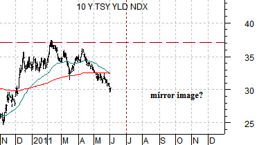
Below are two charts of the 10-year Treasury yield index. The top chart is from 2007 through 2008 while the lower chart begins in November of 2010.
We have argued that 2011 may, in fact, be the opposite of 2008. Instead of yields rising into the end of the second quarter- as was the case in 2008- we were looking for yields to bottom out through the end of the current quarter.