The ‘news’ was no help yesterday as the markets reacted negatively to the Supreme Court’s health care ruling while U.S. weekly jobless claims declined slightly to 386,000. Some believe that any reading above 375,000 suggests that hiring isn’t robust enough to lower the unemployment rate.
On the positive side of the ledger the ongoing run of bad ‘news’ is pressuring borrowing costs lower. ‘WASHINGTON — The average U.S. rate on the 30-year fixed mortgage stayed this week at the lowest level on record. Cheap mortgages have helped drive a modest housing recovery and could give the broader economy a jolt at a time when the job market is weak.’
One of our views is that the markets trade in cycles as relative prices move first out of and then back into balance. A long period of strength in consumer stocks will eventually be followed by upward pressure in producer prices. Strong energy prices push money towards the producers of oil and gas and then weaker energy prices lead to an improved trend for the energy users. And so on.
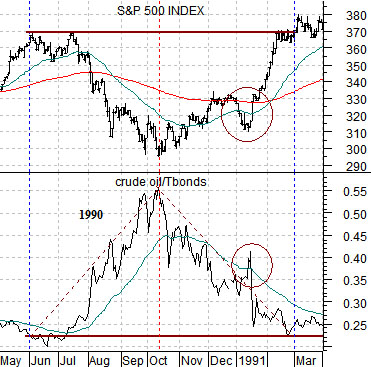
Below is a chart from 1990- 91. It compares the S&P 500 Index with the ratio between crude oil futures prices and the U.S. 30-year T-Bond futures. The time frame captures the markets’ reaction to the period leading up and then into the first Gulf War.
As oil prices rose through the third quarter of 1990 the bond market tumbled on, we imagine, concerns regarding looming inflationary pressures. As the price of oil rose and the bond market declined the S&P 500 Index trended lower. In October the trends reversed with oil prices falling while stock and bond prices moved higher.
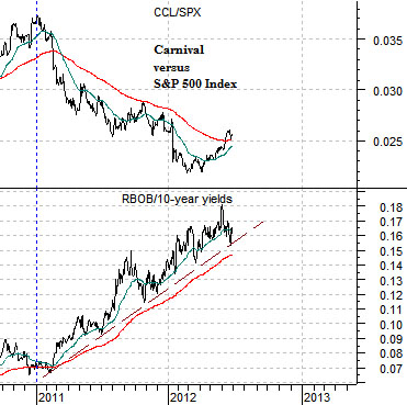
Below is a chart of the ratio between gasoline (RBOB) futures and 10-year U.S. Treasury yields along with the ratio of cruise ship operator Carnival (CCL) to the S&P 500 Index.
The ratio or relationship that stands out- to us- as an true outlier has to do with energy price strength and interest rate weakness. The gasoline/yields ratio accelerated to the upside at the start of 2011 and has simply kept rising. No matter how weak crude oil prices are the decline in gasoline futures has consistently been less than the downward adjustment for yields.
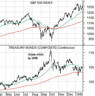
In general… the very worst point within a crisis is at the peak for long-term bond prices.
Below is a chart from 1998 of the S&P 500 Index and the U.S. 30-year T-Bond futures. While the stock market actually got a bit of a running start into the recovery through September the true ‘peak’ for the Asian crisis was made early in October. The argument is that as soon as bond prices stop making new highs money will begin the process of moving back towards ‘risk’.
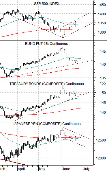
Below is a chart of the S&P 500 Index, German bund futures, U.S. 30-year T-Bond futures, and Japanese yen futures.
The SPX is the market that money moves away from when it is stampeding into the safety of a variety of major bond markets as well as the Japanese yen.
The point is that we have almost gone a full month without ‘new highs’ for bond prices and the yen. This doesn’t mean that ‘new highs’ are not just around the corner but, then again, one has to wonder how many bullets the Eurozone issue has left in its magazine.
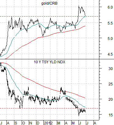
Below is a comparison between the ratio of gold to the CRB Index and 10-year U.S. Treasury yields.
Gold prices have declined over the past 9 or 10 months but relative to commodity prices in general gold is only a week or two away from its highs levels in… perhaps forever (at the 1980 gold price peak the ratio was only around 2.8:1).
The chart suggests that 10-year yields below 1.7% was part of the catalyst that sent the gold/CRB Index ratio up towards 6:1 last month so we would expect to see yields moving back up through 1.7% when the recovery begins in earnest.