Early in the last decade we argued in favor of the commodities sector with an emphasis on the shares of companies that produced raw materials. We wrote a number of positive articles on gold prices although much of our focus was on copper and the base metals miners. The gist of the argument was that the raw materials sectors had been left behind by the bull market in financial asset prices and that over time this sector would catch up and fall back into line on a relative basis.
In hindsight, of course, it was a fair argument made at a reasonable point in time. We abandoned it far too early but after having made the same basic point a few hundred times in a row we moved off in search of something new to think and write about.
When the markets start to get more confusing than usual we tend to step backwards somewhat in search of perspective. When we wonder about the future trend for the dollar, the elevated levels of the bond market, and the relentless bull trend for gold prices it some times helps to view things over a longer-term time frame. So… that is where we start things off today.
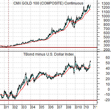
Below we compare gold futures with the spread or difference between the price of the U.S. 30-year T-Bond futures and the U.S. Dollar Index (DXY).
The basic argument is that gold prices rise when the bond market is strong or when the dollar is weak. Gold prices tend to do very well when the bond market is strong AND the dollar is weak. Such has been the case for much of the past decade. The logical end for the bull market run for gold will likely occur around the time that the bond market reaches some kind of peak and the dollar starts to firm.
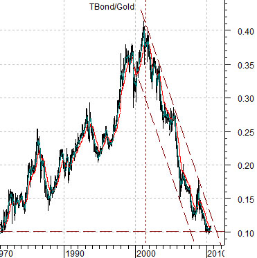
Yet… are gold prices really that high? The chart at bottom right shows the ratio between the U.S. 30-year T-Bond futures and gold prices from 1981 to the present time frame.
In 1981 the TBond’s price was roughly 10% of the price of gold. Over the next two decades the ratio rose until the TBond was close to 40% of the gold price and after close to ten years of strong commodity prices we find the ratio back at its original starting point. After 20 years of financial asset price strength the markets have pushed commodity prices higher on a relative basis.
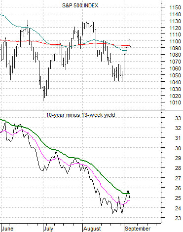
Equity/Bond Markets
The chart just below compares the S&P 500 Index (SPX) with the yield spread between 10-year and 3-month Treasuries.
The argument yesterday was that the SPX had rallied up with the yield spread and that the spread had failed at or near the 25-day e.m.a. line on number of occasions in recent months. That is essentially what happened yesterday as the equity markets backed down in the face of strong and rising bond prices. To really turn the trend the yield spread is going to have to continue to resolve higher.
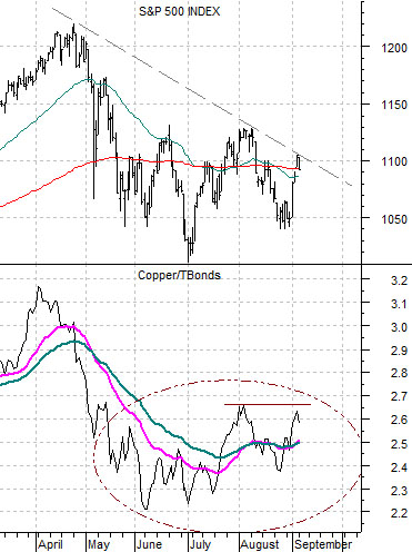
Further below is a view of the SPX and the ratio between copper futures and the U.S. 30-year T-Bond futures.
The idea here is that the SPX is trading very closely with the ratio between copper and the TBonds. Yesterday copper was lower while the bond market was higher in price which led to weakness for equities.
Short-term the SPX will have to get above the trend line cutting through the highs from April and August.
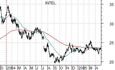
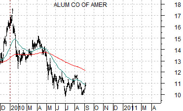
Last is a somewhat strange comparison. We show Intel (INTC) from 2004 and Alcoa from 2010.
The thought is that the SPX turned higher in March of 2003 and March of 2009. The cyclical correction that carried the tech sector lower through the first nine months of 2004 appears similar to the correction that has worked on Alcoa since the beginning of 2010. The point? The techs (Intel) lagged the cyclical recovery coming out of 2004 and it may be that sectors such as aluminum (and energy) may be laggards coming out of 2010.