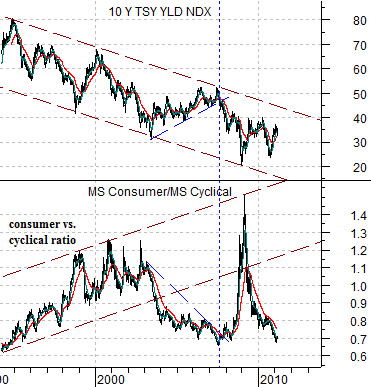
Below is a chart of 10-year Treasury yields and the ratio between the Morgan Stanley Consumer Index and Cyclical Index.
The argument is that with long-term yields trending lower the offsetting trend for the consumer/cyclical index should be higher. However during those periods of time when yields are rising- as was the case from 2003 into 2007- the cyclicals will tend to outperform.
The chart shows that part of the ferocity of the 2008 market collapse came from the upwards ‘snap’ by the ratio as years of gains for cyclical assets on a relative basis evaporated. From there, however, ‘the market’ came to realization once again that emerging markets growth was still the only game in town. Rinse and repeat.
Our point is that no matter how strong the cyclical trend is we always have a vague sense of foreboding whenever we recall this particular chart. It could be- in fact we hope that this is the case- that in due course valuations for the consumer stocks will shrink sufficiently and growth prospects will improve so that the shift back to ‘consumer’ from ‘cyclical’ will take place in a bullish manner. Yet each and every time yields start to fall while copper and crude oil prices weaken we wonder whether we are on the edge of a replay of the second half of 2008. Pins and needles indeed.
Aside from all of this and returning to the here and now the key today may well rest with the weekly jobless claims report.
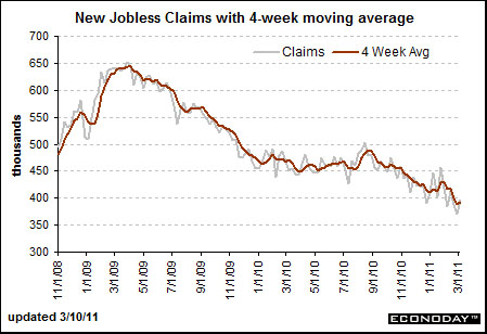
The next chart is from econoday.com and it shows the trend for new jobless claims from late 2008 to the present day. The peak for jobless claims was reached at the bottom for the S&P 500 Index in March of 2009 and the start of the recovery for the ‘laggard banks’ (which was rather brutally cut short this week) began when claims started to decline once again last autumn.
In a perfect world a sharp decline in claims would provide the markets with a cold splash of reality. The trend is not being led by Japan but is instead being driven by an improving U.S. employment situation. A bullish number today would go some ways towards halting the frantic flow of money out of equities and into bonds so that we can return to a somewhat firmer footing.
Equity/Bond Markets
It is something of a stretch to argue that an act of God like the earthquake in Japan was chart-based but… we are in a flexible frame of mind today.
We are not going to argue that the earthquake was anticipated or that it was somehow preordained. We are merely going to make the attempt to set up the case that the markets were in a position to react negatively to some kind of Asian crisis.
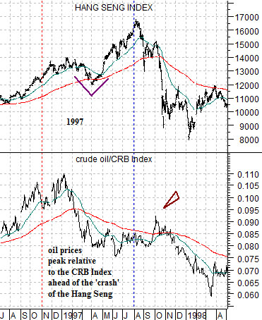
The comparison starts with the events of 1996 and 1997. Keeping in mind that stronger crude oil prices have driven the trend since 1999 and that there have been very few periods of time in the last while where crude oil prices were actually weak compared to general commodity prices this is a likely place to begin.
In late 1996 the ratio between crude oil and the CRB Index rose to a peak. At right we compare this ratio with the Hang Seng Index from Hong Kong.
In the autumn of 1997 the Hang Seng Index ‘crashed’. We have argued on many occasions in the past that the collapse of the Hang Seng Index was preceded by the relative strength peak for oil prices.
Notice on the chart the ‘pivot’ upward for the Hang Seng Index in April of 1997 as it pushed to a peak into the late summer. The final bit of strength for this index through September of 1997 went with a sharp rally in the crude oil/CRB Index ratio.
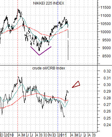
Now… compare the sequence of events from 1997 with what has happened since early 2010. Below we show the crude oil/CRB Index ratio while we have replaced the Hang Seng Index with the Nikkei 225 Index from Japan.
The basic argument is that the trend for Asian growth- represented by Hong Kong in 1997 and Japan for the present time period- is similar to the trend for the crude oil/CRB Index ratio.
When the ratio starts to decline the underlying trend turns negative. Yet the markets have a tendency to fight the bearish trend for roughly nine months before finally succumbing to the weight of markets-based gravity.
The Nikkei displayed a ‘pivot’ in the autumn of last year that looks quite a bit like the ‘pivot’ on the chart of the Hang Seng Index. In both instances the final bit of strength for the indices occurred as the crude oil/CRB Index ratio made a late rally upwards.
The two points that we wished to make are as follows. First, if the relationship is really a similar as it appears then we are likely going to see a continuation of relative weakness for crude oil prices in the days and months ahead. Second, if the Nikkei 225 Index is at all similar to the Hang Seng Index from 1997 then perhaps we can draw a conclusion or two regarding the near-term action in the S&P 500 Index based on how the SPX reacted through and immediately following the ‘crash’ in the Hong Kong stock market. This will serve as our main focus on the following page.