We are never quite sure whether markets never repeat cycles or whether the cycles are, in fact, so long in duration that by the time you see the same thing twice a whole new generation of investors are seeing it for the first time.
In any event… our opening comments are meant as a preamble to the topic that we may or may not be able to address today with any sense of clarity. We figure it is a coin toss at best whether we can ultimately find or make a point today.
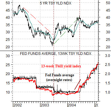
Below is a chart comparison between 5-year U.S. Treasury yields and an overlaid chart of the Fed funds target rate (in black) and 3-month U.S. TBill yields (in red).
Our premise is that if something happened in the last cycle chances are something completely different will happen in the current cycle. We accept the strangeness of our premise and press forward all the same.
The long end of the bond market typically leads the short end. One way to know that the Fed was ultimately going to have to start raising the funds rate in 2004 was the rising trend for yields that began a year earlier in mid-2003. After declining to a bottom into 2003 5-year yields moved higher for close to a year until the Fed responded with its first bump of the funds rate. So far, so good.
We have argued that two things happened in 2004 concurrent with the start of the rising trend for short-term interest rates. Earnings for the S&P 500 Index finally eclipsed the peak set in 2000 some time during the spring of 2004 and… energy prices moved up to record highs.
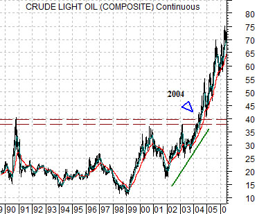
The second chart below shows crude oil futures from 1989 into 2006.
The rising trend for crude oil prices in particular and commodity prices in general was created in part by dollar weakness. After the Nasdaq and large cap U.S. equities peaked between 1999 and 2000 the dollar held near the highs through 2001 and then turned lower in 2002. This helped lift crude oil futures prices until after two years of gains new highs were finally reached. As early as 2004- close to four years ahead of the cycle peak- energy prices proved to be the driving force behind the cyclical recovery that forced interest rates higher.


Equity/Bond Markets
Below is a chart of the spread or difference between 30-year and 3-month U.S. Treasury yields. When the spread rise to something like ‘45’ it means that 30-year yields are 4.5% greater than 3-month TBill yields. When the spread falls below ‘0’ it means that 30-year yields are less than TBill yields.
The markets are usually quite easy to decipher in hind sight and much more challenging when looking forward. What intrigues us, however, is how difficult it can be to figure what is going on in real time.
The yield spread went negative around the start of 2001 and moved to a final peak close to 3 1/2 years later. The chart at top right shows that the end result of a rising yield spread was a very strong price trend for the share price of Boston Scientific. BSX was one of the companies that benefited from the ‘slack’ in the economic system that existed between the point in time that the Fed started to cut rates in January of 2001 and the initial rate hike in 2004 in response to strong crude oil prices.
If the current cycle is completely different than the previous cycle then a case can be made that watching for strength in BSX to mark the start of the cycle or strength in energy prices to indicate its imminent end doesn’t make any sense. With this in mind we press forward.
The yield spread bottomed around the start of 2007 and 3 1/2 years later it is showing indications of declining based NOT on rising short-term yields but instead on falling long-term yields. It may be that the spread simply holds near the highs until economic momentum pushes the funds rate higher in 2011 or 2012. However… the market or sector that has benefited from the rising yield spread in a manner similar to BSX between 2001 and 2003 is… gold. It seems that no matter which angle we approach the markets we keep coming back to the idea that pressures that began to build during 2006 and 2007 will not begin to abate until the trend for gold prices weakens. At minimum that would take a break well below the 200-day e.m.a. line which currently is just above 1100.


