We are going to take a bit of an intermarket ‘wander’ today as we put aside the here and now and focus on a rather macro perspective. The inspiration for this came from the rather weak action for copper prices in trading yesterday and the observation that the ratio between copper and the CRB Index has been trending somewhat lower since the middle of February.
The question is… what happens AFTER the peak for copper prices relative to the broad commodity sector? We are not arguing (yet) that copper has reached a relative strength top for the cycle but given recent weakness it is at least something that we should be considering.
The argument is that the relative strength of copper is similar to the trend for long-term Treasury yields. When copper is strong and rising we generally see an upward tilt for yields.
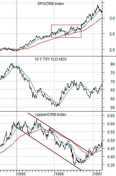
The chart below compares the ratio between copper and the CRB Index, 10-year Treasury yields, and the ratio between the S&P 500 Index and CRB Index from 1994 into 1997. As a side note there have been two major cycle peaks for copper in recent decades with the first coming in the mid-1990’s while the second occurred in 2006.
The copper/CRB Index ratio rose to a high point around the start of 1995 as 10-year yields pushed up towards 8%. Once the ratio topped out the market began to pull long-term yields lower which had the effect of creating an upward bias for the ratio between equities and commodities.
We have argued in the past that the trends for many of the major pharma stocks are similar to the SPX/CRB Index so in this instance the peak for copper prices and yields in early 1995 not only marked the start of a bullish trend for equities relative to commodities but also helped to initiate a rather powerful consumer, tech, and health care price run.
Our point is that in the mid-1990’s the positive trend for the equity markets led to some degree by the share prices of the major drug makers was initiated by the peak for copper futures on a relative basis at the end of 1994. The ‘link’ between copper and the equity markets tends to be made through the bond market as yields rise and fall with the copper price strength and weakness.
Equity/Bond Markets
We are now going to shift forward a decade or so and look closely at the sequence that the markets went through before and after 2006.
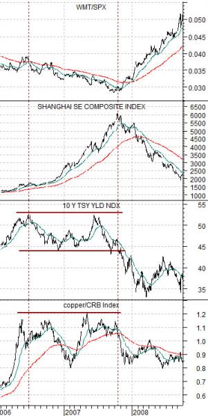
Below is a chart of the copper/CRB Index, 10-year Treasury yields, the Shanghai Composite Index, and the ratio between Wal Mart and the S&P 500 Index (WMT/SPX).
The chart is once again anchored by the copper/CRB Index and 10-year Treasury yields. We have dropped the SPX/CRB Index and added the Chinese stock market and the relative strength for Wal Mart. Hopefully we can explain why we have chosen to do so.
While copper prices peaked on a relative basis at the end of 1994 and the spring of 2006 there was a major difference in what happened next. In 1994 copper prices and yields simply declined which created a pivot within the equity markets that favored ‘consumer’ over ‘cyclical’. In fact the ratio between the Morgan Stanley Consumer Index and Morgan Stanley Cyclical Index doubled between 1994 and 1998.
In 2006, however, the ratio didn’t peak and turn lower but instead peaked and… held. Instead of creating a downward trend for long-term yields the end result was a flat trend for yields that extended from the spring of 2006 through into the autumn of 2007.
A flat trend for the copper/CRB Index and 10-year yields created a significantly different outcome. Instead of shifting to strength in the consumer stocks similar to 1995 the markets maintained a powerful bias towards the cyclical sectors. The problem was that with copper prices no longer pushing the markets had to new cyclical themes.
The charts show that a significant portion of the bull market for the Chinese stock market took place within two points in time. The rally began with copper price strength but shifted to parabolic once copper prices had peaked. The rally continued at this pace until copper prices finally began to weaken in the autumn of 2007. This weakness was confirmed by the break through the channel bottom for 10-year yields.
The argument is that instead of turning from bullish to bearish for the cyclical themes similar to 1995 the trend changed from bullish to… bullish between 2006 and late 2007. The best way to ‘see’ this is through the chart of the Wal Mart/S&P 500 Index.
If the peak for copper prices in 2006 had marked the end of the cyclical trend then the WMT/SPX ratio would have responded to lower yields by swinging higher. Instead the ratio continued to mount small rallies up to its 200-day e.m.a. line before failing back to new lows.
The true shift from cyclical to consumer did not begin until the final quarter of 2007. At this time yields fell to new lows, the copper/CRB Index started to weaken once again, and the WMT/SPX ratio turned to the upside. Even as oil prices raced to a peak into the middle of 2008 the markets were saying quite clearly that the cyclical trend was weakening at a rapid pace as the Shanghai Composite Index turned lower even as the WMT/SPX ratio swung to the upside.
The point, we suppose, is that this is why we fixate constantly on even small changes in copper prices, long-term Treasury yields, the WMT/SPX ratio, and the relative action between consumer and cyclical themes.