The words ‘rally or die’ might be excessively dramatic but that doesn’t alter the fact (in our view) that the markets have reached a fairly critical decision point. Securities, sectors, and markets have declined to levels that should either serve as support or mark the jumping off point into a much larger decline.
On the good news side of the equation… we are actually quite positive at this juncture. Bank of America’s $8.5 billion settlement might serve as the ‘bad news is now in’ turning point for the banks while the situation in Greece may be set to move off of the front pages of the financial press for a few months. If the markets are going to rally this is a good time to get things started.
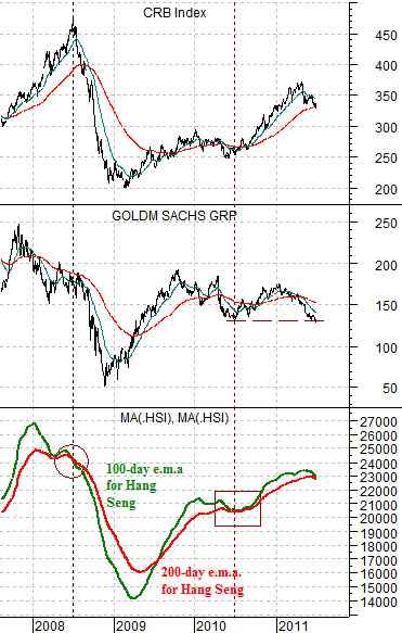
To put things into some form of perspective we had included a comparative view of the CRB Index (commodity prices), the share price of Goldman Sachs (GS), and the Hang Seng Index from Hong Kong. The Hang Seng is shown using a 100-day exponential moving average line and 200-day e.m.a. line.
As mentioned on more than a few occasions… our view is that as long as the 100-day e.m.a. line (green) is above the 200-day e.m.a. line (red) the trend for commodity prices is bullish.
So… in recent days the Hang Seng Index has fallen far enough below the moving average lines to pull the 100-day down towards the 200-day. The last time this happened was into the end of the second quarter last year.
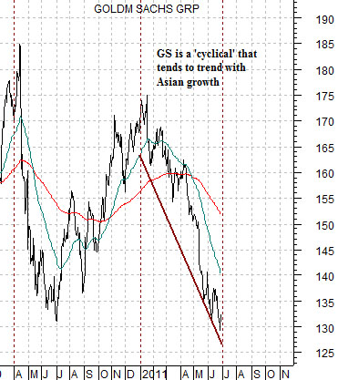
GS tends to trade with the Asian growth theme. All this means is that the trend for GS is usually very similar to that of the Chinese equity markets. In fact it has a tendency to look very similar to the moving average lines from the Hang Seng Index.
The point? At a ‘rally or die’ juncture with the trend driven in large part by the direction of Asian growth, commodity prices, and the major financials… the pendulum swings well towards the ‘rally’ outcome when the markets snap copper prices and yields higher while reacting positive to major news with respect to the banks. We grant that trading is somewhat suspect given the close proximity of quarter end but, even so, what we witnessed yesterday could only be described as a lean in the bullish direction.
Equity/Bond Markets
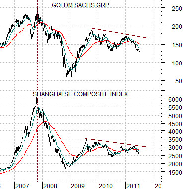
As long as we are going to show comparisons based on the share price of Goldman Sachs… we might as well show and explain why we are doing so.
Below is a chart comparison of GS and the Shanghai Composite Index from China. On a day to day basis the charts are certainly not identical but over the longer run they are certainly fairly close.
The point is that it is a little easier to follow GS through the course of a North American trading day than it is to base an argument off of the Shanghai Comp. Given that both peaked in the final quarter of 2007- months ahead of the commodity markets in mid-2008- and both continue to trend lower after peaking during the second half of 2009 we rather like the idea of using GS to represent the broad trend for Asian ‘growth’.
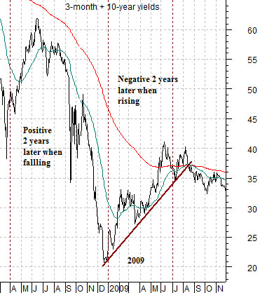
The 2-year lag argues that what happens to interest rates today has an impact on the cyclical trend 2 years into the future. Or, we suppose, the cyclical trend today is an extension of what interest rates were doing 2 years ago.
Quick justification. The Fed began to lower the funds rate at the start of 2001. The cyclical trend remained negative deep into 2002. The Fed began to raise the funds rate in mid-2004 but we didn’t see cracks in the cyclical trend until 2006. There is a lag- the only quibble is whether it is exactly 2 years.
At top right we show the sum of 3-month and 10-year Treasury yields from 2008- 09. Below right is a chart of GS from 2010- 11. Based on the 2-year lag the argument was that there would be a cyclical ‘soft spot’ during the first half of 2011 as a result of the bounce in yields through the first six months of 2009. The trend was expected to change- and improve- over the final six months of the year which helps us shade towards a more bullish equity markets outcome.