We are going to run through a bit of a recap today.
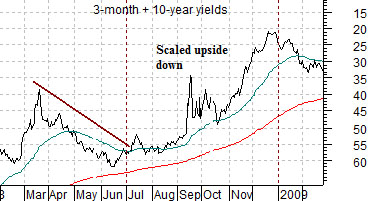
Just below are charts of the sum of 3-month and 10-year Treasury yields from February 2008 through February of 2009 and the S&P 500 Index from February of 2010. The yields chart has been scaled upside down.
The argument is that the cyclical trend trails the bond market by two years. In other words rising bond PRICES (falling yields) tend to create a positive cyclical trend two years into the future. To simulate the trend for bond PRICES we have included a chart of short-term and long-term YIELDS and then scaled it upside down.
Our point is that the cyclical trend is benefitting through the second half of this year from the collapse in yields during the final six months of 2008 in response to the subprime crisis. If we take the comparison literally then a stock market correction through this year’s second quarter should turn into a rising trend into year end. Fair enough.
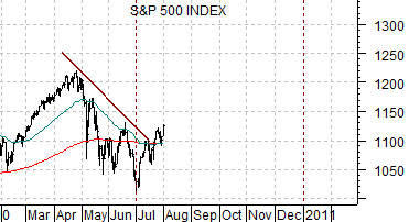
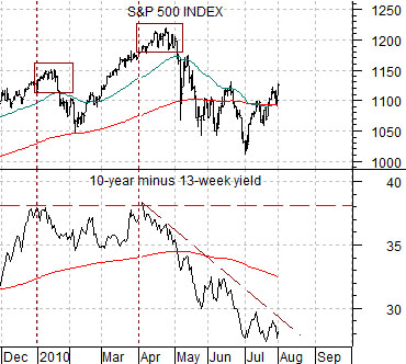
Below is a chart of the SPX and the spread between 10-year and 3-month yields.
The equity and bond markets have two distinct relationships. On the one hand they have tended to trend inversely in real time with stocks rising and bond prices are falling but on the other hand the trend pushing equity prices today is also a reflection of what was going on with interest rates two years previous.
This particular chart deals with the here and now. The argument is that the spread between 10-year and 3-month yields reaches a peak around 3.8%. Since 3-month yields lead the Fed funds rate the only way that short-term yields can rise above .25% (allowing 10-year yields to move through 4.0%) is if economic growth has improved to the point where the Fed can start the process of tightening credit. Until that time comes the view is that a return to roughly 4.0% for 10-year yields will push the spread back up to 3.8% which serves as the upper extreme.
The point would then be that stocks rise with 10-year yields but 10-year yields are currently only above to move up to 4.0%. Once the yield spread moves up to 3.8% it is time once again to start looking for the exits.
Equity/Bond Markets
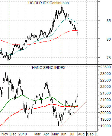
Below is a chart comparison between the U.S. Dollar Index (DXY) futures and Hong Kong’s Hang Seng Index.
The Hang Seng Index represents at least one aspect of cyclical growth. It relates to commodity prices, commodity currencies, and yields.
We have argued on occasion that the 200-day e.m.a. line and 100-day e.m.a. line for the Hang Seng Index are important. Aside from the obvious fact that these two moving average lines are altogether arbitrary the point was that when they ‘cross’ it says something about the cyclical trend.
On almost all of our charts we show the 200-day e.m.a. in red and the 50-day e.m.a. in blue. Typically when we include the 100-day we will show it in green as is the case on the chart at right. When we wish to highlight the moving average lines to perhaps show that they have crossed or may be about to cross we will usually make the lines more bold.
In any event… the decline in the Hang Seng Index from April into June pulled the moving average lines together so that by July the index had to either kick back into a strong and rising trend or… fail. In other words if you go back a week or two it was almost a coin toss whether economic growth was going to double-dip or reaccelerate. Over the past few days the odds have shifted rather heavily back to ‘reaccelerate’.
How did this happen? Our view is that it had much to do with the U.S. dollar.
When the dollar stopped rising in early June money began to migrate back towards ‘risk’. The chart shows that as the dollar turned lower the Hang Seng began to rise.
We have argued in recent issues that there are two ‘drivers’ working on the equity markets. One has been dollar strength and weakness with the former slowing growth and the latter helping to support growth. The second is the bond market. Falling yields reflect money moving away from risk towards the safety of the Treasury market.
The recent market would have been somewhat easier to decipher if the two ‘drivers’ had shifted at the same time but has obviously not been the case. The dollar turned lower in early June when the euro stopped surging higher. This helped push the Hang Seng Index upwards so that a moving average line ‘cross’ was avoided.
The bond market, on the other hand, kept throwing off a cyclically bearish message right through July. As the dollar said ‘go’ the bond market kept saying ‘stop’ which added an extra element of difficulty to our work.
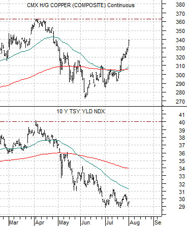
At bottom is a comparison between copper futures and 10-year Treasury yields. Notice the difference in the trends as base metals prices surged back towards the April highs even as 10-year yields seemed intent of moving to new lows. Our thought is that similar to late 2008 the cyclical trend for the U.S. is lagging behind that of Asia. However, the basic point is that the stronger the trend for copper prices the greater the odds that long-term yields are going to swing higher. As mentioned on page 1 this supports a stronger stock market up until such time as the spread between 10-year and 3-month yields moves back up to 3.8%.