Strength in the U.S. dollar over the past few days has added considerable down side pressure to the equity markets as money moves away from riskier bets. In a sense the markets are presenting investors with a replay of sorts of 2008 as dollar strength preceded or went with a global asset price tumble.
The problem is that similar to last year we are faced with the hard and cold reality of a couple of ratios. In other words it is not a given that equity prices must decline when the dollar rises- there have been long periods of time when stock prices have risen on dollar strength after all- so the key remains relative instead of absolute performance.
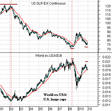
Below we compare the U.S. Dollar Index (DXY) futures with the ratio between the World ex-USA Index and the Dow Jones Industrial Index. In a sense we are showing ‘everything else’ compared the kind of U.S. large caps that populate the Dow.
The somewhat obvious point is that when the dollar is falling ‘everything else’ outperforms U.S. large caps. Conversely when the dollar rises ‘everything else underperforms. Fair enough.
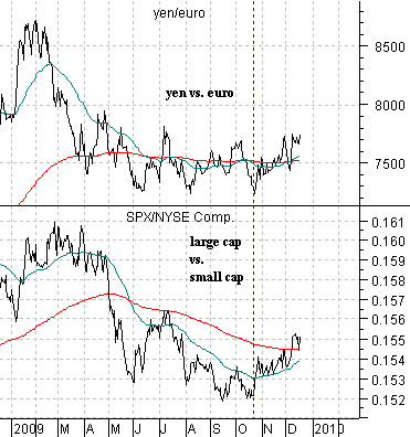
Below is a comparison based on the cross rate between the euro and the yen along with the ratio between the S&P 500 Index and the NYSE Comp.
The yen/euro cross rate trends with the U.S. dollar. The SPX/NYSE Comp. ratio represents ‘large cap’ vs. ‘small cap’.
When the yen/euro cross rate begins to rise it reflects a stronger trend for the dollar. When the dollar begins to rise U.S. large caps are supposed to outperform most foreign markets. When the dollar rises U.S. large caps are expected to do better than U.S. small to medium caps.
The basic point that we are attempting to make is that when the dollar begins to strengthen the best performing sectors should be U.S. large cap stocks with an emphasis on the non-cyclicals. A bearish outcome similar to last year will feature moderate weakness in the DJII and extreme weakness virtually every where else. A more moderate or even bullish outcome would come from continued price strength in the large cap U.S. names so that relative performance actually equates to absolute performance.
Equity/Bond Markets
Frankly… we expected the markets to get volatile early in 2010 but we didn’t expect the rising trend to fail until we pushed through the end of the year. Given that the markets do not care a whit about our expectations… we suppose almost anything could happen through the remaining trading days of this year.
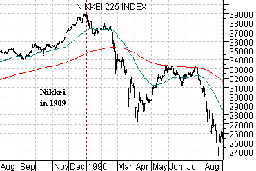
Below is a chart of the Nikkei 225 Index from 1989- 90. The point is that the trend continued to push upwards until 1989 had come to a close. Once traders closed their books on calendar year 1989 the Nikkei went into a free fall.
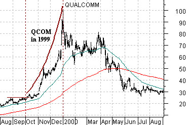
The next chart shows the share price of Qualcomm (QCOM) from 1999 into 2000.
Similar to the Nikkei through 1989 the share price of QCOM blazed through the end of the year with almost relentless strength only to peak as the year drew to a close and decline a quick 40% in January.
So… the point that we are attempting to make here is that the markets tend to drive a trend through the end of a quarter, the end of the year, and most especially the end of a decade. Perhaps so many investors were counting on a weaker dollar into January that the herd is being pushed merrily off of a cliff a few weeks early. We shall see.
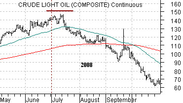
The third chart below shows crude oil futures from May through October last year.
While trends tend to change around the end of a quarter the reality is that the actual trend change often shows up a couple of weeks earlier or later. In hindsight it is somewhat obvious that the trend for crude oil prices pivoted back to the down side at the end of June in 2008 but, for those who recall, prices were actually making marginal new highs into mid-July.
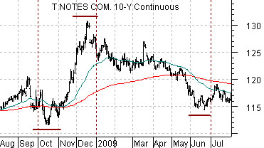
The final chart below features the U.S. 10-year T-Note futures from August of 2008 through July of 2009.
Once again we are showing a chart from an earlier time period. Our focus here is on exactly when prices pivoted higher or lower.
If we are conceded the argument that trends tend to change around the end of a quarter then we have to at least mention that the key word is ‘around’. Trends tend to change ‘around’ the end of a quarter even though absolute highs and lows are often made a few weeks before or after the actual quarter end.
The 10-year T-Note futures made a high in mid-September a couple of weeks ahead of the end of the third quarter and a low in mid-October. The bond market surged to what remains the cycle high into mid-December and then declined to a key bottom in mid-June.
What do all of these dates have in common? They were all trend changes and they all were made two weeks or so ahead of or following the conclusion of a calendar quarter. Why is this relevant? Because while our expectation was that the cyclical trend would push through into the start of January the reality is that the markets have a marked tendency to change gears a couple of weeks earlier. Given that it is now mid-December perhaps we shouldn’t be surprised that the markets are at least showing an inclination to book gains, eschew risk, and shake the tree as move deeper in the month of December.