We fixate over every real or perceived trend change in the bond market. It has been our experience, after all, that each time the markets do something completely unexpected… if one were truly listening to what the bond market was ‘saying’ the outcome should hardly have been a surprise. We write that one should never argue with the bond market and then proceed quite often to do exactly that.
All of this is mere preamble to our eventual point. The argument is that we are quickly approaching a critical juncture with respect to not only the bond market but the entire cyclical trend as well. We can argue that the yield curve is still too steep or that Chinese credit tightening is too new but… the further the trend deviates from our thesis the greater the need to re-think the thesis.
The point. The point is that we are perilously close to repeating the second half of 2008. We will argue that the second half of 2008 was largely a dramatic shift in relative strength from cyclical to defensive sectors and that if the defensive sectors continue to rise an argument can be made for a significantly more benign outcome but… all the same… 2008 is an uncomfortable comparison.
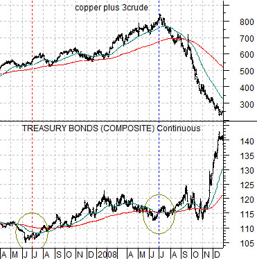
The argument begins with the chart of the U.S. 30-year T-Bond futures and the sum of copper and crude oil futures from 2007 through 2008 just below.
The TBonds bottomed twice through this time period. The first bottom was in mid-2007 while the second bottom was made one year later in mid-2008 concurrent with the peak for copper and crude oil futures.
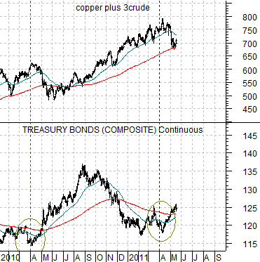
Next is the same comparison for the current time period. Notice that the TBonds bottomed at the end of the first quarter in 2010 with a second low at the end of the first quarter of 2011. Notice as well that the second upswing for bond prices coincided almost perfectly with a peak for copper and crude oil futures.
So… we are two months into the correction for copper and crude oil and the sum of holding near its 200-day e.m.a. line. That was exactly where things stood in August of 2008. If the markets fail to dig in at or near current levels we can imagine a scenario where commodity prices continue to weaken through the summer as bond prices race to the next peak. We do not believe that this kind of outcome is inevitable but, then again, if it proves to be so at least we can take solace in the fact that it wasn’t a total surprise.
Equity/Bond Markets
What we do know at present is that the markets are trading as if growth is slowing.
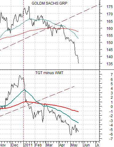
First is a chart comparison between Goldman Sachs (GS) and the spread between Target (TGT) and Wal Mart (WMT).
We have argued in the past that Target outperforms Wal Mart when times are good while WMT does better when the trend becomes more negative and defensive. We have also shown that the spread between TGT and WMT is a reasonable surrogate for the trend for the Asian equity markets and have gone so far as to suggest that Goldman Sachs’ stock price moves with the broad Asian-growth theme.
The point is that there has tended to be a general relationship between the share price of GS and the spread between TGT and WMT. GS does better when growth is positive while TGT rises versus WMT when investors are anticipating rising incomes, employment, and economic growth.
In any event… the chart at top right makes an interesting point. It does that from the start of 2011 through to the current time period the growth trend has become almost increasingly negative. GS has fallen from 175 to close to 135 while Target has shifted from 7 points higher than WMT to close to 6 points lower.
The reason that this may be important is that both GS and the spread between TGT and WMT peaked and turned lower in the autumn of 2007 well ahead of the cycle peak for commodity prices in mid-2008. If GS and the spread continue to decline then it helps to explain exactly why bond prices keep rising, why the commodity markets are starting to feel ‘heavy’, and why the U.S. dollar has the general feel of market making a bottom.
So… we return to our bond markets fixation.
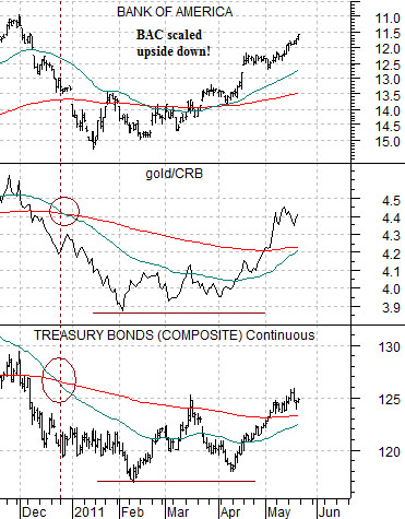
Next is a comparative view of the U.S. 30-year T-Bond futures, the ratio between gold and the CRB Index, and an upside down chart of Bank of America (BAC). We have turned BAC over so that it moves in the same direction as the bond market and gold.
The argument is that rising bond prices are a negative for cyclical growth. As well, when gold is stronger than the CRB Index it represents a negative trend for cyclical growth in general and the banks in particular. The higher the TBonds go and the longer the gold/CRB Index ratio rises… the greater the risk associated with the banks.
On any given day the TBonds could turn lower. On any given day gold prices could actually break to the down side. If both of these were to occur then it would make perfect sense to be positive on the banks in general and the laggard banks in particular.
The problem is that bond prices keep rising and every time we suspect that gold prices have peaked… they surge upwards once again. We can point to recent (very) minor weakness in gold relative to copper to support the idea that bond prices are going to decline but… that may simply be wishful thinking. The point? The longer the current trend runs the greater the risk of a repeat- even on a minor scale- of the second half of 2008.