The essence of a carry trade lies with borrowing money in a low interest rate market and investing it in a higher interest rate market. Simple. Borrow money at, say, 1%, invest it at 5%, and sit back and watch the profits roll in.
The problem with most carry trades is that eventually and inevitably they become too popular. Free money tends to attract a crowd after all. If one is borrowing in yen to invest in Aussie bonds to earn the positive carry… the risk is that the yen will rise by a greater percentage than the original interest rate spread. Fair enough.
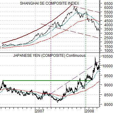
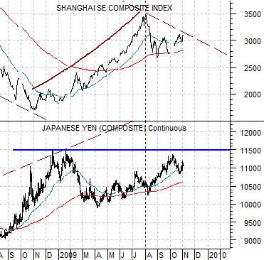
We grant that the yen carry trade supplanted the gold carry trade and has likely been replaced by the dollar carry trade. Borrowing in dollars to take advantage of Fed largesse makes sense in much the same way as being early to a ponzi scheme. However the focus of our attention at present is on the relationship between the Japanese yen futures and the Chinese stock market from 2006 into 2008.
Below we compare the yen and the Shanghai Composite Index. The argument is that the parabolic rise in the Shanghai Comp. occurred between the time the yen peaked in early 2006 and broke above that level around the start of 2008. While the yen traded flat to lower the flow of risk-based liquidity drove the Chinese shares market to the moon.
Below we show the same two markets up until the current time period. We note that once the yen reached a trading peak in early 2009 the Shanghai Comp. went somewhat parabolic once again.
The assumption here is that the yen still matters. The logical leap is that to some extent the yen and dollar represent flight to safety options so a push to new highs for the yen relative to the dollar represents a form of risk aversion.
Our basic point is actually quite simple today. Concurrent with a flat to weaker Japanese yen between early 2006 and the start of 2008 the Chinese stock market ramped higher. To the extent that the trend for the Nasdaq and the semiconductor sector is very similar to that of the Asian stock markets we can make the case that yen strength seems to appear when cyclical growth starts to wane. As the yen presses up towards 1.14- 1.15 indications of a shift back towards risk aversion are appearing.
Equity/Bond Markets
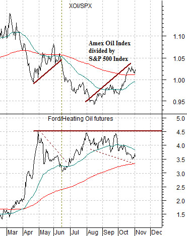
Below is a comparison between the ratio of the oils (XOI) to the broad U.S. equity market (SPX) and the ratio of the share price of Ford (F) to heating oil futures.
The ongoing argument has been that a ‘positive recovery’ will include a rising Ford/heating oil ratio. Corrections or stumbling blocks will occur when the oils return to relative strength with the XOI/SPX ratio rising. From this perspective the markets have been struggling since early May.
At minimum we would like to see the XOI/SPX ratio fall back below its 200-day e.m.a. line. We suspect that this will require weaker energy prices.
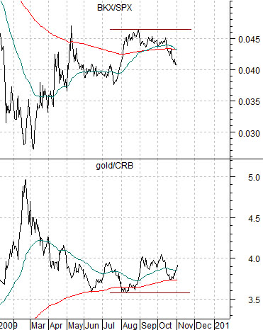
Below is a comparison between the ratio of the Bank Index (BKX) to the S&P 500 Index and the ratio of gold to the CRB Index.
The argument is that these two charts are mirror images of each other. The stronger gold is relative to general commodity prices the weaker the banks should be in comparison to the broad stock market. The gold bulls may rejoice when gold prices push higher but one has to be careful about what one wishes for.
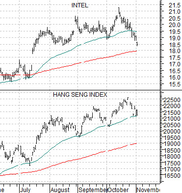
Below is a fairly simple comparison between Intel (INTC) and Hong Kong’s Hang Seng Index.
Yesterday Morgan Stanley downgraded the chip sector based on the potential for earnings to peak some time in 2010. Aside from the fact that the markets have an attention span of about 5 minutes and ‘next year’ is some distance away… our point is that ‘cyclical is cyclical’. If the chip stocks start to break their moving average lines then there is a reasonable chance that the Hang Seng Index will be not too far behind and… as the page 6 chart comparison attests… the Hang Seng Index, the commodity currencies, and even energy and metals prices are all part of the same trend.