We are going to show something a bit different today. There is a very good chance that this will end up in these pages as often as the 2-year lag because… it is a rather fascinating concept.
Let’s get the caveats out of the way first. We have read and heard about all kinds of time cycles but we have never encountered anything similar to what we are going to call the ‘rolling 3-year’. This does not mean that it hasn’t been explained in detail elsewhere or is, in fact, a widely recognized, understood, and followed concept but from our perspective this is something new. We are tempted to give it a fancy name but ‘rolling 3 year’ should suffice.
The argument is that the reason the markets seem so confusing at times is that there is not just one time cycle at work. In fact there are numerous cycles with each extending for about three years. Hence the term ‘rolling 3 years’.
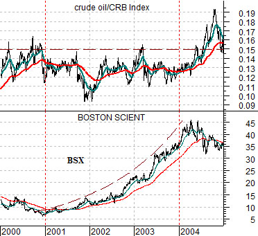
Let’s start things off with the chart that we included on the first page of yesterday’s issue. At top right is a comparison between the share price of Boston Scientific (BSX) and the ratio between crude oil and the CRB Index from 2000 through 2004.
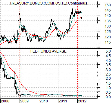
Below right is a comparative view of the Fed funds target rate and the 30-year U.S. T-Bond futures from 2008 to the present time period.
The inspiration for the ‘rolling 3-year’ actually came from these two charts. We mentioned yesterday that it had taken the long end of the Treasury market three years to rise to what we believed to be a cycle peak while earlier in the issue we were arguing that Boston Scientific’s share price had trended upwards for about three years after the peak for energy prices towards the end of 2000.
As we pondered the apparent coincidence that both cycles began with a key trend change (cyclical growth top in 2000 and bottom for the Fed funds rate at the end of 2008) and then ran through to a conclusion three years later we went through a mental check list of tops and bottoms from the previous decade and realized that this might well represent one of our most compelling pieces of chart-based inspiration that we have ever come up with. So… we will go through a couple of examples on the next page to show how this has worked.
Equity/Bond Markets
The ‘rolling 3-year’ cycle argument suggests that the markets are going through a series of overlapping three years cycles. Instead of just one cycle- like the 4-year or Presidential cycle- there are actually a number of cycles on the go at any single period of time.
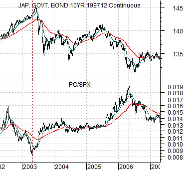
At right is a chart comparison between the Japanese 10-year (JGB) bond futures and the ratio between Panasonic (PC) and the S&P 500 Index (SPX) from 2002 into 2007.
We are using Japanese bond futures to represent the long end of the bond market. We could have used something like the U.S. 30-year T-Bond futures of 10-year T-Note futures as well.
The PC/SPX ratio represents one aspect of cyclical growth. In particular it represents the ‘laggard or weaker’ cyclicals relative to the broad market. The PC/SPX ratio would have been expected to turn higher once the recovery had progressed to the point where the wind was strong enough that even turkeys were able to fly.
Let’s back this up just a bit. The PC/SPX ratio bottomed in the spring of 2003. What happened three years earlier in the spring of 2000? The Nasdaq reached a cycle top. The cyclical trend peaked in the spring of 2000 and then bottomed out three years later in the spring of 2003. Fair enough.
The bottom for the PC/SPX ratio marked the top for the bond market. Based on our premise this would suggest that the next trend change would come around three years later in the spring of 2006.
The PC/SPX ratio did, in fact, top out in the spring of 2006 with the long end of the bond market making a cycle bottom around the middle of that year. What else was happening in the second quarter of 2006? Copper prices spiked above 4.00 in May as the copper/CRB Index reached a top. From there, by the way, the commodity trend shifted over to the grains.
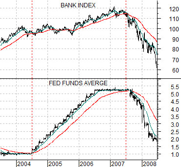
Now… at bottom right is a comparison between the Fed funds target rate and the Bank Index (BKX) from 2003 into 2008.
The upward pivot in the PC/SPX ratio in 2003 created downward pressure on long-term bond prices. A second three-year cycle began to form around the middle of 2004 as the Fed started to tighten credit.
The chart shows that short-term interest rates began to rise around the middle of 2004 and three years later the Bank Index began to crumble.
The point is that based on these examples there were two 3-year cycles on the go with one linked to the long end of the bond market and the other tied to changes in short-term interest rates. Both cycles were impacting real and relative prices but with different starting and ending points. Instead of one simple cycle were at least two cycles overlaying the markets causing pressure at different times and, perhaps, in different directions. In fact, if we spent some more time on this issue we wouldn’t be surprised to find that there were actually quite a number of 3-year cycles rolling through the markets.