In terms of the ‘math’ of the markets yesterday was an interesting day. Interesting, we suppose, in the sense that it didn’t make much sense. Interesting in that the dollar and bond market rose while those sectors that trend with the dollar and bond market declined.
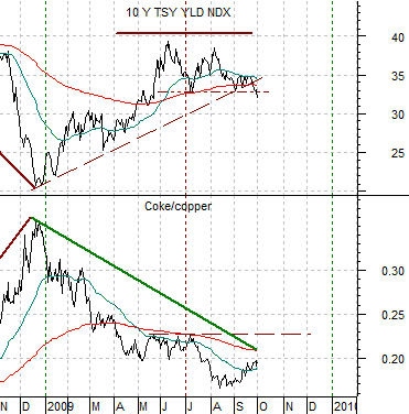
To explain we start off with a chart comparison of 10-year Treasury yields (TNX) and the ratio between the share price of Coca Cola (KO) and copper futures.
The argument is that rising yields go with strength in copper relative to Coke (cyclical vs. consumer) while declining yields lead to a rising Coke/copper ratio. As yields broke below the early July lows the ratio should have been pushed upwards either through strength in the large cap consumer sectors or weakness in copper prices. At the end of the day both were lower which was somewhat reminiscent of last autumn’s asset price free fall.
Below right is a comparison between the ratio of the S&P 500 Index (SPX) and the CRB Index (equities vs. commodities) and the sum of the U.S. 30-year T-Bond futures and U.S. Dollar Index (DXY).
The argument is that when the bond market and dollar are trending lower equities will tend to decline relative to commodity prices. When the dollar and bond market are rising in tandem then equities should rise relative to commodities.
Our point is that we had an apparent break down in long-term Treasury yields ahead of today’s U.S. employment report but had very negligible strength from the consumer defensive stocks. We had strength in the bond market and dollar but equities were actually weaker than commodities. We had dollar strength even as the semiconductor stocks fell versus copper prices and at a time when large cap biotech stocks such as Amgen (AMGN) should be leading the charge higher its share price ended lower.
The issue that we are circling today is that yesterday seemed more like the first day of a new quarter than the first day of a trend change. The reaction ranged from scattered to almost random so our thought is that we are going to have to let a few more days pass by before we try to make sense out of what the markets are actually up to.

Equity/Bond Markets
In response to yesterday’s sharp equity markets price weakness we are going to lean against the wind somewhat and show a fairly bullish chart comparison.
We have done this one on many occasions but given that it is still working we are going to run through it once again. The idea begins with the markets back in 1990- 91. At right we feature a comparison between the ratio of the Amex Oil Index (XOI) to the S&P 500 Index (SPX) and the share prices of Carnival Cruise Lines (CCL) and Wells Fargo (WFC).
The argument has been that once the oils peak in terms of relative strength (i.e. the XOI/SPX turns lower) the trend for CCL and WFC should turn positive. Fair enough.
We show the same comparison from the recent time frame below right. The XOI/SPX ratio threw us a curve last year as it peaked at the end of June and then ran back up to a second top in early March of this year. The argument, however, does not change. As long as the XOI/SPX ratio is trending lower the basic trends for CCL and WFC should be higher.
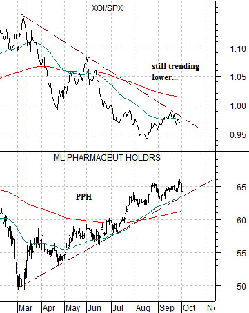
Below we tighten up the time frame somewhat and compare the XOI/SPX ratio with the pharma etf (PPH).
Our point is that regardless of what happened in trading yesterday the XOI/SPX ratio is still working lower. That may change today or next week but for the time being the ratio is still trending to the down side and our view is that as long as this continues the trend for the large cap pharma stocks represented by the PPH will be positive. As long as an assortment of equity-related trends are still positive… we have a hard time getting too negative on the broad U.S. equity market.