The relationship between interest rates and equities exists on at least two different levels. We have argued, for example, that trend changes for yields impact the cyclical trend with a 2-year lead. What happens to yields today has an effect on asset prices 2 years into the future while what happened with yields 2 years previous is working on asset prices today.
There is also a concurrent relationship. This is essentially what one sees when equity and commodity prices tumble as yields decline or conversely when the markets start to hum as yields push higher. Our focus today is on the way yields help to define that part of the trend that involves the laggard sectors.
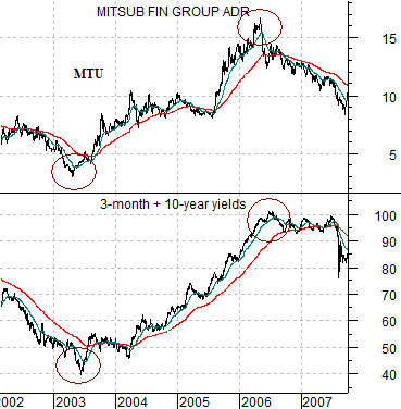
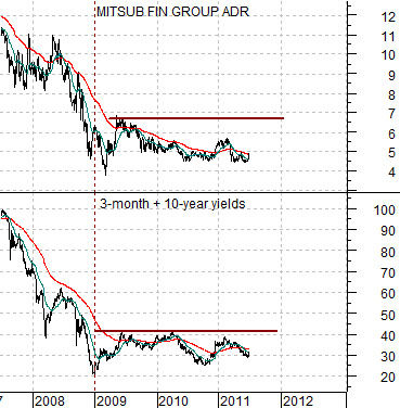
Below is a comparison between the sum of 3-month and 10-year Treasury yields (short and long-term yields combined) and the share price of Japanese bank Mitsubishi UFJ (MTU) from 2002 into 2007. We are using MTU to represent the ‘laggard cyclicals’.
The argument is that yields AND MTU bottomed in 2003 and yields AND MTU peaked in 2006. As relationships go this one is fairly straightforward.
Next we feature the same chart comparison from 2007 to the present time frame.
The points we are trying to make are as follows. First, the peak for MTU should coincide with the peak for yields. In a deflationary scenario the peak could have been made back in 2009 but with our usual ‘glass is half full’ slant on things our argument has been that the markets are still wallowing through the output gap created post-2007. Eventually economic growth will expand until long-term yields begin to rise followed in due course by short-term yields.
The laggard cyclicals are… lagging… which makes sense given that the sum of 3-month and 10-year yields has also been flat-lining since the end of 2008. If history is kind enough to repeat the peak for the laggard stocks lies somewhere far off into the future after the Fed has completed its next series of interest rate increases. At present the cycle is merely spinning its wheels in search of the kind of traction that will initiate a rising trend for interest rates.
Equity/Bond Markets
We argue that trends tend to run quarter to quarter with the two most significant trend change points occurring at the start of January and July. Given that it is now the start of July… it is time to start paying very close attention.
The problem is that trends often do not begin until a few weeks into the first month of the quarter. By this we mean that while trends run quarter to quarter the actual price pivots tend to be made a week or three after the quarter begins.
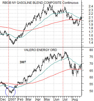
To explain… we have included a chart of gasoline futures and the share price of oil refiner Valero (VLO) from the end of 2006 through August of 2007.
One of the strongest themes or trends through the first half of 2007 reflected rising gasoline prices. Yet… the share price of VLO remained under pressure during the first couple of weeks of January while gasoline futures did not swing upwards until the second half of that month.
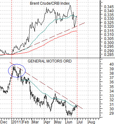
Below is a chart of General Motors (GM) and the ratio between Brent crude oil futures and the CRB Index from December of 2010 to the present time frame.
Our argument is that the trend for GM was bearish through the first six months of 2011 but… the share price still managed to move higher over the first week or so of this year.
The point? With the benefit of hindsight we are able to show exactly where and when trends changed but in real time… it is not quite so easy or so obvious. It will probably take a good portion of this month before many of the trends that will dominate the quarter actually show up but in the mean time the one that we are really focusing on is likely going to mimic the price action of GM.
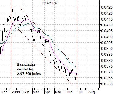
Below is a chart of the Bank Index (BKX) divided by the S&P 500 Index (SPX). Similar to GM this ratio moved steadily lower through the first half of 2011. If the laggard sectors are going to start to rise then the banks should go with or, perhaps, lead the charge. Our sense today is that what is good for GM may, in fact, be good for the banking shares.