When we view the markets we are always trying to find rational explanations for the seemingly irrational trends. Every now and then, however, a trading day will feel like someone threw a rock at a tree full of birds with prices scattering in all directions. When this happens it usually takes a bit of time before the flock regroups.
Was yesterday a meaningful day? Bonds up, dollar up, yen up, commodities down, equities down. It certainly wasn’t a random day as markets moved in the directions associated with capital exiting risk but it still didn’t feel like a trend moving with conviction.
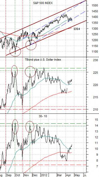
Below is our chart comparison between the S&P 500 Index (SPX), the sum of the U.S. 30-year T-Bond futures and U.S. Dollar Index (DXY) futures, and the price spread or difference between the 30-year and 10-year Treasury futures.
If ‘risk off’ means falling equity and commodity prices then the offset to this is rising bond prices and a stronger U.S. dollar. This shows up through the increase in the sum of the TBond and DXY as well as a rising price spread between the 30-year and 10-year Treasury futures.
We have argued on a few occasions that the path for the SPX is higher as long as the sum of the TBond and DXY holds below the 225- 227 range. This also revolves around the 30- 10 price spread remaining below resistance around the +14 level.
The rising trading channel for the S&P 500 Index is defined by the extremes for the TBond plus DXY and the 30- 10 spread. By this we mean that the channel bottoms for the SPX were made when the sum of the TBond and DXY rose through 225 or when the 30- 10 spread moved up to or just above +14. The tests of the channel top for the SPX were made as the TBonds plus DXY fell to around 2010 or when the 30- 10 spread moved down into the +7 to +8 range.
The point? In terms of the trading channel the SPX can still decline back to roughly 1314 without altering the bullish trend. As long as the U.S. dollar and bond market are rising the stock market will come under a certain amount of pressure. Our expectation is that the correction will remain fairly well contained unless… the bond market and dollar expand in price to the point where the series of highs set between September of last year and January of this year are exceeded with the TBond plus DXY moving above 227 while the 30- 10 spread rises through +14.50.
Equity/Bond Markets
We are going to show a couple of charts today based off of our ‘decade theme’. The decade theme argues that the markets keep doing the same basic things decade after decade even though it always feels as if the trends are completely new and unique.
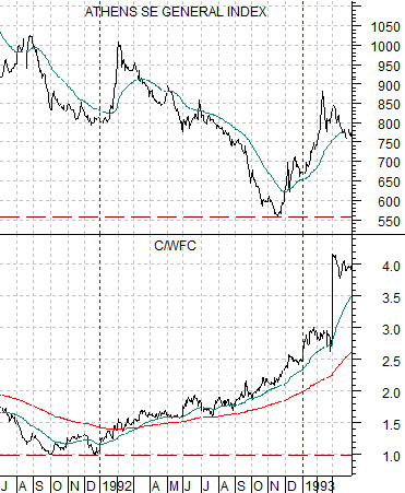
Next is a chart comparison between the Athens Stock Exchange General Index and the ratio between Citigroup (C) and Wells Fargo (WFC) from 1991- 93.
The idea is that decade after decade there are ‘two bottoms’. The first is set in the final quarter of the ‘1’ year (i.e. 1991, 2001, 2011) while the second is made a year later towards the end of the ‘2’ year.
The chart shows that the ratio between the lagging banks (C) to the leading banks (WFC) bottomed in the final quarter of 1991 while the Greek stock market did not reach bottom until the fourth quarter of 1991.
What makes this interesting is that the 1991 low for the C/WFC ratio was close to 1:1 while the cycle bottom for the Greek stock market was roughly 560.
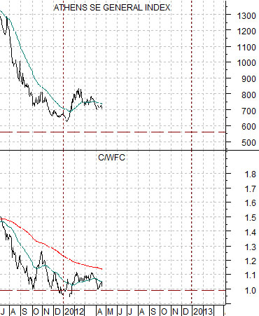
Fast forwarding 20 years we find the C/WFC ratio back to around 1:1 through the final quarter of 2011 and the Athens SE General Index not that far above the levels of 1992. Over the past two decades everything has changed and nothing has changed… which is curious.
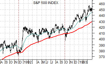
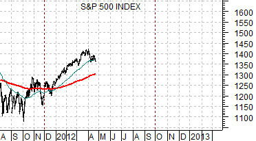
Quickly… below are two charts of the S&P 500 Index. We are trying to show how the SPX traded between the fourth quarter of 1991 and the final quarter of 1992 as it held a slightly bullish trend with periodic corrections back to the rising 200-day e.m.a. line. The suggestion is that the index could find similar support through the balance of this year.