The weekly U.S. jobless claims number remained on the high side of 400,000, JPMorgan reported earnings below expectations, while economic data pointed to slower Chinese growth. All in all the fact that the equity markets held in as well as they did yesterday was somewhat impressive.
It is never true that the current market is identical to some past market. There are details that may be similar but from our perspective it is always more accurate to argue that in some respects the trend reminds us of something that we have seen before. Which brings us to our opening point today.
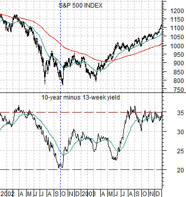
Below is a chart of the S&P 500 Index (SPX) and the yield spread or difference between 10-year and 3-month Treasury yields from 2002- 03..
In general… a declining yield spread is cyclically positive but only when the spread is tightening as a result of rising short-term yields. In general a wide or high yield spread represents the markets attempt to stimulate growth while a flat or inverted yield spread is the economic equivalent of slamming down on the brakes of your automobile.
The yield spread can decline either through rising short-term yields (positive) or declining long-term yields (negative). The latter case was alive and well through the first nine months of 2002.
The stock market did not bottom until early October in 2002 and this went with the end of the compression in the yield spread.
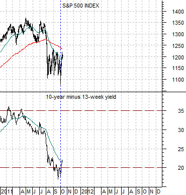
Fast forward nine years and compare what happened in 2002 with the first nine months of this year. The chart below right shows that once again the yield spread has been declining in response to falling long-term interest rates instead of rising short-term yields.
Our view was that this trend should end at or near the completion of a calendar quarter. Our view was that the seasonal trend tends to create cyclical bottoms in or around the month of October. Our view was that once the yield spread stopped declining and started to rise the S&P 500 Index would shift into a more bullish trend. So far, so good.
Equity/Bond Markets
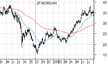
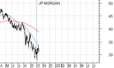
As long as we are using 2002 as a comparison year we might as well show how this was supposed to relate to the trend for JPMorgan (JPM).
Just below are two charts of JPM. The top chart is from 2002- 03 while the lower chart is from 2011.
The argument is that the share price of JPM ‘should’ pivot higher once the yield spread starts to rise. That was definitely the case in October of 2002. The weakness in the bank stocks yesterday was not large enough or dramatic enough to be a ‘trend buster’ but it did represent a form of rather unwelcome pressure. Perhaps things will improve early next week as some of the other big banking names report.
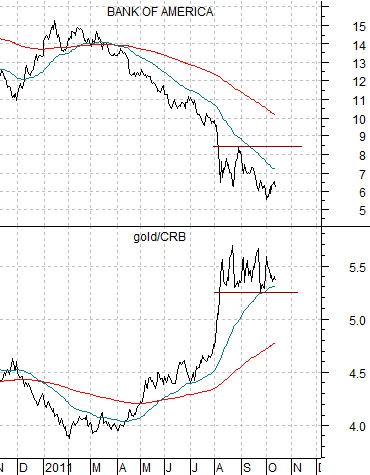
Next is a chart of Bank of America (BAC) and the ratio between gold and the CRB Index. We have done this one many times in the past but the argument is that the trends are virtual mirror images. If the gold/CRB Index ratio is not busting to new highs then there is a reasonable chance that we are working through a potential bottom for the laggard banks.
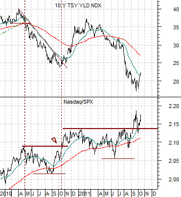
Last we have included a chart of 10-year Treasury yields and the ratio between the Nasdaq and S&P 500 Index.
Falling yields are always and everywhere a positive for financial asset prices. What is negative is ‘why’ yields are falling. Falling interest rates do not push stock prices lower; rather the reason rates are falling pushes stock prices to the down side.
The point is that when yields decline there are often a number of sectors that actually rise in price. Usually these are interest rate sensitive sectors (utilities, pipelines, consumer staples, etc.) but more cyclical groups can also push upwards. Such has been the case with the Nasdaq as this index continues to rise relative to the S&P 500 Index. Our thought is that Eurozone problems are pushing down on yields while tech-related or Nasdaq strength is putting upward pressure on yields.