We are going to play a little defense today now that the markets are moving away from the recent state of crisis. The premise for today’s argument represents an amalgam of three separate thoughts as we cobble together a view of the relationship between the Hang Seng Index and commodity prices, the double-bottom made by the U.S. dollar in 1992 and 1995, and the reaction during the second half of 1995 to dollar and bond market strength.
One of the most challenging aspects of the markets is the ability for a very clear trend to build for months or even years without anyone really noticing. The markets tend to move under the radar for a prolonged period of time so once a trend becomes generally accepted and recognized it has been on the go for some time. We started our commentary by referring to ‘playing defense’ because this seems like the appropriate time to take issue with commonly held beliefs.
Now that we have confused the issue we will attempt to find a starting point for our argument. While it may not be the best place to begin at least the charts at right represent some kind of beginning.
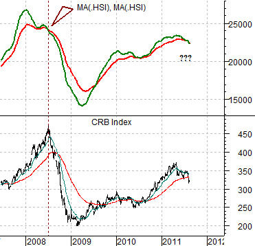
The charts compare the CRB Index with the Hong Kong stock market. We have reduced the Hang Seng Index to two moving average lines. The red line is the 200-day e.m.a. while the green line is the 100-day e.m.a.
The argument is and has been that the basic trend for the commodity markets is positive as long as the moving average lines for the Hang Seng Index do not ‘cross’. In other words when the green line moves down through the red line it has tended in past year to indicate that the Hang Seng Index (which represents the broader theme of Asian, Latin, and emerging markets growth) has entered a bearish phase. The ‘cross’ of the moving average lines occurred in late 1997 and again at the end of 2000. concurrent with solid 12 to 15 months price corrections for the CRB Index.
The chart below shows that the moving average lines crossed in July of 2008 as the CRB Index reached a peak. The lines converged but did not cross in mid-2010 but have recently crossed over this month.
The point is that a case can be made that the commodity markets are now in a negative or bearish trend.

Equity/Bond Markets
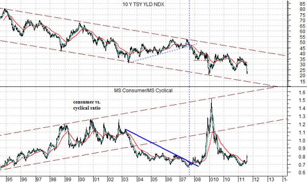
Below is a rather large chart of 10-year Treasury yields and the ratio between the Morgan Stanley Consumer Index and Cyclical Index.
The argument is that in a declining interest rate trend (i.e. 10-year yields trending lower within the channel) the consumer stocks will actually outperform the cyclical stocks. The twist is that any time yields trend higher the markets will push money towards the cyclical sectors as was the case from 2003 into 2007. The end result, of course, was a dramatic explosion in the consumer/cyclical ratio during 2008 that snapped it back up to the long-term channel top.
So… here is the point. The CRB Index may have entered a bearish trend. Long-term yields have recently been falling and the consumer/cyclical ratio has been rising. Hmmm.
Next we compare the share price of drug maker GlaxoSmithKline (GSK) with the ratio between equities (S&P 500 Index) and commodities (CRB Index).
The two points that we want to make are that the share price of GSK trends broadly with the value of the ratio. When the ratio rose to 7.5:1 into 1999 the share price of GSK was close to 75. And so on. As well, the ratio turned powerfully higher in 1995.
1995. This is, more or less, the year that we are going to compare to the current time frame. This was the year when the dollar bottomed and bond prices started to rise. This marked the start of one of the most powerful bull markets for equities versus commodities. This was the starting point for the tech rally that led into 1999’s internet bubble.