Those who are familiar with our work probably won’t be surprised to read that we have an affinity for doing weird things with charts. We turn markets upside down, create strange ratios and combinations, and periodically show relationships based on multi-quarter or even multi-year time lags. We compare markets and sectors from different time periods and create theses based on rather imaginative (read: bizarre) sequences. We suspect that there aren’t too many other services out there that would argue, for example, that the S&P 500 Index should go higher because the ratios between Ford and heating oil futures and Goldman Sachs and the CBOE Volatility Index are on the rise.
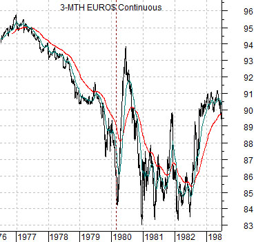
All of this is, of course, preamble to yet another odd comparison. Today’s presentation is an extension of sorts of the argument shown in yesterday’s issue using the dramatic decline in 3-month eurodollar futures from 1976 into the early 1980’s as a chart-based anchor.
The ‘decade theme’ argues that the same basic trends and patterns keep repeating every ten years. The twist is that different markets in different combinations keep rising or falling to extremes.
The offset to strong commodity prices through the late 1970’s was an absolute crushing of short-term debt prices as interest rates rose from less than 5% in early 1977 to more than 15% at times between 1980 and 1982.
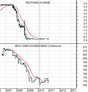
What intrigued us about this chart is just how similar it is to the individual housing index futures contracts from the current time frame. Below right we show the New York Housing Index futures (the index was set at 100 in the base year of 2000 so a level of, say, 170 would suggest that New York housing prices are 70% higher than a decade or so previous) and the Fed funds rate.
If housing prices and the funds rate follow a similar path as short-term debt prices between 1977 and 1982 then… we will see continued downward pressure on real estate prices for another 12 to 18 months along with near-0% interest rates. In other words we may have to live with a stimulatively steep yield curve and rising asset prices for a number of quarters until the recovery creates the inevitable traction in the housing market that will swing the funds rate up off the bottom into 2013.
Equity/Bond Markets
Jan. 12 (Bloomberg) — U.S. stocks rose, sending benchmark indexes to the highest since August 2008, as Wells Fargo & Co. raised its rating for large banks on dividend prospects and amid speculation Europe will step up measures to control its crisis.
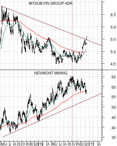
One of our views has been that when the banks start to recover there will be downward pressure on gold prices. While gold prices have yet to weaken on an absolute basis (the gold/CRB Index has fallen however) the comparison at right between Japanese bank Mitsubishi UFJ (MTU) and gold producer Newmont (NEM) certainly suggests that ‘something’ is happening within the markets.
Another view was that the laggard banks would bottom around the time that the Japanese bond market peaked along with the U.S. yield curve. For this particular argument we used the spread between 30-year and 5-year Treasury yields to represent the yield curve.
The banks were supposed to rally until the yield curve inverted once again. The point is that if the funds rate (page 1) remains close to 0% into 2012 then the yield curve won’t be inverting any time soon.
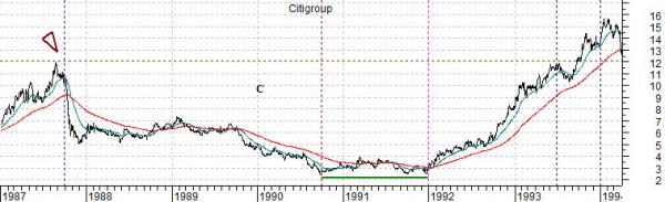
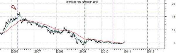
Below is a comparison between Citigroup from 1987 into 1994 (through the real estate collapse/recession in 1991) and Mitsubishi UFJ from 2005 to the present day. The idea here is that if we line up the two stock prices on a quarterly basis then the next peak for the financial would expected some time during the first half of 2012. Our point, by the way, is that this fits in almost perfectly with our page 1 comparison which hints at the prospect of rising short-term yields through the back half of 2012.