The problem with running the same chart presentation too many days in a row is that we run out of things to write about. It gets somewhat boring stating the same details time and time again so… one might argue that this paragraph is just a way to use up a bit of space. As, we suspect, is this rather meaningless add-on sentence.
On a more serious note it is summer and each and every year during the summer we get the sense that something major is about to happen and in most instances… nothing of significance takes place until after the Labor Day weekend.
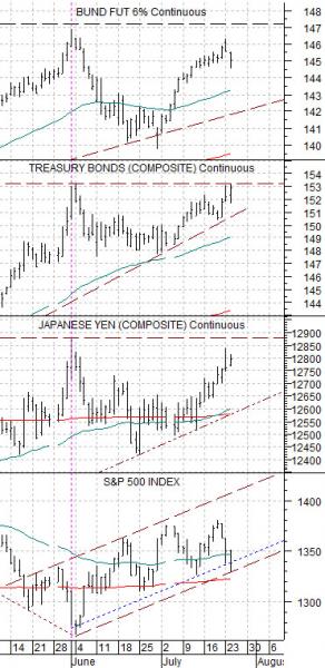
Below is our chart of, from bottom to top, the S&P 500 Index, the Japanese yen futures, the U.S. 30-year T-Bond futures, and the German bund futures.
The argument is and has been that as long as bond prices and the Japanese yen are not busting out to new highs then the trend for the S&P 500 Index should be moderately positive. There will be bearish pressure on U.S. large cap equities on bond price strength and bullish pressure on bond price weakness but… the key is that if bond prices and the yen are ‘range bound’ then we should see an upward tilt for the S&P 500 Index.
We use continuous charts for our work so the view of, say, the TBond futures will look somewhat different than a simple chart of the September contract because our data is continually focused on the front month contract.
The peak for the front month contract of the TBond futures at the end of June was just over 153. The TBonds closed the regular sessions yesterday at 152 31/32 with an intraday high of 153. 2/32. The point? That is not a break out. That most certainly is not a ‘bust out’. The prior peak is being tested and stressed but- so far- it has held.
At the peak for the bond market and Japanese yen we should be at a concurrent bottom for the S&P 500 Index. Our concern at present is that the TBonds snap to new highs and then extend the rally for a few months with the S&P 500 Index sagging into the start of this year’s final quarter.
Equity/Bond Markets
Usually the bond market ‘leads’. But not always.
In the ‘good old days’ the stock and bond markets trended in the same direction. Rising bond prices led to rising stock prices as valuations expanded. Thinking back 30 or so years we recall the ‘Rule of 21’ which stated that the sum of the U.S. inflation rate and market price to earnings ratio (PE) would tend to add up to 21. In other words an inflation rate of 10% would go with a market PE of 11 while inflation declining to 6% would expand PE’s to 15 times.
Some time around the start of 1990 the Japanese asset bubble peaked, popped, and collapsed. From the early 1990’s to the present day the Japanese stock market has only risen when bond prices were also moving lower.
The point is that a market suffering from a deflationary bias tend to do better when bond prices are falling. The U.S. financial markets slipped into this trend around 1998 and from that time forward the stock market has trended with yields instead of bond prices.
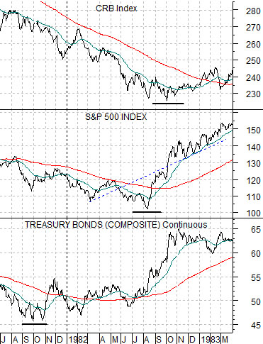
In any event… at top right is a chart from 1981- 83. The chart compares the U.S. 30-year T-Bond futures, the S&P 500 Index, and the CRB Index over that time span.
Bonds, stocks, and commodities. The bond market bottomed in the autumn of 1981. The stock market bottomed in August of 1982. The commodity market bottomed in the autumn of 1982. Bonds ‘led’ the recovery. Once bond prices finally turned higher the bear market in both stocks and commodities was approaching its end.
So… in 1981- 82 the bond market ‘led’ to the upside. In 1998 the U.S. relationship reversed as equity prices began to trend with yields instead of prices.
In 2000 yields ‘led’ to the down side. Long-term Treasury yields began to decline in January of that year while the S&P 500 Index continued to show strength over the next one to three quarters.
In late 2002 something different happened. The stock market bottomed in the final quarter of that year while yields continued to decline into the middle of 2003. This change or difference gave rise to our view that yields ‘lead’ to the down side while equities may be ‘leading’ to the upside.
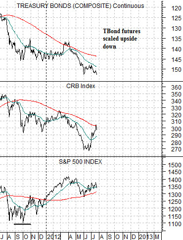
At bottom is the same chart comparison but in a different order. The S&P 500 Index serves as an anchor and is placed at the bottom with commodity prices in the middle and the TBond futures- scaled upside down- at the top. We are using an upside down view of bond prices instead of bond yields… just to make things more confusing than they perhaps should have to be.
The argument is that in 1981 bond prices bottomed to initiate the leading edge of the recovery. In 2011 stock prices may have bottomed to signal the start of the current recovery.
The point is that while bond yields may not bottom out until the autumn of this year as long as the S&P 500 Index is holding a reasonably bullish trend then it is only a matter of time- perhaps a quarter or so- until the recovery expands far enough and long enough to drive interest rates back to the upside.