On the one hand there isn’t an obvious end in sight to the Eurozone crisis. On the other hand slowing growth in China is beginning to weigh on the market’s perception of the trend for commodity prices. If we had a third hand we might note that in the face of all kinds of negative pressures U.S. 30-year yields are still well above the lowest levels set at the end of May.
If there is a pocket of risk it probably lies between now and the end of the quarter. If Eurozone problems are going to escalate then this is an appropriate time frame. If the bearish impact from Europe is going to do damage to China’s equity markets then this should show up over the next six or seven weeks.
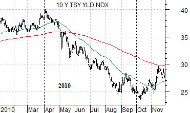
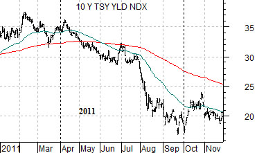
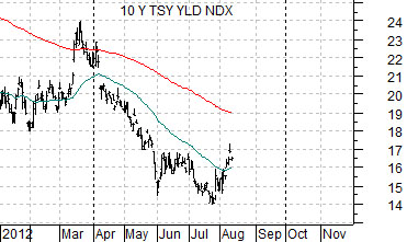
At right are three charts of U.S. 10-year Treasury yields. The top chart is from 2010 followed by 2011 and then 2012.
We have argued that the markets have been trading off of two different themes in recent years. From April through September the trend has been cyclically bearish with yields moving lower. From October through March the trend has reversed with cyclical asset prices and yields pushing higher.
Our best explanation for this behavior lies with the tendency for U.S. jobless claims to bottom in the spring and rise into the autumn. While the Eurozone issues never seem to fade the markets are more inclined to trend in a ‘glass is half full’ manner when there are obvious signs of an improvement in U.S. employment. Once the jobless claims numbers begin to flatten out or rise investors go back to fixating over weaker growth in Europe and China.
In any event we are showing charts of 10-year Treasury yields to make the case that in both 2010 and 2011 the low point was reached around the end of the third quarter. While there is no particular reason why this tendency has to be repeated… it probably makes sense in mid-August to at least consider the possibility that the next month and a half could be… challenging.
The point is that the seasonal bias towards weaker growth and falling yields may continue into the fourth quarter.
Equity/Bond Markets
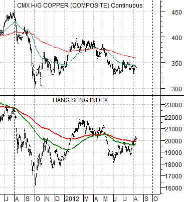
Below is a chart of copper futures and the Hang Seng Index from Hong Kong. The argument is that copper and the Hang Seng Index trend very closely together.
The chart makes the rather simple point that in August and September of last year… there was pronounced cyclical weakness. The kind of weakness that took copper from 4.50 down to 3.00. We will show this comparison again on page 5.
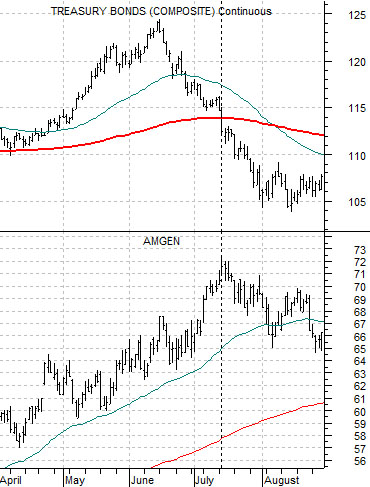
At right are two charts of the U.S. 30-year T-Bond futures and the share price of Amgen (AMGN). The top chart is from 2003 (the last major bond price peak) while the lower chart is from 2012.
The argument is that late in the cyclical correction we tend to get strength in the biotechs. The share price of Amgen begins to rise and the bullish trend continues until the markets shift into a bullish cyclical ‘pivot’. At the pivot the Japanese stock market drives higher along with a host of sectors ranging at times from airlines to financials to techs that have been left for dead.
The detail that we have been fixating over relates to exactly ‘when’ the share price of Amgen reached a peak in 2003. The chart suggests that it occurred right a the TBond futures broke down through the 200-day e.m.a. line.
We have been positive on the biotechs for quite some time so our focus at present is to try to stick with the bullish trend until the markets tell us that it is time to move on to something else. We can see that the TBond futures have been moving somewhat lower since late July but not to the extent that the moving average line is being challenged. If the TBond futures move nicely below 144 then the view will be that we are in the midst of the cyclical ‘pivot’ and it is time to move away from defensive growth and non-commodity themes (i.e. the biotechs).