If some one had told us that the S&P/Case Shiller Index would show that home prices in 20 U.S. cities were up 3.8% in the month of April- the largest gain since 2006- we would have bet that the stock market would have a very good day. It all goes to show, we suppose, that one of two things is true. Either China is more important to U.S. stocks than the positive impact on the banks from rising home prices or… this is all about the quarterly trend.
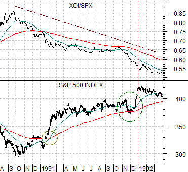
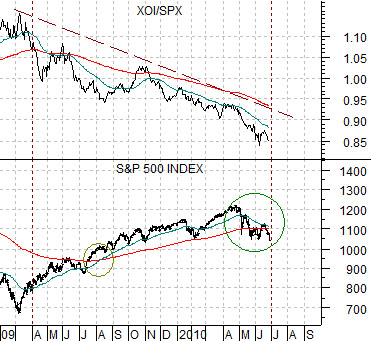
Below are two chart comparisons between the S&P 500 Index (SPX) and the ratio between the Amex Oil Index (XOI) and the SPX. The chart at top right is from 1990- 92 while the chart below right starts in early 2009.
Except for the past few days… we have felt quite comfortable with this comparison for quite some time.
The idea was that the oils (XOI) have made two major relative strength peaks in recent decades. The first was in the autumn of 1990 while the second took place into the first quarter of 2009.
When the XOI/SPX ratio began to decline in 1990 it ushered in a broad recovery for the equity market that basically ran through into 1994. Major banks such as Wells Fargo trended higher while laggard banks (Citigroup) remained near the lows until the very end of 1991.
The argument was that as long as the XOI/SPX ratio was trending lower the SPX should follow a fairly similar path to the post-1990 time period.
The similarity into June of this year was quite striking. The moving average lines ‘crossed’ to the upside back in April of 2009 compared to the ‘cross’ in January of 1990.
In the fourth quarter of 1991 the SPX sagged back to the moving average lines only to surge upwards as the laggard banks finally began to show strength. Based on the chart comparison our expectation was that we could see some form of equity markets correction into to early June followed by a sharp rally back to new highs as the banks kicked back into gear.
Equity/Bond Markets
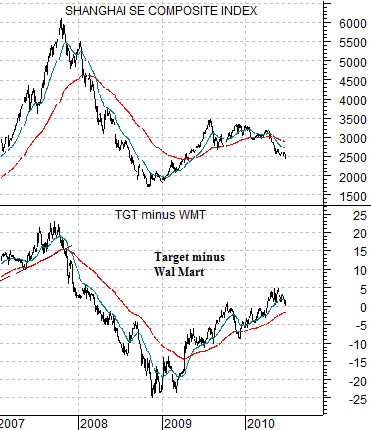
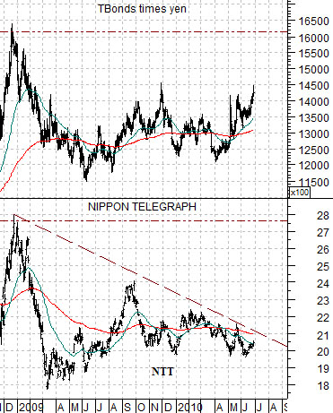
When we refer to defensive stocks we often show Wal Mart (WMT), Nippon Tel (NTT), or Johnson and Johnson (JNJ).
Below is a comparison between the Shanghai Composite Index and the price spread or difference between Target (TGT) and Wal Mart (WMT).
If the Shanghai Comp. represents the strength of Asian growth then the spread between TGT and WMT reflects the same trend within the U.S. equity markets. At times we show Amazon in place of TGT for this analysis.
The point is that WMT tends to outperform when Asian growth slows.
Next is a chart of Nippon Tel and the product of the U.S. 30-year T-Bond futures times the Japanese yen futures.
When money moves away from risk it tends to head into the dollar, yen, bond market, and gold. NTT has tended to do better in recent years when the yen and the bond market are stronger.
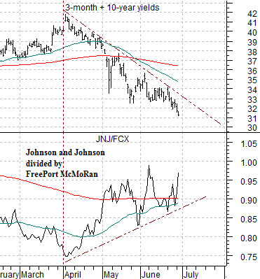
Lastly is a comparison between the ratio of Johnson and Johnson (JNJ) to FreePort McMoRan (FCX) along with the sum of 3-month and 10-year Treasury yields.
If yields are declining it usually means that growth is slowing. In a falling interest rate trend the share price of JNJ will tend to rise relative to that of base metals miner FCX.
The point? If the defensive stocks (WMT, NTT, JNJ) that outperform when interest rates are falling and growth is slowing continue to decline in price then the entire market will fall- as was the case yesterday. Unless the cyclical trend changes with yields moving higher these are the kinds of stocks that have to gain not only in relative terms but also in absolute terms if the broad stock market is going to steady out.