There are many ways to view the markets but there are two that we tend to use quite often. The first is based on real time relationships while the second suggests that what came before impacts what is happening now.
Using the first perspective one would argue that rising interest rates today are a reflection of improving economic growth which, in turn, is responsible for the uptrend in cyclical asset prices. In other words the idea would be that asset prices and interest rates relate directly on virtually a day-to-day basis.
The second perspective suggests that a tightening of credit conditions today impacts asset prices some time out into the future which is another way of writing that monetary policy works with a lag. When, for example, the Fed eased credit costs dramatically in early 2001 we did not see a return to cyclical strength until early in 2003 while the start of tighter credit conditions in 2004 did not hit most cyclical markets until at least 2006.
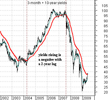
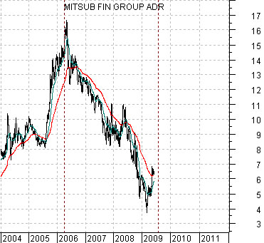
Belowwe show a chart of the sum of 3-month and 10-year Treasury yields from 2002 into 2009 and a chart of the share price of Japanese bank Mitsubishi UFJ (MTU) from 2004 forward. The charts have been shifted or offset by two years.
We have shown this relationship in the past using commodity prices instead of MTU but since MTU represented the kind of cyclical market that peaked and then turned lower in the spring of 2006 this comparison might make better sense.
The argument is that falling interest rates into 2004 led to rising cyclical asset prices into 2006. When rates turned higher in 2004 it created a forecast of a peak for cyclical growth in the spring of 2006. Fair enough.
If the lag is 2 years from the time when yields break solidly back through the moving average lines then the charts make the case that the negative trend for MTU from 2006 into 2009 represented rising yields from 2004 into 2007 leading into a positive trend from the summer of 2009 through 2010 which results from the sharp break in interest rates in the summer of 2007. The bottom line based on this chart comparison would be that we are due for considerable upward pressure on asset prices starting later this summer and running for close to 18 months.
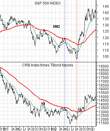
Below we have included a comparison between the S&P 500 Index (SPX) and commodity prices (CRB Index) times bond prices (U.S. 30-year T-Bond futures) from 1982.
The argument is that in the early 1980’s the stock market was trending with both bond and commodity prices so as long as the combination of the two remained below its 200-day e.m.a. line… the SPX was going to hold below its moving average line as well. The equity bull market began in August of 1982 as the commodity times bonds combination finally broke to the upside.
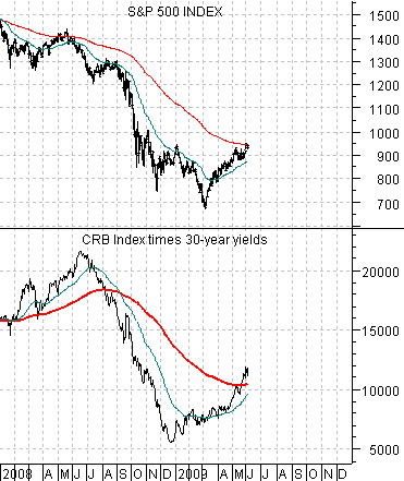
The difference between today and 1982 is that the stock market appears to be rising with yields instead of bond prices. With this in mind we have given the relationship a bit of a spin and show the SPX and the CRB Index multiplied by 30-year yields (instead of 30-year bond prices) below.
Fair or not the reality is that stocks have been rising as the dollar has declined (which goes with stronger commodity prices) and as yields have moved upwards. A weak dollar and bond market have served as the key offsets to recovering equity market prices. Notice that the CRB Index times 30-year yields combination has moved above its moving average line concurrent with the SPX pushing up to its moving average line.
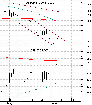
The monthly U.S. employment report is due out today and it always has the capacity to roil the markets. Below we show a short-term comparison between the U.S. Dollar Index (DXY) futures and the S&P 500 Index.
The simple point is that the SPX has risen from around 880 up to 950 on dollar weakness so any rally back above 80 for the DXY futures would put the short-term trend for the SPX at risk.