Let’s start the week off with a cyclically bullish perspective. Given that the cyclical trend rose to a peak around the end of the first quarter in both 2010 and 2011 this would ordinarily be a good time to start heading for the exits. So… let’s take a look at what the 2-year lag suggests.
The 2-year lag argues that the cyclical trend lags the direction of interest rates by roughly two years. When yields peak and turn lower (typically in response to economic weakness) conditions start to improve after about two years. Conversely when yields bottom and swing upwards (typically in response to economic strength) the cyclical trend starts to weaken with a similar lag.
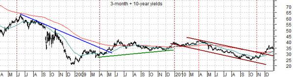
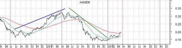
Below is a chart of the sum of 3-month and 10-year Treasury yields along with a chart of the ratio between Alcoa (AA) and Newmont (NEM). The charts have been shifted or offset so that yields, for example, in 2008 are lined up with the AA/NEM ratio in 2010.
The 2-year lag suggests that the declining trend for yields through the second half of 2008 and into the first quarter of 2009 forecast the cyclical recovery in late 2010 and into 2011 that went with the rising AA/NEM ratio.
The rise in yields through the final three quarters of 2009 preceded 2011’s cyclical slump. And so on.
So… on the one hand it would seem prudent to fade the rally as the quarter draws to a close. On the other hand, of course, the 2-year lag makes the case that the recovery should start to gain real traction as we push on into this year’s second quarter. The lagged impact of falling interest rates during the second and third quarters of 2010 will start to show up over the next month or so as downward pressure on the gold miners (Newmont) and/or upward pressure on the economically sensitive theme that favors Alcoa.
Equity/Bond Markets
On today’s third page we are going to argue that the trend that began in 2002 may be drawing to a close this year.
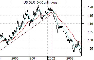
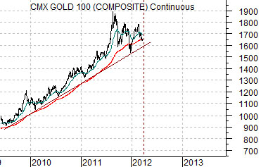
Below is a chart of the U.S. Dollar Index (DXY) futures from 1999 through 2003. Directly below this is a chart of gold futures from 2009 to the present day.
The idea here is that stronger commodity prices in general and energy prices in particular have dominated the trend since early in 2002. This was, by and large, an offset to U.S. dollar weakness.
The chart shows that the dollar made its final peak early in 2002 before turning lower. With a bit of imagination we are comparing the dollar in the first quarter or two of 2002 with gold prices ten years later in 2012.
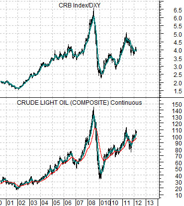
Next is a comparative chart of the CRB Index divided by the U.S. Dollar Index along with crude oil futures prices. The argument is that while the CRB Index will tend to rise when the dollar is moving lower the price of crude oil is even more sensitive in that it mirrors the ratio of the CRB Index to the DXY. In other words… while the CRB Index rises as the DXYdeclines the CRB/DXY ratio will rise at an even faster pace and it is this ratio that sets the trend for crude oil.
So… the dollar turning lower in 2002 helped drive energy prices higher. If gold today is in a similar position to the dollar in early 2002 then gold prices should be under pressure this year.
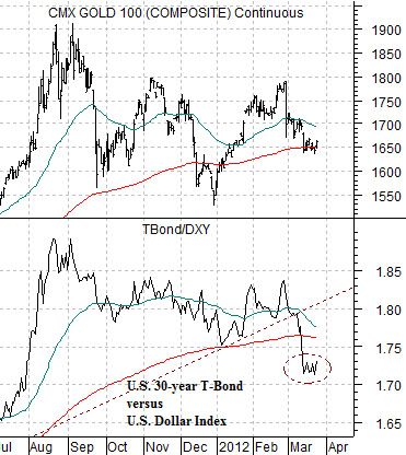
Last is a chart of gold futures and the ratio between the U.S. 30-year T-Bond futures and U.S. Dollar Index. The argument is that the offsets to weaker gold prices are… a weaker bond market (falling TBond prices) and stronger dollar (rising DXY). All of which means that we aren’t likely to see lower gold prices unless there is considerable bearish pressure on the long end of the U.S. Treasury market.