In real time the markets are never obvious. In hindsight, however, many pivot points and trends are amazingly obvious. Given that we might well be in one of those ‘you should have known’ situations we thought that we should work through a fairly simple explanation.
The basic point is that the cyclical trend goes with long-term yields. The cyclical trend represents, more or less, the movement of money out towards risk. It tends to include both equity and commodity prices.
When the cyclical trend has built up a considerable amount of momentum there is usually a lag between the pivot in yields and the realization by the markets that something has already changed. One case in point would be early in the year 2000. Long-term yields peaked and turned lower in January (indicating that the cyclical trend was now negative) while the Nasdaq tacked on a quick 1000 points (from 4000 up to 5000) before shifting into a bear market.
In any event… let’s get to our chart-based argument. Just below is a comparison between 10-year Treasury yields and the S&P 500 Index from October 2008 through June of 2009.
Yields bottomed at the end of 2008. This marked the pivot from a bearish to a bullish cyclical trend. The equity markets were so busy tunneling lower that a couple of months passed by before capital stopped fleeing the kind of risk that the bond market was ‘saying’ was no longer an issue.
Fast forward to the present situation. A case can be made that long-term yields bottomed at the end of this year’s third quarter. From the perspective of ‘it should have been obvious’ consider what this might mean. The U.S. Treasury market- so far- is saying that the cyclical trend turned positive almost two months ago which is quite similar to where things stood in late February of 2009.
The next chart compares 10-year Treasury yields with the Greek stock market. Our thought was that the Athens Stock Exchange General Index could represent the ‘Eurozone crisis’ while the SPX today is more similar to the Asian stock markets from early 2009. The bad news is that the Eurozone problems might intensify into next month but the good news is that as long as 10-year Treasury yields are able to slowly resolve up from 2.0% towards 2.5% we could very well be out of the woods and back into a bullish asset price trend within a few weeks.


Equity/Bond Markets
Now… consider for a moment the point that we were attempting to communicate on today’s first page.
IF long-term U.S. Treasury yields bottomed at the end of this year’s third quarter THEN we are simply in the ‘lag’ between the low point for yields and the markets’ realization that things are actually improving. Even if asset prices decline on a daily basis the argument is that this is the kind of ‘early’ that we can deal with. A few days or weeks is manageable while a few quarters or years tends not to be.
In any event… we counted the days between the peak for yields in 2000 and the final top for the Nasdaq. It took about 46 trading days.
We then counted the trading days between the low for yields at the end of 2008 and the bottom for the S&P 500 Index. 45 trading days.
The absolute low for 10-year yields in the current cycle was reached on September 22nd. This means that we are now 43 trading days past the bottom for long-term Treasury yields. The point would be that if we line things up on quarterly basis it makes sense to look for a return to stock market strength some time in December. However, if we use trading days as a measuring tool… we are fairly close to the point in time when a bullish (and lasting) pivot could occur.
The next and, perhaps, more important point is that all of this revolves around the idea that long-term Treasury yields have already bottomed. If yields decline to new lows then all bets are off and we have to start the process all over again at some later date.
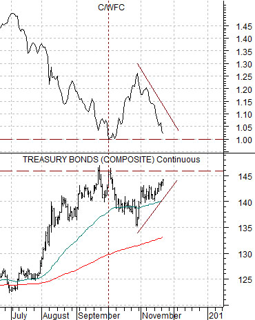
So… let’s look at one way to measure the trend for the bond market.
Below is a chart of the ratio between Citigroup (C) and Wells Fargo (WFC) from 1991- 92.
The argument is that the C/WFC ratio represents the cyclical trend. C tends to do much better when the trend is positive while WFC outperforms during more uncertain times. C tends to boom and bust while WFC tends to trend like a long-term growth stock.
In the fourth quarter of 1991 the ratio declined to 1:1 (adjusting for all the various splits and reverse splits that have occurred along the way). It bounced, circled back to just below 1:1, and then exploded to the upside. In late 1991 the share price of Citigroup was identical to that of Wells Fargo, two years later the ratio had risen to 8.5:1, and in 2000 the ratio peaked at 27:1.
Further below is a comparison between the C/WFC ratio and the U.S. 30-year T-Bond futures.
IF yields have bottomed THEN bond prices have topped. IF the TBonds made a price peak in September THEN our above argument makes sense.
IF bond prices have peaked THEN the C/WFC ratio should find support back at or- ideally- above 1:1. The better the ratio the stronger the argument that yields have bottomed and the move valid that the view that it should have been obvious that the cyclical trend had already turned bullish.