The markets responded yesterday but pushing copper futures prices higher. Not, perhaps, far enough to break the recent down trend but just enough to make things somewhat interesting.
The argument is, in a sense, that cyclical is cyclical so over time all of the cyclical themes will tend to rise or fall together. Within the larger trend there will be periods of time when one theme or another is weaker which tends to focus investors attention on the more bullish areas. In the current situation copper has acted as the poster child for the global recovery. From our point of view that makes some sense given the relationship between Asian growth and base metals prices.
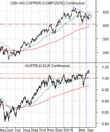
The chart below compares the Australian dollar (AUD) futures with copper futures.
The ongoing argument has been that copper is trading with the Aussie dollar and that each peak for the AUD has gone with a concurrent peak for copper. Between November and March the AUD made a series of tops against the U.S. dollar between 1.01 and 1.02 with each top marking a ‘higher high’ for copper along with a bullish trend for the equity markets and long-term yields.
The problem over the last few days has been that the Aussie dollar finally broke above 1.02 even as copper prices worked lower. Which market was ‘right’? Was the AUD in danger of reversing to the down side or was copper simply lagging on the way higher?
The good news, we suspect, was that copper prices jumped higher yesterday. The bad news is that the rally to a close around 4.36 ended right at the downward sloping resistance line.
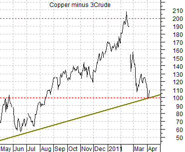
Next we show the spread or difference between copper prices (in cents) and crude oil prices (in dollars times 3). The idea has been that a rising spread represents positive Asian growth while a spread falling below ‘100’ along with an upswing in the relative strength of large cap consumer defensive stocks likely points to a growth problem ahead.
A flat day for crude oil combined with a rally day for copper helped bounce the spread line up from the ‘100’ level. It wasn’t a massive reversal but at least it took some of the near-term pressure off of the various markets.
Equity/Bond Markets
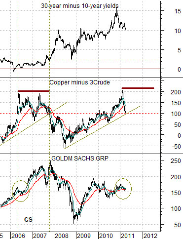
Below is a chart of Goldman Sachs (GS), the spread between copper and crude oil, and the spread between 30-year and 10-year U.S. Treasury yields.
For the sake of argument… let’s assume that copper prices have recently peaked for the cycle. In other words… 4.60 is ‘the high’.
Copper topped out in the spring of 2006 and when this happened the share price of GS worked through a 3-month correction followed a couple of months later by a clear swing up from the 150 level to the eventual peak closer to 250.
It took a bit less than 2 years for the spread between copper and crude oil to finally break to the down side which marked THE peak for the share price of Goldman Sachs in the autumn of 2007.
The point? Aside from the fact that the yield curve was dead flat in 2006- 2007 instead of wide-open as it is today… the argument is that it could be a year or more before crude oil gathers up enough momentum to break the equity market’s bullish trend.
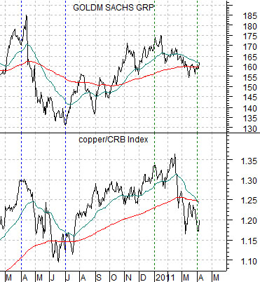
Below is a comparison between Goldman Sachs and the ratio between copper and the CRB Index. Our view is that the 3-month correction from January through March is quite similar to the 3-month correction for GS that ran between April and the end of June last year. A rising copper/CRB Index ratio would do wonders for the cyclical trend.
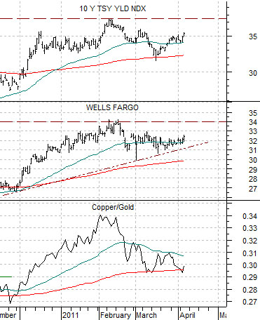
Quickly… in trading yesterday the copper/gold ratio rose, the share price of Wells Fargo (WFC) nudged higher, and 10-year yields closed back above 3.5%. All three of these markets declined in mid-February when oil prices started to spike upwards so the sense was that we were seeing tentative indications that the energy-focused trend was approaching some kind of near-term conclusion.