We are going to add a new twist to an old argument today. To start off we have included a comparative view of the share price of McDonalds (MCD), base metals miner Rio Tinto (RTP), and the ratio between the share price of Coca Cola (KO) and the S&P 500 Index (SPX).
The markets have a habit of obscuring new and emerging trends. We suspect that most would have a hard time agreeing with the statement that large cap U.S. consumer growth stocks have generally been the place to be for the last four years. Obviously that is not quite true if one expands the investment universe to foreign markets but ,then again, we often find that it is easier to make a point if we ignore a few key details.
If one had purchased shares of Rio Tinto (a stock widely associated with the China growth theme) in early 2006 and held them to the present time period you would be roughly flat on the trade. If you had taken the same money and bought MCD you would be in danger of doubling your capital. Through the last four years the general trend for the KO/SPX ratio has been higher as Coke has outperformed the broad U.S. market.
We have argued on quite a few occasions that the KO/SPX ratio tends to trend in the opposite direction of the trend for commodity prices. Yet… the chart shows that the ratio has been resolving higher since some time in 2006.
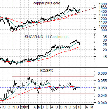
Below we show a comparison between the KO/SPX ratio, sugar futures, and the sum of copper and gold futures.
It is not blazingly clear to us that we are currently in a ‘strong commodity price’ trend. While we might be in danger of splitting hairs given that commodity prices have been trending higher since the end of 2008 our point is that if commodity prices were truly strong then the KO/SPX ratio should be trending lower.
The chart shows that the share price for KO was close to 5% of the value of the SPX at the end of 2008 and is almost exactly 5% of the level of the SPX today. It has risen at the exact same pace as the market (and paid a few dividends along the way). A strong and rising KO/SPX ratio suggests a negative trend for commodity prices while a weak and falling ratio supports the idea that the kind of cyclical growth that tends to favor commodity prices is alive and well. A flat trend, on the other hand, suggests that the issue of economic recovery or double-dip recession has yet to be resolved.

Equity/Bond Markets
We know that the markets are never ‘easy’ but this is ridiculous. It just goes to show, we suppose, that the left side of the chart is far easier to read than the right side.
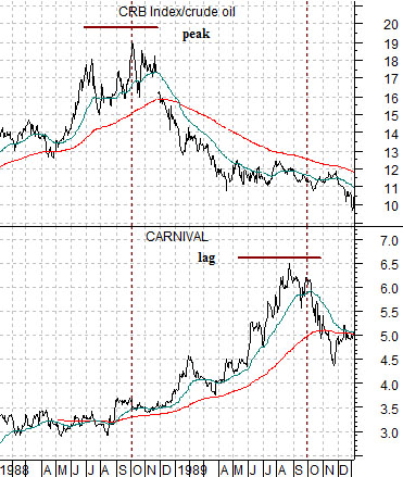
We have focused on the share price of Carnival Cruise Lines (CCL) on many occasions in the past. We use CCL to represent the broader ‘airlines and autos’ theme.
Below we show CCL and the ratio between the CRB Index (commodity prices) and crude oil prices from 1998- 99.
The argument is and has been that CCL tends to lag behind the ratio by very close to one year at the peaks. In other words when crude oil prices reach a relative ‘low’ compared to general commodity prices (i.e. a peak for the CRB/crude oil ratio) the share price of CCL tends to reach a high one year later. The chart shows that the ratio topped out in the autumn of 1988 while CCL hit a high in the autumn of 1989.
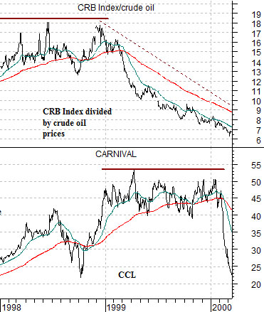
Further down we show the same comparison for the time period beginning in 1998 and running through into early 2000. The CRB/crude oil ratio hammered away at the highs through 1998 while CCL struggled with its highest levels during 1999.
So… with a full year of lead time we thought the chart-based argument was going to prove to be both simple and useful. Wrong. In trading yesterday CCL broke to a new recovery price peak. The problem is that the CRB/crude oil ratio peaked in February of 2009 which fits perfectly with the historical relationship. Our expectation has been that we are in the early stages of an anti-commodity cyclical trend that will favor the airlines and autos theme over the next few years. If we take this chart comparison literally, however, then we should be getting ready to head for the exits.