Oct. 21 (Bloomberg) — China’s stimulus-induced lending binge probably propelled growth in the third quarter to its fastest pace in a year. Now, policy makers have to figure out how to wean the economy off state support… State-directed support will make up more than four-fifths of growth this year, says the World Bank, spurring record iron- ore production at Rio Tinto Group and car sales in China at Volkswagen AG.
We will run through the ‘decade trend’ in more detail in tomorrow’s issue but it is a concept that we have explained on many occasions in the past. As the days and weeks roll by it seems to make more and more sense to us and, in fact, explains much of what is going on in the markets at present.
The basic idea, however, is that the markets have been working through a fairly similar sequence over the past few decades. Cyclical peaks coinciding with asset ‘bubble’ tops are made in the ‘0’ year (1980, 1990, 2000) followed by post-bubble trauma through the ‘1’ and ‘2’ years. Recoveries begin out of the ‘2’ year followed by a period of consolidation in the ‘4’ year. From there prices rise to a speculative peak mid-way through the ‘7’ year (1987, 1997, and 2007) only to collapse into a series of crises extending into the ‘8’ year. Central banks respond by opening the monetary flood gates leading to an acceleration of cyclical growth through the ‘9’ year that ultimately builds into an asset price bubble in the ‘0’ year. Rinse and repeat.
Why are the stock markets so much stronger than most believed possible only a few short months ago? The ‘decade trend’ provides the answer: it is, after all, a ‘9’ year.
Adding two quick details to the mix we argue once again that while cyclical is cyclical… the markets do not create asset price bubbles in the same market twice in succession. In 1980 it was commodities, into 1990 it was Taiwan and Japan, into 2000 it was the Nasdaq, and into 2010 it appears to be any permutation of the broader BRIC theme.
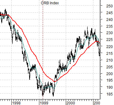
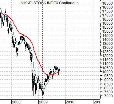
The commodity markets peaked in 1980 and close to 20 years later as the Nasdaq drove the cyclical trend higher the CRB Index rose from 1999 into 2000. The Nikkei topped out in 1990 and now close to 20 years later we argue that the Nikkei’s path through 2010 should be somewhat similar to the CRB Index into 2000. We show the chart comparison at right.
Equity/Bond Markets
The above point was that we are once again ‘enjoying’ a central bank-financed and government-sponsored cyclical rally that should carry us through into 2010. The most obvious market to work into an asset price bubble is China. To the extent that cyclical markets tend to trend together the stronger the trend for Asian equities the better the trend for commodity prices, tech, and even Japan. While commodity prices were going along for the ride into 2000 they still moved steadily higher so our view was that the same could hold true for Japan over the next few quarters.
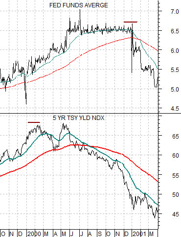
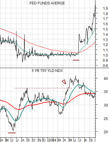
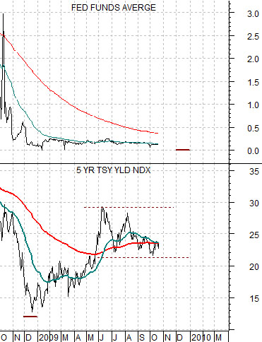
We are going to take another quick run at a topic that we introduced in yesterday’s issue. To explain we have included three comparative charts of 5-year U.S. Treasury yields (FVX) and the Fed funds target rate.
5-year yields peaked in January of 2000 (chart below) but the Fed did not begin to cut the funds rate for a full year.
5-year yields bottomed in June of 2003 (chart at top right) but the Fed did not begin to raise the funds rate until June of 2004.
The point is that when 5-year yields make a clear top or significant bottom it can take as much as twelve months for the Fed to respond by adjusting the overnight funds rate. The issue at present has to do the with the bottom for 5-year yields at the end of 2008 (chart below right). If this bottom holds then a case can be made that the Fed will initiate the first Fed rate hike towards the end of the year which, we will argue, will likely become increasingly necessary as the U.S. dollar slides into oblivion.
