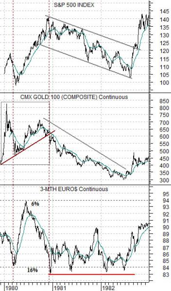
We thought that we would take one more run from a slightly different perspective at the chart comparison that we showed in yesterday’s issue. Below we feature 3-month eurodollar futures, gold futures, and the S&P 500 Index from 1980- 82.
The chart is interesting for a couple of reasons. First, it shows the interaction between various markets. Second, it does a nice job of explaining how central banks muddy the waters somewhat.
The argument is that the Fed raised interest rates repeatedly into 1980 in order to cool inflation. Once gold prices collapsed the inflationary trend was broken but the Fed continued to hold rates near the highs through 1981 and into 1982. This led to collapsing asset prices and a rather punishing equity bear market that finally came to an end once 3-month eurodollar futures prices started to rise during the second half of 1982.
The current situation is almost exactly the opposite as the Fed attempts to stimulate growth in order to stave off the threat of deflation.
Jan. 5 (Bloomberg) — Federal Reserve officials signaled they’ll probably push ahead with unprecedented stimulus until the recovery strengthens and many of the 15 million unemployed Americans find work.
We suggested yesterday that if the rising trend for gold represents concerns with respect to deflation then a weaker gold price would mark a turn back towards an inflationary trend.
Our thought was that if the Fed’s actions in 1981 and 1982 created an equity bear market as interest rates were held ‘high’ well past the peak for gold prices then there is a reasonable chance that the Fed will hold rates ‘low’ for too long this time around. Instead of a grinding bear market with falling asset prices we face the prospect of a period of ‘above trend’ growth for asset prices until the markets and the Fed finally get around to letting short-term yields rise back to more reasonable levels.
Equity/Bond Markets
Jan. 5 (Bloomberg) — Treasuries fell, pushing yields to the highest levels in a week, as U.S. companies boosted payrolls in December almost three times as much as forecast, adding to signs the economic recovery is picking up momentum.
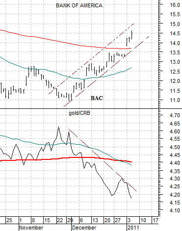
Below is our chart comparison between Bank of America (BAC) and the ratio between gold and the CRB Index.
The idea has been that once the gold/CRB Index ratio started to decline through its moving average lines the banks should swing upwards. The change in trend showed up around the start of December last year.
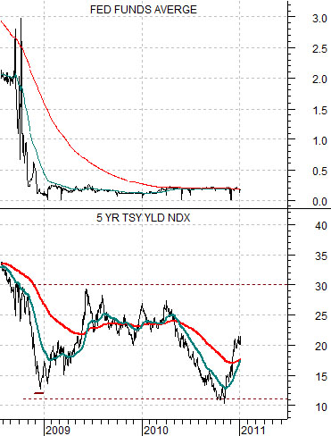
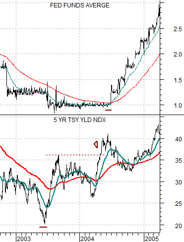
Below are charts of the Fed funds target rate and 5-year Treasury yields. The chart below right is from 2002- 2005 while the chart directly below if from the current cycle.
5-year yields bottomed in 2003 about one year ahead of the first hike in the funds rate. Notice that before the funds rate turned upwards 5-year yields moved to new highs. As well the first peak for 5-year yields was reached right around the time that the funds rate began to lift.
The point is that if 5-year yields bottomed during the final quarter of 2010 then we may not see the first funds rate boost until the fourth quarter of this year. It may take something north of 3.0% (i.e. new recovery highs) before short-term yields start to move upwards and if history were to be kind enough to repeat the peak for longer yields and bottom for bond prices- at least on a temporary basis- would be reached when the Fed finally relents and moves the funds rate up from around 0%.