Over the last while we have cobbled together a thesis of what we believe the trend will ‘look like’ over the second half of the year. As theses go this one is a bit complicated with quite a few moving parts. We thought that this might be an appropriate time to run through it once again.
In a sense the argument is that in some ways things are quite similar to 2008 while in others the trend is almost exactly the opposite. Our view is that the similarity lies with impending dollar strength while the key difference will be found in the direction of the bond market.
2008 was, by and large, the end result of 2007’s inverted yield curve. An inverted yield curve slows growth which goes with falling interest rates and rising bond prices.
2011 should be an extension of last year’s yield curve peak with growth surprising to the upside. Of course… the markets have had a different view over the past few months.
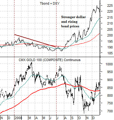
In mid-2008 the markets shifted trends with both the dollar and bond market swinging higher. A strong dollar AND bond market is death for energy and base metals prices (stronger dollar pinches commodity prices while rising bond prices indicates eroding cyclical growth) but is little more than a mixed bag for gold prices. The chart below shows that as the sum of the TBond and U.S. Dollar Index swung higher in July of 2008 the price of gold declined by a moderate amount.
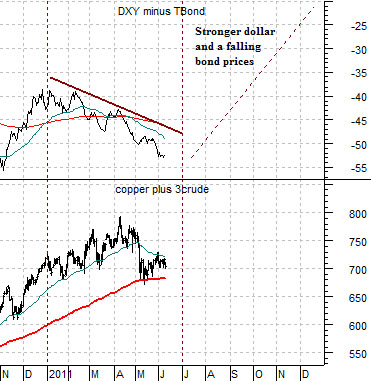
Our thesis is that we will see a stronger dollar and falling bond prices during the second half of this year. In other words the spread between the U.S. Dollar Index and U.S. 30-year T-Bond futures will rise as the dollar moves higher and bond prices trend lower.
If we were to get this outcome then the argument would be that the sum of copper and crude oil futures prices will go through the same kind of pressure that impacted gold back in 2008. In other words… moderately lower prices as a result of the stronger dollar but supported overall by the reality of rising yields.
The final piece of puzzle involves gold prices. The argument has been that gold prices will undergo the same kind of pressure during the final six months of this year that impacted copper and crude oil in 2008. Since stronger gold prices have reflected downward pressure on the financial sector the conclusion was that we could actually see quite a robust stock market trend into year end.
Equity/Bond Markets
From time to time over the past year or three we have touched on the idea of the ‘decade theme’. The argument has been that from decade to decade there is a rough sort of similarity between the trends in the various years. In other words… cyclical asset prices tend to rise to a peak in the ‘0’ year (i.e. gold and oil in 1980, Japan in 1990, Nasdaq in 2000), correct late into the ‘2’ year, go through a correction in the ‘4’ year, crash in the ‘7’ or ‘8’ year, and then accelerate upwards once again into the ‘0’ year.
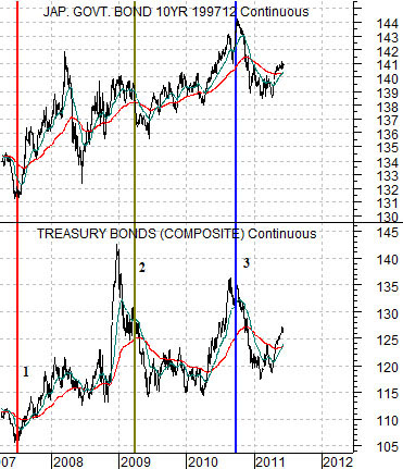
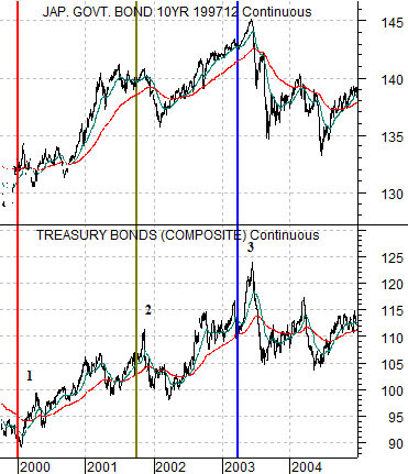
We generated two arguments from this observation. First, the asset class that may well have reached its cyclical peak in 2010 was the long end of the bond market. Second, while we like the Japanese theme the chart pattern is so close to that of the CRB Index during 2001 that a case could be made for a negative trend for the Nikkei into the final quarter of this year.
We are going to attempt to address both arguments today using two bond market charts. At top right is a comparison from late 1999 into 2004 of the U.S. 30-year T-Bond futures and the Japanese 10-year (JGB) bond futures. Below we show the same comparison from 2007 to the present time frame.
The story begins in 2000 as well as 2007 when the U.S. yield curve moved into inversion. An inverted yield curve tends to lead to a sharp decline in economic growth.
As growth slowed post-2000 the bond market pushed higher in price until late in 2001 a peak was reached. This coincided with the low point for commodity prices and the start of a cyclical recovery.
Following a collapse through 2008 the bond market rose to a peak into early 2009. This marked the low point for the Asian stock markets and commodity prices with U.S. equities turning upwards in March of 2009. In other words… early 2009 was somewhat similar to the final quarter of 2001.
The next key chart point for bond prices came during the spring of 2003. The equity markets began to strengthen with the laggard sectors pivoting higher around mid-year concurrent with the cycle peak for both the U.S. and Japanese bond markets.
In terms of ‘time’ this lines up with the bond market towards the end of 2010. Even several quarters and a number of crises later we can see that the Japanese bond market reached a price top some time last year.
The point? The argument was that bond prices would peak in 2010 and to date this still remains valid. Laggard cyclical prices were supposed to turn higher in late 2010 but the progression may have been pushed forward in time following the Japanese earthquake and tsunami. On the other hand the problem with comparing the Nikkei in 2011 with the CRB Index in 2001 is that the latter was responding to an inverted yield curve in 2000 while pressure on Japan was at its most intense back in 2008.
When we view the markets through a simple bond market comparison our sense is that conditions today are roughly similar to late 2003 or early 2004 with economic growth expanding and prices rising with the first Fed rate hike due a few quarters into the future.