We get asked quite often about the gold mining stocks. We are not quite sure why given that we are on record as being fairly major gold ‘bears’ but it does seem to be a topic that comes up on a regular basis.
We have a negative bias for gold. We expect that gold prices will decline back to around 1100- 1150. We can make the case that this could happen before the end of the year.
So… on the one hand we are negative on gold. On the other hand we have been negative on gold for a rather long time. On the one hand we tend to be early in our views. On the other hand even a broken clock is right twice per day so if we hold to our bearish view for long enough perhaps we might even be correct one of these years.
To start things off today we wanted to attempt to put aside our bearish gold bias and show one of the chart comparisons that we use to follow the trend for the gold mining stocks.
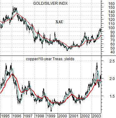
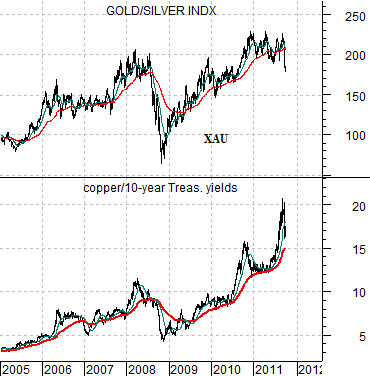
Below are charts of the Philadelphia Gold and Silver Index (XAU) and the ratio between copper futures prices and 10-year U.S. Treasury yields. The top chart runs from 1995 into 2003 while the lower chart covers the time period between 2005 and the present day.
Gold is part ‘metal’ and part ‘financial’. The trend for the gold mining stocks tends to reflect both the trend for metals prices (i.e. copper) and the direction of long-term yields. A higher copper prices is a positive while declining long-term yields is also a positive.
The copper/10-year yields ratio trends with the XAU and also has a tendency to lead somewhat at the turns. In general if the ratio is above its 200-day e.m.a. line the intermarket trend for the gold miners is positive and when it is below the line the trend is likely negative.
The point is that if we look at the ratio within the context of its 200-day e.m.a. (red line) the trend is still positive. Recent weakness in copper prices has been offset by falling yields. Support for the ratio lies at ‘15’ which represents something like 3.00 (300) copper and 2.0% (20) 10-year yields. If yields rise up through 2% without an equivalent rise in copper prices then the intermarket trend for the gold miners would turn negative in a manner somewhat similar to the start of 1996.
Equity/Bond Markets
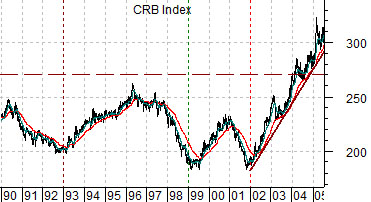
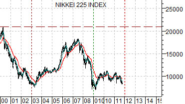
Below are charts of the CRB Index from 1990 into 2005 and the Nikkei 225 Index from 2000 to the present day. We are comparing the trend for commodity prices with that of the Japanese stock market… using a 10-year lag.
There are two points here. First, the ‘decade theme’ argues that the cyclical trend tends to repeat the same basic pattern from decade to decade. Second, the basic trend for the Nikkei is almost identical to that of the commodity markets from ten years previous.
While the amplitude of the swings varies the direction of the trends are very similar suggesting that what happened to the CRB Index around the end of 2001 may be relevant to the cyclical trend in general and the Nikkei 225 Index in particular in the days ahead.
The argument is that if the comparison continues to work… then the Nikkei is going to go for a ride over the next number of years.
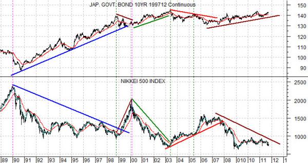
Below is a chart comparison between the Japanese 10-year (JGB) bond futures and the Nikkei 500 Index.
We have added a number of lines on the chart in an attempt to make a fairly important point. From roughly 1990 to the present time frame the Japanese stock market has only trended higher when bond prices have been trending lower. Given that bond prices have generally been trending higher for the past 30 years… the rallies for this stock market have been fairly brief followed by lengthy declines.
So… if we accept the message from the chart comparison at top right that suggests that the Nikkei is poised to drive higher and then marry it with the message from the chart below that shows that the Nikkei is only strong when bond prices are falling… we end up with the conclusion that where we are now- this week, this month, or perhaps this quarter- represents what could well be a generational low for long-term interest rates.