We tend to believe that history repeats but always in a slightly different way and rarely (i.e. never) in the way that you expect. Yet when you look back at long-term charts you can often see the same basic trends and cycles taking place again and again and again even as investors firmly believe that each trend is wholly unique.
The Decade Theme argues that at the start of each decade a major sector rises to a cycle peak before correcting lower into the final quarter of the ‘2’ year. The twist is that there is a substantial difference between a peak in commodity prices and weakness in U.S. large cap equities or, perhaps, a top for long-term bond prices. Given that the markets work in terms of offsets a decline in equity and commodity prices can lead to a bull market for bonds while falling bond prices could quite easily go with a bullish response for equities and bonds.
For more than a decade we have held the view that if, as, or when Japanese 10-year yields rise above 2.0%… Japan will have escaped from deflation. It was also our view that we would have to have tremendous conviction that rising Japanese yields were a positive because one would hardly be able to swing a tablet computer without hitting an economist or analyst arguing that rising yields were the early stages of a Japanese debt default.
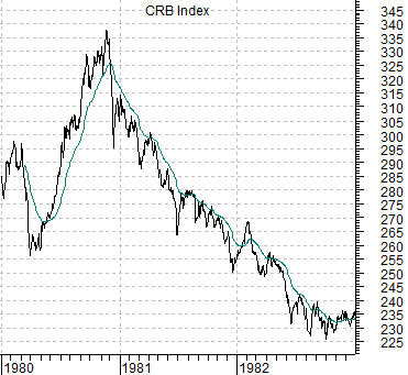
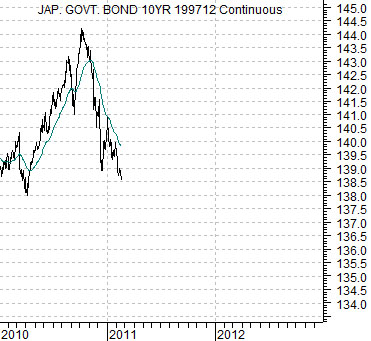
Below is a chart of the CRB Index from 1980 through 1982. Below right is a chart of the Japanese 10-year (JGB) bond futures from 2010 to the present day.
The argument is that the charts are visually quite similar. Commodities represented the asset sector that reached a peak in 1980 only to move to new all time highs in 2006. Our view here is that Japanese long-term bond prices likely represent the asset sector that made a price peak last year suggesting that we will see a fairly relentless increase in long-term Japanese interest rates through into late 2012.
Last seen 10-year Japanese yields are still only 1.32% so we won’t see 2.0% any time soon. Yet… the Japanese stock market has shown such a clear tendency over the past two decades to underperform whenever yields are falling and outperform when yields are rising that any argument suggesting ongoing bond price weakness has to be viewed as bullish for Japanese equity prices.
Equity/Bond Markets
Goodness… we find the chart comparisons below thoroughly intriguing but have the very clear sense that we may never be able to explain them. This is going to take a bit of work because we have turned a couple of the charts upside down.
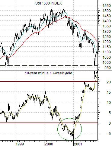
Directly below is a comparison between the S&P 500 Index (SPX) and the spread between 10-year and 3-month Treasury yields from 1998 into late 2001.
The argument is that when the markets and/or cyclical asset prices get overheated the bond market and/or the Federal Reserve pulls back on the reigns in an attempt to slow the momentum. In this example the ‘reigns’ are represented by the yield spread.
One of the surest ways to slow economic growth is to engineer an inversion of the yield curve. When the spread between 10-year yields and 3-month yields falls below the ‘0’ line it means that investors can receive a higher rate of return in TBills than 10-year bonds. The tendency is for money to move ‘inward’ and away from risk which tends to strangle growth leading to a decline in cyclical asset prices.
The point is that the SPX hit bottom in late 1998 and pushed upwards into 2000 until the yield spread inverted. This effectively killed the bull market sending the SPX into a tail spin.
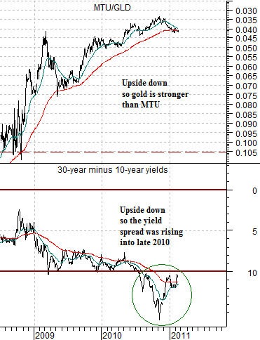
Below we show two ‘upside down’ charts. We have included the ratio of Mitsubishi UFJ (MTU) to the gold etf (GLD) and the spread between 30-year and 10-year Treasury yields. Note that we are using the 30-year minus 10-year spread in this case to remove the somewhat artificial impact of the Fed holding short-term rates near 0%.
The first point is that the charts are visually quite similar. Because the trends are actually the exact opposite of the SPX and yield spread from 1998- 2001 to create the similarity we had to turn both the MTU/GLD ratio and current yield spread upside down.
The argument starts with the idea that the banks (MTU) and gold (GLD) are acting as offsets. If weakness for the banks led to strength for gold then our conclusion is that strength for the banks may lead in due course to weakness for gold.
So… what will help strengthen the banks? The answer is… a very wide yield spread. If an inverted or negative spread acts to slow growth then an excessively wide spread will stimulate growth.
The charts are set up to make a fairly straightforward point. The yield curve inversion in the second half of 2000 led to a collapse in the SPX that removed the entire post-1998 bull market. Similarly the break above 1% for the yield spread (shown on the upside down chart as a ‘break down’) through the second half of 2010 was the markets’ way of maximizing cyclical growth.
Our thought is that the MTU/GLD ratio could trend through 2011 in a manner similar to the SPX during 2001. In other words the ratio could literally return to its 2008 starting point. Instead of MTU trading at a bit more than .04 of the GLD it could rise to around .10. This would involve either absolute price strength for the laggard banks, absolute price weakness for gold, or some combination of the two.