We are going to start off today with an issue related in some ways to ‘time’. Specifically… how long is it going to take for the current trend to come to some kind of conclusion.
The trend that we are referring to relates to weakness in commodity prices in general and energy prices in particular. Given that crude oil prices have only recently turned lower this might seem somewhat premature but the argument is that the markets have been working in this direction for over a year.
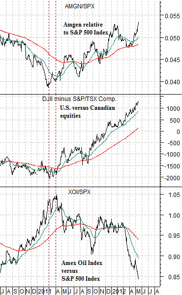
At right is a comparative chart of the ratio between Amgen and the S&P 500 Index, the point spread or difference between the Dow Jones Industrial Index and Canada’s S&P/TSX Composite Index (TSX), and the ratio between the Amex Oil Index (XOI) and S&P 500 Index (SPX).
Around the end of the first quarter of 2011 the direction of the flow of capital within the markets changed. The oil stocks began to underperform the broad market, the biotech sector started to show relative strength, and U.S. large cap stock prices began to rise relative to more resource-oriented Canadian share prices.
Over the past 13 or 14 months the share price of Amgen has risen by around 30% against the SPX, the Amex Oil Index has declined by roughly 20%, and the Dow has swung from around 2000 points below the TSX to more than 1000 points above it. In other words we are referring to rather significant changes in relative pricing.
The question we were pondering, however, had to do with ‘time’. Are the current trends going to run for another day or two, a handful of weeks, or perhaps for a few more years?
One answer would be that a trend in motion will remain in motion until some force acts upon it. Perhaps a better answer is that a trend based on energy price weakness should continue until crude oil prices reach a defendable bottom and as we go through the various relationships we keep coming to the conclusion that this points to oil prices moving below 80 and perhaps as low as the 60- 70 range.
The point is that money is on the move to the detriment of the commodity cyclical sectors. Until the markets argue that something has changed it makes sense to accept this message, avoid the bearish sectors, and concentrate on finding the bullish offsets.
Equity/Bond Markets
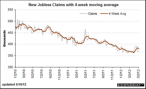
The U.S. weekly jobless claims report is due out this morning. We have argued that this may well be the most important ‘driver’ for the capital markets.
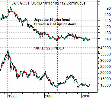
To set the stage for our argument we will begin with a chart of the Japanese 10-year (JGB) bond futures- scaled upside down- and the Nikkei 225 Index.
We have flipped the chart of the JGBs upside down so that instead of representing the trend for ‘prices’ it shows the general trend for ‘yields’. In other words a downward sloping trend for the JGBs represents falling long-term interest rates.
The point that we are attempting to make is that the trend for the Nikkei 225 Index is almost identical to the trend for Japanese long-term yields. When yields are falling… stock prices are falling. When yields are rising… stock prices are rising. Simple stuff.
The problem is that this is a fairly unusual relationship even though it has existed within the Japanese markets for more than two decades. In fact the U.S. markets shifted to the same relationship some time around 1999 so for the past 13 or 14 years it is likely fair to argue that the most important thing for stock prices is the direction of the long end of the bond market.
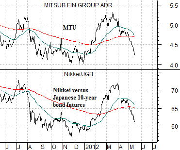
The chart at middle right compares Japanese bank Mitsubishi UFJ (MTU) with the ratio between the Nikkei 225 Index and Japanese 10-year bond futures.
The Nikkei/JGB ratio is, more or less, an ultra-sensitive way of determining the trend. The Nikkei rises when the JGBs decline and falls when the JGBs rise. Given that the share price of MTU tends to move almost tick for tick with this ratio the conclusion is that MTU will outperform the Nikkei when bond prices are falling and underperform when bonds are rising.
In any event… we are in danger of wandering away from our point. In 2010 and 2011 there was a period of time between the spring and autumn when the weekly jobless claims numbers were not moving lower. Our view is that this is relevant to both the stock and bond market.
For the third year in a row the stock market reached a peak around the end of the first quarter. Our thought is that we are seeing one of two things here- either a similar ‘pause’ into the autumn for jobless claims that supports rising bond prices or… the assumption of a similar ‘pause’. If the markets are trading on the view that because something happened in 2010 and 2011 then it is a given that it will happen this year then there is the potential for the kind of ‘shock’ that creates significant price gaps. The point is that if we were to see a surprisingly large decline in the jobless claims numbers then one has to respect the explosive power of billions and billions of dollars worth of leveraged positions being unwound or reversed in a very short period of time.