We tend to focus on two markets ‘lags’. The first is the 2-year lag between the trend for interest rates and cyclical asset prices while the second deals with the 9-month lag between various cyclical asset markets as the trend begins to turn negative. There is a third lag that we mention from time to time based not on the direction of yields but instead on the slope of the yield curve.
To quickly explain let’s run through a few significant markets turning points. In 1997 crude oil prices turned lower and the Hang Seng Index crashed. In 2000 the Nasdaq reached a cycle top as the yield curve inverted. In 2003 the yield curve reached its widest point as the equity markets bottomed. In 2006 copper prices pushed to a peak and the cyclical trend turned negative. In 2009 the cyclical trend bottomed as commodity and equity prices plumbed the lows.
The point is that a case can be made that the markets are working in some form of 3-year cycle with the next turning point due in 2012. In fact we have argued that we should see upward pressure on interest rates and a flattening of the yield curve into the autumn of 2012 based- at least in part- on this pattern.
Today’s chart presentation deals with the idea of a 3-year cycle and the potential lead/lag relationship between the slope of the yield curve and the trend for cyclical asset prices.
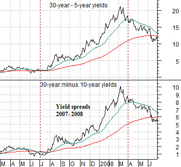
Below we show a chart of the spread or difference between 30-year and 5-year Treasury yields and 30-year and 10-year Treasury yields from 2007- 2008.
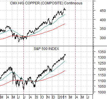
Next is a chart of copper futures and the S&P 500 Index from 2010 to the current time period. The two charts have been set up to account for what appears to be a very precise 3-year lag between the trend for the yield spread and its impact on the trend for cyclical asset prices (in this instance equities and copper futures).
IF the lag is relevant THEN it helps to explain why the cyclical trend turned positive in the second half of 2010 (following the start of the melt down of the banking shares in 2007) and why it is remained so strong into the start of 2011. The charts suggest that the current tail wind will start to ease as we approach the end of the current quarter.
Equity/Bond Markets
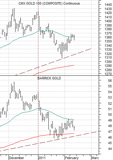
Just below is a comparative view of gold futures and the share price of Barrick (ABX).
We are negative on gold prices. Of course we also understand that the trend for gold prices is still positive and will remain that way until- at minimum- prices take out the recent lows around 1310.
Our view is that Barrick down through trend line support around 46 would go some ways towards helping to pull gold prices lower.
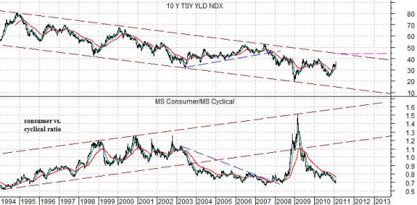
Below is what we believe to be an interesting chart comparison. The chart compares 10-year Treasury yields with the ratio between the Morgan Stanley Consumer Index and Cyclical Index.
The first point is that in a long-term trend towards declining interest rates the consumer/cyclical ratio should rise.
The second point is that when yields are rising within the channel the tendency is for the consumer/cyclical ratio to decline. In other words the rally from channel bottom to top for yields between 2003 and 2007 pushed the consumer/cyclical ratio as the cyclical stocks outperformed.
The third point is that one explanation for the fireworks in 2008 could be that like a beach ball pushed under the water… when the pressures abate the laws of physics argue that the path of least resistance is higher. This may account not only for the dramatic increase in the value of the consumer stocks on a relative basis but also for the very precise spike to the channel top for the ratio into early 2009.
Our view is that 10-year yields are headed to 4.5% which, oddly enough, is very close to the channel top. As long as yields are rising the cyclical stocks will outperform so the (very important) key is that the next time yields start to trend lower we are going to have to shift our focus as quickly as possible back to the large cap consumer names.