We have a rather strange assortment of views with respect to the markets. One of these has to do with when trend changes are likely to show up. For the purposes of today’s issue we will call this point in time ‘the pocket’.
In general trends tend to run quarter to quarter. A broader trend can run for several quarters or even for a number of years but we tend to believe that a trend in motion will often continue through an entire quarter.
The twist is that the actual pivot often occurs a few weeks into the start of a new quarter. One explanation for this might be the timing of quarterly earnings reports.
The bulk of the earnings reports are released during the third and fourth weeks of each quarter. Up until this time traders are focused on what happened during the previous three months but once the numbers are digested the focus shifts immediately to how each company or sector will fare over the current quarter. The argument is that some time around the second half of the first month of each quarter a trend change can occur as traders stop looking in the rear view mirror and start to anticipate how things will look over the next three months.
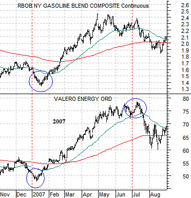
Below is a comparison from 2007. The chart shows gasoline futures prices and the share price of petroleum refiner and marketer Valero (VLO).
Gasoline prices and VLO started 2007 by declining. The trend pivoted during ‘the pocket’ and continued to rise through into mid-July. In essence we are attempting to show that a positive trend can begin with weakness while a negative trend (i.e. VLO during the third quarter of 2007) can follow early month strength.
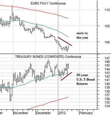
So… to the point. Below is a chart comparison between the U.S. 30-year T-Bond futures and the cross rate between the euro and Japanese yen. These are two markets that we have been following quite closely.
What we are looking for is a mid-month trend change leading to weakness for bond prices and strength for the euro relative to the yen. Whether this will come to pass is another question but for now our focus and attention remains on the potential for trend changes in ‘the pocket’.
We could probably dig up a dozen reasons why bond prices ‘could’ decline this quarter but for now we will focus on three perspectives.
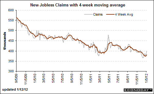
Below is a chart from Econoday.com showing the trend for U.S. weekly jobless claims. The argument is that in January of 2010 and 2011 claims spiked higher only to decline once again into March. Our view has been that the trend towards lower jobless claims (and improving U.S. employment) is going to lead to both a stronger U.S. dollar and weaker U.S. bond prices (ultimately adding downward pressure on gold prices).
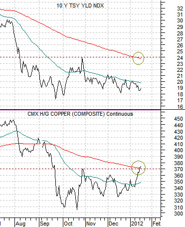
Below is a chart of 10-year U.S. Treasury yields and copper futures. Yields tend to trend with copper so with copper back to the highs of last October as well as the 200-day e.m.a. line a case could be made for 10-year yields resolving rather briskly back up towards 2.4% from today’s level of around 1.9%.
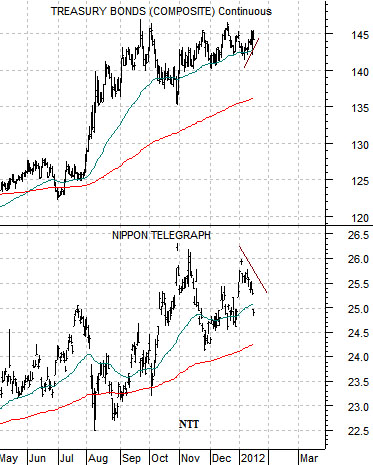
Below is a chart comparison between the U.S. 30-year T-Bond futures and the share price of Nippon Tel (NTT).
Over the past few years NTT had traded broadly with the bond market. It represents the kind of safe haven destination that money moves towards during periods of potential crisis. In other words… while the relationship is not particularly ‘tight’ on a daily basis as long as NTT is making new highs the markets are indicating that the kind of worries and concerns that push bond prices higher are still in effect.
The point is that NTT has yet to show the kind of price strength (i.e. pushing well above the 26 level) that would indicate that bond prices are headed higher. The TBonds have flat-lined since the autumn of last year leaving open the potential for price declines once the sense of crisis starts to abate.