One of the most compelling arguments that we can make in favor of a surprisingly strong cyclical rebound through year end come from the 2-year lag. Given that this is such an extreme view we are attempting to show a few prior time frames to put this into some form of perspective.
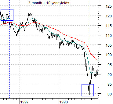
Below is a chart of the sum of 3-month and 10-year U.S. Treasury yields from mid-2006 through 2008.
The argument is that what happens to yields today impacts cyclical growth two years from now. What happened to yields two years ago tends to impact the markets today.
Yields peaked in the late summer of 1996. The Asian crisis hit the markets in the late summer of 1998. The 2-year lag suggests that the cyclical low reached during the third quarter of 1998 was a reflection of the top for yields back in 1996.
From the third quarter of 1996 into 1998’s Asian crisis yields declined. This helped create a positive cyclical trend that began with the lows for yields in 1998 extending into the third quarter of 2000. The Nasdaq’s collapse began in earnest during the fourth quarter of 2000 reflecting the swing higher for yields back in 1998.
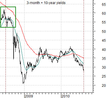
Next is a chart of the sum of 3-month and 10-year Treasury yields from the second quarter of 2008 to the present day.
Yields reached a top through the middle of 2008 which, extending two years into the future, argues for a growth slowdown or bottom into the middle of 2010. So far, so good.
It may be that the declining trend for yields that commenced during the middle of 2008 will run through to the present time period but for now we are only concentrating on what happened over the final six months of 2008. The 2-year lag provides a reasonable explanation for the slow down in cyclical growth over the first half of 2008 but also suggests that the massive infusions of liquidity added to the markets through the final months of 2008 are due to ramp up cyclical growth as we work towards this year’s final quarter.
The view that growth will become ‘surprisingly strong’ over the coming months sets the foundation for much of our work at present.
Equity/Bond Markets
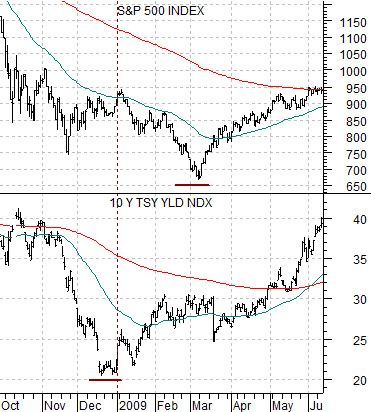
Below is a chart comparison from the autumn of 2008 into 2009. The chart shows the S&P 500 Index (SPX) and 10-year Treasury yields.
We suspect that our argument will prove to be a bit of stretch but we are going to make the attempt all the same. Here goes…
Yields bottomed at the end of the fourth quarter. The stock market bottomed in early March. The trend for the stock market is similar to the trend for yields these days so once yields began to rise the equity markets shifted into a positive trend. The ‘lag’ between the end of December and early March represented the markets’ inability to grasp the fact that something had changed.
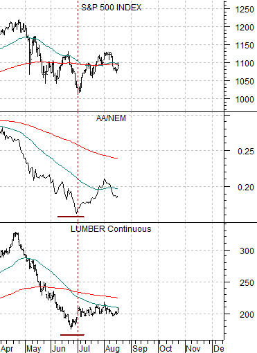
Next we show the SPX, the ratio between Alcoa and Newmont (AA/NEM), and lumber futures.
We are using the AA/NEM and lumber futures charts to represent ‘yields’. Why? Because they tend to trend with yields and have held the lows set at the end of June. Yields, on the other hand, have continued to move lower.
The SPX is still trending with lumber and the AA/NEM ratio. It ‘says’, in a sense, that the bond market is wrong or, at minimum, that falling Treasury yields are not as of yet a bearish event.
What we do not see on this chart comparison is a ‘lag’. The SPX turned higher with the AA/NEM ratio and lumber futures.
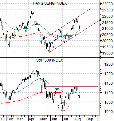
If there is a ‘lag’ then it might be found in the chart below. This chart compares the Hang Seng Index from Hong Kong with the S&P 500 Index.
The Hang Seng Index bottomed in late May and continues to grind higher. The SPX, on the other hand, is working through a potential ‘head and shoulders’ bottom with a neck line/break out point around 1130 which, if taken out, counts back up to 1220- 30.